- While Labeling boxplot in seaborn with median value is used as a reference, those answers will not work because the whiskers, as plotted by
matplotlib, aren't easily calculated directly from the data.
- As shown in
matplotlib.pyplot.boxplot, the whiskers should be at Q1-1.5IQR and Q3+1.5IQR, however the whiskers are only drawn to those values when there are outliers. Otherwise a whisker is only drawn to the min value below Q1, and/or the max value above Q3.
- Look at
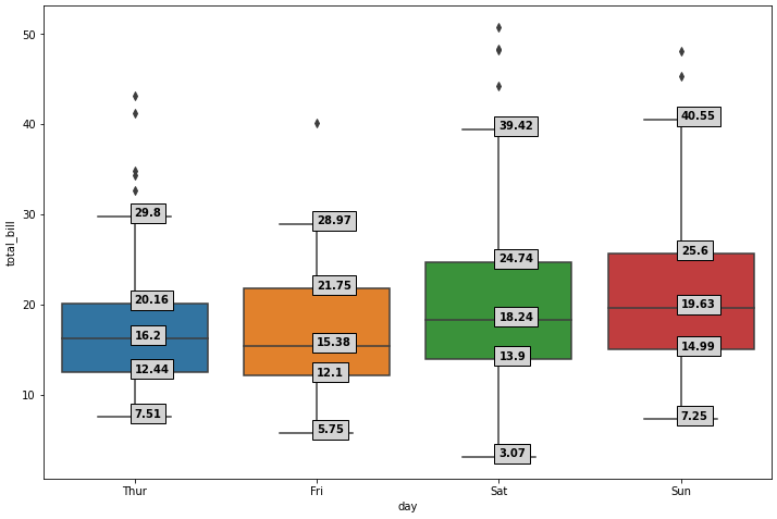
days_total_bill.min() to see that all the low whiskers are only drawn to the minimum value in the columns ({'Thur': 7.51, 'Fri': 5.75, 'Sat': 3.07, 'Sun': 7.25})
- How to get boxplot data for matplotlib boxplots shows how to use
matplotlib.cbook.boxplot_stats to extract all the boxplot stats as used by matplotlib.
boxplot_stats works with an array of values containing no NaN. In the case of the sample data, each day (comment 1.) does not contain the same number of values, so instead of doing boxplot_stats(days_total_bill.values), a list comprehension (comment 2.) is used to get the stats for each column.tips is a tidy dataframe, so the relevant data ('day' and 'total_bill') are pivoted into a wide dataframe with pandas.DataFrame.pivot, because boxplot_stats needs the data in this form.- The list of dicts is converted to dataframe (comment 3.), where
.iloc is used to select only the stats to be annotated. This step is done to make it easier to iterate through only the relevant statistics for each day when doing the annotations.
- The data is plotted with
sns.boxplot, but pandas.DataFrame.plot can also be used.
box_plot = days_total_bill.plot(kind='box', figsize=(12, 8), positions=range(len(days_total_bill.columns))) where range is specified to index from 0, because the default is to index boxplots from 1.
- Tested in
python 3.11.4, pandas 2.0.3, matplotlib 3.7.1, seaborn 0.12.2
import seaborn as sns
import matplotlib.pyplot as plt
from matplotlib.cbook import boxplot_stats

# load sample data
tips = sns.load_dataset("tips")

# 1. pivot tips so there's a column for each day for total_bill
days_total_bill = tips.pivot(columns='day', values='total_bill')
# 2. extract the boxplot stats for each day
days_total_bill_stats = [boxplot_stats(days_total_bill[col].dropna().values)[0] for col in days_total_bill.columns]
# 3. create a dataframe for the stats for each day
stats = pd.DataFrame(days_total_bill_stats, index=days_total_bill.columns).iloc[:, [4, 5, 7, 8, 9]].round(2)

# plot
fig, ax = plt.subplots(figsize=(12, 8))
# directly plot the wide dataframe with only the total_bill data
box_plot = sns.boxplot(data=days_total_bill, ax=ax)

# same plot is created with the primary tips dataframe
# box_plot = sns.boxplot(x="day", y="total_bill", data=tips, ax=ax)

# annotate
for xtick in box_plot.get_xticks():
    for col in stats.columns:
        box_plot.text(xtick, stats[col][xtick], stats[col][xtick], horizontalalignment='left', size='medium', color='k', weight='semibold', bbox=dict(facecolor='lightgray'))
![enter image description here]()
Data Views
tips
   total_bill   tip     sex smoker  day    time  size
0       16.99  1.01  Female     No  Sun  Dinner     2
1       10.34  1.66    Male     No  Sun  Dinner     3
2       21.01  3.50    Male     No  Sun  Dinner     3
3       23.68  3.31    Male     No  Sun  Dinner     2
4       24.59  3.61  Female     No  Sun  Dinner     4
days_total_bill
- not all indices have data
day  Thur  Fri  Sat    Sun
0     NaN  NaN  NaN  16.99
1     NaN  NaN  NaN  10.34
2     NaN  NaN  NaN  21.01
3     NaN  NaN  NaN  23.68
4     NaN  NaN  NaN  24.59
...
239    NaN  NaN  29.03  NaN
240    NaN  NaN  27.18  NaN
241    NaN  NaN  22.67  NaN
242    NaN  NaN  17.82  NaN
243  18.78  NaN    NaN  NaN
days_total_bill_stats
[{'mean': 17.682741935483868,
  'iqr': 7.712500000000002,
  'cilo': 14.662203087202318,
  'cihi': 17.73779691279768,
  'whishi': 29.8,
  'whislo': 7.51,
  'fliers': array([32.68, 34.83, 34.3 , 41.19, 43.11]),
  'q1': 12.442499999999999,
  'med': 16.2,
  'q3': 20.155},
 {'mean': 17.15157894736842,
  'iqr': 9.655000000000001,
  'cilo': 11.902436010483171,
  'cihi': 18.85756398951683,
  'whishi': 28.97,
  'whislo': 5.75,
  'fliers': array([40.17]),
  'q1': 12.094999999999999,
  'med': 15.38,
  'q3': 21.75},
 {'mean': 20.441379310344825,
  'iqr': 10.835,
  'cilo': 16.4162347275501,
  'cihi': 20.063765272449896,
  'whishi': 39.42,
  'whislo': 3.07,
  'fliers': array([48.27, 44.3 , 50.81, 48.33]),
  'q1': 13.905000000000001,
  'med': 18.24,
  'q3': 24.740000000000002},
 {'mean': 21.41,
  'iqr': 10.610000000000001,
  'cilo': 17.719230764952172,
  'cihi': 21.540769235047826,
  'whishi': 40.55,
  'whislo': 7.25,
  'fliers': array([48.17, 45.35]),
  'q1': 14.987499999999999,
  'med': 19.63,
  'q3': 25.5975}]
stats
      whishi  whislo     q1    med     q3
day
Thur   29.80    7.51  12.44  16.20  20.16
Fri    28.97    5.75  12.10  15.38  21.75
Sat    39.42    3.07  13.90  18.24  24.74
Sun    40.55    7.25  14.99  19.63  25.60
Manual Calculation Doesn't Match Matplotlib Whisker Location
stats = tips.groupby(['day'])['total_bill'].quantile([0.25, 0.75]).unstack(level=1).rename({0.25: 'q1', 0.75: 'q3'}, axis=1)
stats.insert(0, 'iqr', stats['q3'].sub(stats['q1']))
stats['w_low'] = stats['q1'].sub(stats['iqr'].mul(1.5))
stats['w_hi'] = stats['q3'].add(stats['iqr'].mul(1.5))
stats = stats.round(2)

        iqr     q1     q3  w_low   w_hi
day
Thur   7.71  12.44  20.16   0.87  31.72
Fri    9.66  12.10  21.75  -2.39  36.23
Sat   10.84  13.90  24.74  -2.35  40.99
Sun   10.61  14.99  25.60  -0.93  41.51


