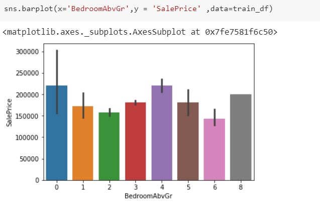
I plotted data on a barplot using seaborn library. But on the top of the bars, I can see some black lines. Can someone explain me what does it mean?
Note : the last bar does not have this line as there is only one entry for that case.

This is the error bar.
Error bars are graphical representations of the variability of data and used on graphs to indicate the error or uncertainty in a reported measurement.
In your data, it is likely the Standard Deviation or STD line.
EDIT: ====================
In response to Petr Novotný - I think you're right. It may br the 95% confidence interval:
From the Documentation
ci : float or “sd” or None, optional
Size of confidence intervals to draw around estimated values. If “sd”, skip bootstrapping and draw the standard deviation of the observations. If None, no bootstrapping will be performed, and error bars will not be drawn.
The difference between Standard Deviation and confidence interval is a subtle one.
difference-between-standard-error-means-and-standard-deviation
A confidence interval is something slightly different... 95% confidence interval
If the parameter "ci" is not passed, I believe seaborn bootstraps the STD into a Confidence Interval. By what method I don't know.
This is more of a statistics question. They are error bars. They can display either confidence intervals or the standard deviation. The bar plot shows an aggregation of some values. The error bar shows how spread out the original non-aggregated data was (simplified!). That is also the reason why no bar shows up when there was only one value. I wil point you towards the seaborn documentation. Pay extra attention to the "estimator" and "ci" parameters to start with. From there I enourage you to do your own research.
In barplot method there is a ci argument which is set to 95% by default. which gives you the errors bars. if you don't want them in your plot just set ci=None in barplot method.
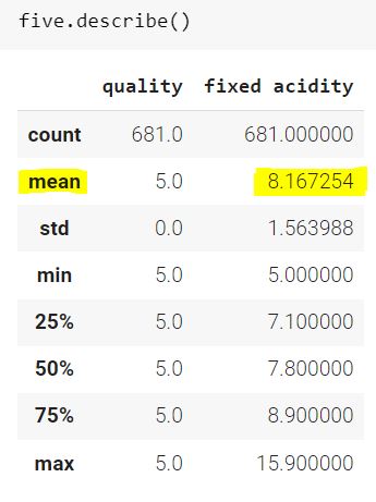
Now what barplot plots? lets deep dive into it, for example I have a extracted 2 columns wine quality and fixed acidity from a dataset. having fixed quality datapoint =5
Now let's find the maximum and minimum as well as mean value of the column "fixed acidity"

See the mean value of the "fixed acidity column" which is 8.167254 its time to plot the barplot and let's see what it plots

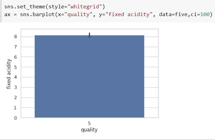
See the plot, the value is just little above 8 which is same as mean value we got earlier. so, its clear that barplot plots mean value of a column. now the question is what's the black lines? Its called "Error bars" as I mentioned earlier. The bar is the confidence interval for the variable as the library describes, i.e. it's interval where the 100 % (in my case ci=100) of your variable lies in, which is estimated by bootstrapping method (in statistics).
© 2022 - 2024 — McMap. All rights reserved.