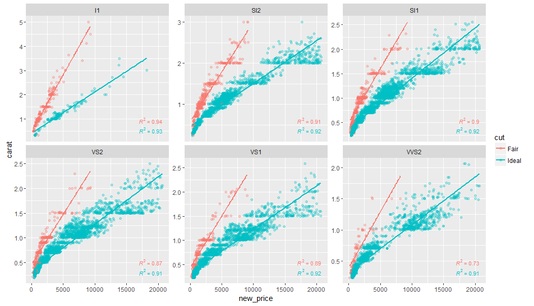
I got this plot
Using the code below
library(dplyr)
library(ggplot2)
library(ggpmisc)

df <- diamonds %>%
  dplyr::filter(cut%in%c("Fair","Ideal")) %>%
  dplyr::filter(clarity%in%c("I1" ,  "SI2" , "SI1" , "VS2" , "VS1",  "VVS2")) %>%
  dplyr::mutate(new_price = ifelse(cut == "Fair",
                                   price* 0.5,
                                   price * 1.1))

formula <- y ~ x
ggplot(df, aes(x= new_price, y= carat, color = cut)) +
  geom_point(alpha = 0.3) +
  facet_wrap(~clarity, scales = "free_y") +
  geom_smooth(method = "lm", formula = formula, se = F) +
  stat_poly_eq(aes(label = paste(..rr.label..)),
               label.x.npc = "right", label.y.npc = 0.15,
               formula = formula, parse = TRUE, size = 3)
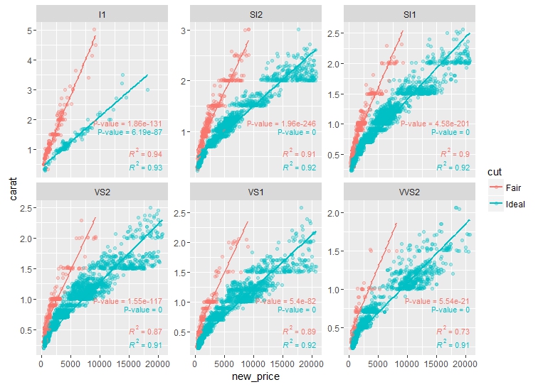
In addition to R2, I want to add p-values to the facets as well. I can do this manually through running the regression first then getting p-values and using geom_text() to add these p-values similar to the answer of this question.
Is there any faster or automated way to do that? e.g. similar to the way R2 values have been added.
Update
The p-value I'm talking about is the slope p-value. The trends are considered highly statistically significant when p < 0.005.


summarize()– Payolaggpmiscpackage for more details or contact the author. – Slipwaystat_fit_glance? source : cran.r-project.org/web/packages/ggpmisc/vignettes/examples.html – Uppity