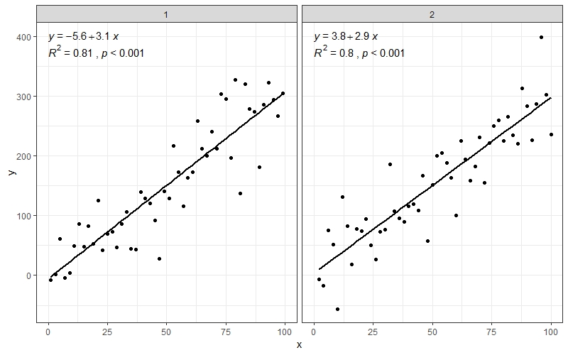
Add regression line equation and R^2 on graph
Asked Answered
S

10

325

I wonder how to add regression line equation and R^2 on the ggplot. My code is:

library(ggplot2)

df <- data.frame(x = c(1:100))
df$y <- 2 + 3 * df$x + rnorm(100, sd = 40)
p <- ggplot(data = df, aes(x = x, y = y)) +
            geom_smooth(method = "lm", se=FALSE, color="black", formula = y ~ x) +
            geom_point()
p

Any help will be highly appreciated.

Selfstarter answered 26/9, 2011 at 0:52 Comment(2)
For lattice graphics, see latticeExtra::lmlineq().Scup
@JoshO'Brien Error: 'lmlineq' is not an exported object from 'namespace:latticeExtra'Ionize
A
314

Here is one solution

# GET EQUATION AND R-SQUARED AS STRING
# SOURCE: https://groups.google.com/forum/#!topic/ggplot2/1TgH-kG5XMA

lm_eqn <- function(df){
    m <- lm(y ~ x, df);
    eq <- substitute(italic(y) == a + b %.% italic(x)*","~~italic(r)^2~"="~r2, 
         list(a = format(unname(coef(m)[1]), digits = 2),
              b = format(unname(coef(m)[2]), digits = 2),
             r2 = format(summary(m)$r.squared, digits = 3)))
    as.character(as.expression(eq));
}

p1 <- p + geom_text(x = 25, y = 300, label = lm_eqn(df), parse = TRUE)

EDIT. I figured out the source from where I picked this code. Here is the link to the original post in the ggplot2 google groups

Output

Araliaceous answered 26/9, 2011 at 1:20 Comment(9)
@JonasRaedle's comment about getting better looking texts with annotate was correct on my machine.Micromho
This doesn't look anything like the posted output on my machine, where the label is overwritten as many times as the data is called, resulting in a thick and blurry label text. Passing the labels to a data.frame first works (see my suggestion in a comment below.Serpasil
@PatrickT: remove the aes( and the corresponding ). aes is for mapping dataframe variables to visual variables - that's not needed here, since there's just one instance, so you can put it all in the main geom_text call. I'll edit this in to the answer.Unrighteous
Problem with this solution seems to be, that if the dataset is bigger (mine was 370000 observations) the function seems to fail. I would recommend the solution from @kdauria which does the same, but much much faster.Mongolian
for those who wants r and p values instead of R2 and equation: eq <- substitute(italic(r)~"="~rvalue*","~italic(p)~"="~pvalue, list(rvalue = sprintf("%.2f",sign(coef(m)[2])*sqrt(summary(m)$r.squared)), pvalue = format(summary(m)$coefficients[2,4], digits = 2)))Luigiluigino
Also, this answer is plain wrong. The intercept and slope are reversed.Oza
Keep scrolling, better answer below: https://mcmap.net/q/98618/-add-regression-line-equation-and-r-2-on-graphParttime
By default geom_text will plot for each row in your data frame, resulting in blurring and the performance issues several people mentioned. To fix, wrap the arguments passed to geom_text in aes() and also pass an empty data frame like so: geom_text(aes(x = xpoint, y = ypoint, label = lm(df)), parse = TRUE, data.frame()). See #54901195.Viosterol
I am not getting the equation in the form that has been shown in the plot, the equation is getting printed in following form ~~italic(r)^2 ~ "=" ~ "0.7357"Wotan
H
267

Statistic stat_poly_eq() in my package ggpmisc makes it possible to add text labels to plots based on a linear model fit. (Statistics stat_ma_eq() and stat_quant_eq() work similarly and support major axis regression and quantile regression, respectively. Each eq stat has a matching line drawing stat.)

I have updated this answer for 'ggpmisc' (>= 0.5.0) and 'ggplot2' (>= 3.4.0) on 2023-03-30. The main change is the assembly of labels and their mapping using function use_label() added in 'ggpmisc' (==0.5.0). Although use of aes() and after_stat() remains unchanged, use_label() makes coding of mappings and assembly of labels simpler.

In the examples I use stat_poly_line() instead of stat_smooth() as it has the same defaults as stat_poly_eq() for method and formula. I have omitted in all code examples the additional arguments to stat_poly_line() as they are irrelevant to the question of adding labels.

library(ggplot2)
library(ggpmisc)
#> Loading required package: ggpp
#> 
#> Attaching package: 'ggpp'
#> The following object is masked from 'package:ggplot2':
#> 
#>     annotate

# artificial data
df <- data.frame(x = c(1:100))
df$y <- 2 + 3 * df$x + rnorm(100, sd = 40)
df$yy <- 2 + 3 * df$x + 0.1 * df$x^2 + rnorm(100, sd = 40)

# using default formula, label and methods
ggplot(data = df, aes(x = x, y = y)) +
  stat_poly_line() +
  stat_poly_eq() +
  geom_point()


# assembling a single label with equation and R2
ggplot(data = df, aes(x = x, y = y)) +
  stat_poly_line() +
  stat_poly_eq(use_label(c("eq", "R2"))) +
  geom_point()


# assembling a single label with equation, adjusted R2, F-value, n, P-value
ggplot(data = df, aes(x = x, y = y)) +
  stat_poly_line() +
  stat_poly_eq(use_label(c("eq", "adj.R2", "f", "p", "n"))) +
  geom_point()


# assembling a single label with R2, its confidence interval, and n
ggplot(data = df, aes(x = x, y = y)) +
  stat_poly_line() +
  stat_poly_eq(use_label(c("R2", "R2.confint", "n"))) +
  geom_point()


# adding separate labels with equation and R2
ggplot(data = df, aes(x = x, y = y)) +
  stat_poly_line() +
  stat_poly_eq(use_label("eq")) +
  stat_poly_eq(label.y = 0.9) +
  geom_point()


# regression through the origin
ggplot(data = df, aes(x = x, y = y)) +
  stat_poly_line(formula = y ~ x + 0) +
  stat_poly_eq(use_label("eq"),
               formula = y ~ x + 0) +
  geom_point()


# fitting a polynomial
ggplot(data = df, aes(x = x, y = yy)) +
  stat_poly_line(formula = y ~ poly(x, 2, raw = TRUE)) +
  stat_poly_eq(formula = y ~ poly(x, 2, raw = TRUE), use_label("eq")) +
  geom_point()


# adding a hat as asked by @MYaseen208 and @elarry
ggplot(data = df, aes(x = x, y = y)) +
  stat_poly_line() +
  stat_poly_eq(eq.with.lhs = "italic(hat(y))~`=`~",
               use_label(c("eq", "R2"))) +
  geom_point()


# variable substitution as asked by @shabbychef
# same labels in equation and axes
ggplot(data = df, aes(x = x, y = y)) +
  stat_poly_line() +
  stat_poly_eq(eq.with.lhs = "italic(h)~`=`~",
               eq.x.rhs = "~italic(z)",
               use_label("eq")) +
  labs(x = expression(italic(z)), y = expression(italic(h))) +
  geom_point()


# grouping as asked by @helen.h
dfg <- data.frame(x = c(1:100))
dfg$y <- 20 * c(0, 1) + 3 * df$x + rnorm(100, sd = 40)
dfg$group <- factor(rep(c("A", "B"), 50))

ggplot(data = dfg, aes(x = x, y = y, colour = group)) +
  stat_poly_line() +
  stat_poly_eq(use_label(c("eq", "R2"))) +
  geom_point()


# A group label is available, for grouped data
ggplot(data = dfg, aes(x = x, y = y, linetype = group, grp.label = group)) +
  stat_poly_line() +
  stat_poly_eq(use_label(c("grp", "eq", "R2"))) +
  geom_point()


# use_label() makes it easier to create the mappings, but when more
# flexibility is needed like different separators at different positions,
# as shown here, aes() has to be used instead of use_label().
ggplot(data = dfg, aes(x = x, y = y, linetype = group, grp.label = group)) +
  stat_poly_line() +
  stat_poly_eq(aes(label = paste(after_stat(grp.label), "*\": \"*",
                                 after_stat(eq.label), "*\", \"*",
                                 after_stat(rr.label), sep = ""))) +
  geom_point()


# a single fit with grouped data as asked by @Herman
ggplot(data = dfg, aes(x = x, y = y)) +
  stat_poly_line() +
  stat_poly_eq(use_label(c("eq", "R2"))) +
  geom_point(aes(colour = group))


# facets
ggplot(data = dfg, aes(x = x, y = y)) +
  stat_poly_line() +
  stat_poly_eq(use_label(c("eq", "R2"))) +
  geom_point() +
  facet_wrap(~group)

Created on 2023-03-30 with reprex v2.0.2

Hecatomb answered 1/2, 2016 at 20:50 Comment(42)
It should be noted that the x and y in the formula refer to the x and y data in the layers of the plot, and not necessarily to those in scope at the time my.formula is constructed. Thus the formula should always use x and y variables?Pneumectomy
It is very true that x and y refer to the whatever variables are mapped to these aesthetics. That is the expectation also for geom_smooth() and how the grammar of graphics works. It could have been clearer to use different names within the data frame but I just kept them as in the original question.Hecatomb
Will be possible in the next version of ggpmisc. Thanks for the suggestion!Hecatomb
Thanks @PedroAphalo for such a convenient package! Is it possible to separate the ..eq.label.. and ..rr.label.. with a comma and a space (as formatted in Ramnath's answer), instead of just spaces? I tried aes(label = paste(..eq.label.., ..rr.label.., sep = ",~")) but it did not work.Navaho
Good point @elarry! This is related to how R's parse() function works. Through trial and error I found that aes(label = paste(..eq.label.., ..rr.label.., sep = "*plain(\",\")~")) does the job.Hecatomb
@PedroAphalo Is it possible to specify number of decimal places for ..eq.label.. and ..rr.label..? It seems to me that only number of significant digits are currently specifiable through coef.digits and rr.digits.Navaho
@Navaho You are right. Currently the number of decimal places cannot be specified when using this statistic. You could use stat_fit_tidy(), also from my package 'ggpmisc', for additional flexibility. The downside is that you will need to handle the formatting yourself when "building" the label within aes(), as this stat as well as stat_fit_glance(), returns numeric values rather than character strings.Hecatomb
@PedroAphalo how to add a new line in label?Caundra
Great function, already used it several times. Is there a way to change the form of exponential function. 'lm' of log(y)~ x gives me an intercept of 1.5 and 6.5, which I understand equals to: exp(6.5*x +1.5), e^(6.5*x +1.5)which equals to 4.48169 * e ^6.5 *x . It be interested in getting the last one. Also, Is there a way to force lm to this output?Owlish
Currently I get something like -1.5*x + 6.5*x²Owlish
@Owlish Have a look at the User Guide of package ggpmisc. It is not clear to me whether you want to fit a non-linear function using nls() or using a log transformation and lm(). In either case, stat_fit_tidy() should let you add the equation. There is an example in the User Guide for the Michaelis-Menten equation that you can adapt to your case.Hecatomb
@Caundra What do you mean by a new line? A fraction? With stat_fit_tidy() you can create a string to be parsed as an R expression. See help(plotmath) for the syntax.Hecatomb
@PedroAphalo is it possible to use the stat_poly_eq function for groups in the same plot? i'm specifying the colour= and linetype= in my aes() call then also calling geom_smooth(method="rlm") which is currently giving me a regression line for each group which i'd like to print unique equations for.Pinochle
@PedroAphalo, thank you. Do you know why negative slope lines don't show the minus sign? I am using this code stat_poly_eq(formula = my.formula,parse = TRUE,na.rm=TRUE)Chelseachelsey
@HermanToothrot I cannot reproduce this problem. It works for me. If you think it is a bug in the package code, please raise an issue at Bitbucket as per the README and/or DESCRIPTION of the package. In which case please, include a reproducible example.Hecatomb
@PedroAphalo is there anyway I can display r Pearson? so not R2, perhaps can I just sqrt() the result?Chelseachelsey
@HermanToothrot Usually R2 is preferred for a regression, so there is no predefined r.label in the data returned by stat_poly_eq(). You can use stat_fit_glance(), also from package 'ggpmisc', which returns R2 as a numeric value. See examples in the help page, and replace stat(r.squared) by sqrt(stat(r.squared)).Hecatomb
This is great. Currently working through how to just write the slope for each facet.Laux
@PedroAphalo sorry it's me again, is it possible to display a value stored in another variable? For example I calculate RMSE and would like to display that instead of R2? ThanksChelseachelsey
@HermanToothrot Only separately, using geom_text() or geom_text_npc(). The calculation could be done on-the-fly. I'll try to write an example soon, probably tomorrow.Hecatomb
@PedroAphalo If I am using a multivariate model like formula = y~x+z, is it possible to rename the third variable?Pricking
@Pricking It is not possible because stat_poly_eq() is strictly for polynomials. Other stats in the 'ggpmisc' package allow using any fit that is supported by package 'broom', but the equation label needs to be "assembled" when doing the mapping with aes(), Please, see the User Guide and the help page for stat_fit_tidy(). (docs.r4photobiology.info/ggpmisc/articles/…), To help you understand what variables are returned you can use geom_debug() from package 'gginnards', see (docs.r4photobiology.info/gginnards/articles/user-guide-1.html).Hecatomb
Is there any way to do the same for plotly plot? I tried doing it by feeding 'p' into plotly function like 'ggplotly(p)', but 'ggpmisc' package does not work for plotly, it works only for ggplot.Mita
@Mita I haven't used plotly or ggploty myself. In 'ggpmisc' I have tried to make the gg object returned to be not different from one created by means of 'ggplot'. What works differently are the npc coordinates and npc geoms that use them. I think using geom_text with stat_poly_equation() should return an object that is not different from one created purely with 'ggplot2'. Please, let me know if this solves the problem so that I can add a warning to the documentation.Hecatomb
I just got to know that, apparently, we can't use ggpmisc::stat_poly_eq in plotly, it's not implemented in plotly.Mita
@PedroAphalo Hi. I am going to produce the same figure (#5) where you have 2 colors for each group. I would like to add the regression equation at specific y value.But when I use label.y = 7 it writes the 2 regression equation on top of each other do you have any idea how can I fix the issue. I am also using facets I would like to calculate the max of each facet's y value and put the equation above the max value. Any suggestion. ThanksSpirometer
You can pass a vector to y.label. Something like y.label = c(7, 7.5) should do the trick. To locate the equation relative to the maximum of the y scale use y.label.npc = 1 or for two equations y.label.npc = c(1, 0.9) instead of y.label as npc coordinates go from 0 to 1. One means the maximum of the y axis in this case, so you should be able to also use expand_limits() or set the y scale limits or the expansion of the scale to make space for the equation above the maximum of the observations if needed.Hecatomb
@Pedro Aphalo very useful library, Is there a way to output the equation from the label into a file or R console I tried geom_debug() but is outputs the attributes and datapointsScully
If you will need this more than once, it would be easiest to copy the code from the definition of stat_poly_eq() in the package source into your script. The code is rather simple except for the multiple ways of formatting the character string. To extract the character string(s) you can use geom_debug(). You can override the default for parameter summary.fun = head with for example summary.fun = function(x) {x[["eq.label"]]} in the call to geom_debug(). (Not tested, so, please, let me know if this does not work...).Hecatomb
@Scully Now tested: summary.fun = function(x) {x[["eq.label"]]} works, and of course, you can also use <<- or assign() within the function to save the equation to a variable. However while testing I noticed problems with eq.label when using other than output.type = "expression", which is the default. This should be now fixed in the version of ggpmisc in GitHub. Examples with summary.fun = function(x) {x[["eq.label"]]} are now also added to the help page.Hecatomb
These are some very useful examples @PedroAphalo thanks! However I find that the formulas in the graphs don't show anymore since version 0.4.0. of the ggpmisc package. In version 0.3.9. it still works fine. Does anyone know how to make it work for the latest version? 0.4.2.-1? With these exact same examples I get the following warnings() from version 0.4.0 onwards: Warning messages: 1: In as.character.polynomial(polynom::as.polynomial(coefs), digits = coef.digits, : NAs introduced by coercion 2: Computation failed in stat_poly_eq(): missing value where TRUE/FALSE neededAprilaprile
I have been using the stat_poly_eq for some time it's a great tool but I am now having the same problem as T.BruceLee.Shirelyshirey
@T.BruceLee @Shirelyshirey Yes, there is a bug that triggers the error under Linux and consequently also under RStudio Cloud. Under Windows the bug slipped through my tests as it does not trigger any error and I do not know why it also slipped through CRAN checks. The most recent commit for the Main branch in GitHub (from 9 days ago) should solve the problem. However, I have not yet submitted to CRAN this fix. Please, if possible install from GitHub with remotes::install_github("aphalo/ggpmisc") and let me know if the bug is now fixed. I will submit this version to CRAN in a few days time. Sorry!Hecatomb
CRAN admins are on holidays until end of August and package submissions are not being accepted. I will submit the fix to this bug in early September. In the meantime, if you are affected by this bug please install 'ggpmisc' from GitHub.Hecatomb
Very interesting propositions for some linear regression models. When I try the same thing with my ggplot, I got "Error in stat_poly_line() : could not find function "stat_poly_line"". I do not understand why because I work with ggplot2 (v. 3.3.2) and ggpmisc (v. 0.3.5). Any idea ?Selfaddressed
Current version of ggpmisc is 0.4.7, version 0.3.5 is from June 2020, while ggplot version 3.3.2 is also quite old as the current version is 3.3.6. stat_poly_line() was added in version 0.4.1. Are you able to upgrade? If not you can use stat_smooth() with method = "lm" instead of stat_poly_line().Hecatomb
My answer is from 2016, but I updated the example code some weeks ago to reflect the simpler code that can be used with more recent versions of the packages. There have been other improvements to ggpmisc, such as support for quantile regression and major axis regression. If you are stuck with the old versions, check the examples in the package vignette for code that will work with your version.Hecatomb
Thank you for this feature! Is it possible to change the text size within the plot?Crummy
Welcome. Sure. Anything that can be set in the geom used should still work, if not, it is bug. The size aesthetic should work. What is not supported by geom_text() and geom_label() is to have different sizes of text within the same string. geom_richtext() from package 'ggtext()` does not have this limitation but the text string for it must be formatted as markdown (and size change encoded using embedded HTML).Hecatomb
@PedroJ.Aphalo Thank you for the wonderful package. Any chance it would be compatible with gganimate? According to my tests it is currently not compatible.Taber
@TianjianQin I haven't tested any of the geoms together with 'gganimate'. Could you let me know which geom or stat you want to use, possibly with a code example, by creating a new issue at github.com/aphalo/ggpmisc/issues? I will check how difficult it would be to fix this problem and schedule a fix for a future version.Hecatomb
@PedroJ.Aphalo I will file an issueTaber
U
111

I changed a few lines of the source of stat_smooth and related functions to make a new function that adds the fit equation and R squared value. This will work on facet plots too!

library(devtools)
source_gist("524eade46135f6348140")
df = data.frame(x = c(1:100))
df$y = 2 + 5 * df$x + rnorm(100, sd = 40)
df$class = rep(1:2,50)
ggplot(data = df, aes(x = x, y = y, label=y)) +
  stat_smooth_func(geom="text",method="lm",hjust=0,parse=TRUE) +
  geom_smooth(method="lm",se=FALSE) +
  geom_point() + facet_wrap(~class)

enter image description here

I used the code in @Ramnath's answer to format the equation. The stat_smooth_func function isn't very robust, but it shouldn't be hard to play around with it.

https://gist.github.com/kdauria/524eade46135f6348140. Try updating ggplot2 if you get an error.

Uchish answered 15/1, 2015 at 8:34 Comment(17)
Many Thanks. This one doesn't only work for facets, but even for groups. I find it very useful for piecewise regressions, e.g. stat_smooth_func(mapping=aes(group=cut(x.val,c(-70,-20,0,20,50,130))),geom="text",method="lm",hjust=0,parse=TRUE), in combination with EvaluateSmooths from #19735649Dogear
I get 'Error in eval(expr, envir, enclos) : could not find function "eval"' when I try to source the functionScottie
I couldn't repeat your error. I thought your problem might be because of different R and R package versions. I tried updating R and all of my R packages. I still couldn't repeat the error. Make sure not to put source_gist in a loop or use it repeatedly. Github will eventually lock you out for a while.Uchish
I've run into the same 'Error in eval(expr, envir, enclos) : could not find function "eval"' after installing the latest ggplot2.Chon
@jclouse, thanks for the heads up. I updated the Gist to work with the most current version of ggplot2.Uchish
@Uchish Many thanks for your answer. Is it possible to show only R^2? if yes, could you please show how?Dicarlo
@aelwan, change these lines: gist.github.com/kdauria/… as you like. Then source the entire file in your script.Uchish
@Uchish What if I have several equations in each of facet_wraps and I have different y_values in each of facet_wrap. Any suggestions how to fix the positions of the equations? I tried several options of hjust, vjust and angle using this example dropbox.com/s/9lk9lug2nwgno2l/R2_facet_wrap.docx?dl=0 but I couldn't bring all the equations at the same level in each of the facet_wrapDicarlo
@kdauria, thanks for your very useful function - I now can show nice formatted equations by group on my scatter plot. Is there any way of depressing the letter "a" from showing in the legend? I tried geom_text(show.legend = FALSE), but got an error message "Error: geom_text requires the following missing aesthetics: label". Thanks!Navaho
@elarry, that's great it's working for you. Check out #9874147 and other related questions.Uchish
@aelwan, the position of the equation is determined by these lines: gist.github.com/kdauria/…. I made xpos and ypos arguments of the function in the Gist. So if you wanted all the equations to overlap, just set xpos and ypos. Otherwise, xpos and ypos are calculated from the data. If you want something fancier, it shouldn't be too hard to add some logic inside the function. For example, maybe you could write a function to determine what part of the graph has the most empty space and put the function there.Uchish
@Uchish Many thanks. I really appreciate your time and help.Dicarlo
@Uchish thanks for your function, really helpful. I have two regression per facet and I would like to have more control on where the equation is displayed. When I use xpos or ypos, the equations overlap. Any ideas on how to fix this?Traherne
@WAF, sorry that's a tough one. When the equation and its position are generated, it's done one data set (or one regression) at a time. As best I know, the other datasets are not accessible during this process -- at least with the function as it is now. You'd have to do some trickery or write a new function altogether.Uchish
I ran into an error with source_gist: Error in r_files[[which]] : invalid subscript type 'closure'. See this post for the solution: https://mcmap.net/q/100827/-r-source_gist-not-workingWeddle
I like this solution. But why do I get "c()" around the plotted coefficients (with the example and with own data)?Dearborn
I have the same issue as @ClemSnideRounder
M
79

I've modified Ramnath's post to a) make more generic so it accepts a linear model as a parameter rather than the data frame and b) displays negatives more appropriately.

lm_eqn = function(m) {

  l <- list(a = format(coef(m)[1], digits = 2),
      b = format(abs(coef(m)[2]), digits = 2),
      r2 = format(summary(m)$r.squared, digits = 3));

  if (coef(m)[2] >= 0)  {
    eq <- substitute(italic(y) == a + b %.% italic(x)*","~~italic(r)^2~"="~r2,l)
  } else {
    eq <- substitute(italic(y) == a - b %.% italic(x)*","~~italic(r)^2~"="~r2,l)    
  }

  as.character(as.expression(eq));                 
}

Usage would change to:

p1 = p + geom_text(aes(x = 25, y = 300, label = lm_eqn(lm(y ~ x, df))), parse = TRUE)
Mcfarlane answered 19/11, 2012 at 10:9 Comment(5)
This looks great! But I'm plotting geom_points on multiple facets, where the df differs based on the facet variable. How do I do that?Thilde
Jayden's solution works quite well, but the typeface looks very ugly. I would recommend changing the usage to this: p1 = p + annotate("text", x = 25, y = 300, label = lm_eqn(lm(y ~ x, df)), colour="black", size = 5, parse=TRUE) edit: this also resolves any issues you might have with letters showing up in your legend.Unrealizable
@ Jonas, for some reason I'm getting "cannot coerce class "lm" to a data.frame". This alternative works: df.labs <- data.frame(x = 25, y = 300, label = lm_eqn(df)) and p <- p + geom_text(data = df.labs, aes(x = x, y = y, label = label), parse = TRUE)Serpasil
@Serpasil - That's the error message you would get if you called lm_eqn(lm(...)) with Ramnath's solution. You probably tried this one after trying that one but forgot to ensure that you had redefined lm_eqnIphigeniah
@PatrickT: could you make your answer a separate answer? I would be happy to vote it up!Nerval
M
34

Here's the most simplest code for everyone

Note: Showing Pearson's Rho and not R^2.

library(ggplot2)
library(ggpubr)

df <- data.frame(x = c(1:100)
df$y <- 2 + 3 * df$x + rnorm(100, sd = 40)
p <- ggplot(data = df, aes(x = x, y = y)) +
        geom_smooth(method = "lm", se=FALSE, color="black", formula = y ~ x) +
        geom_point()+
        stat_cor(label.y = 35)+ #this means at 35th unit in the y axis, the r squared and p value will be shown
        stat_regline_equation(label.y = 30) #this means at 30th unit regresion line equation will be shown

p

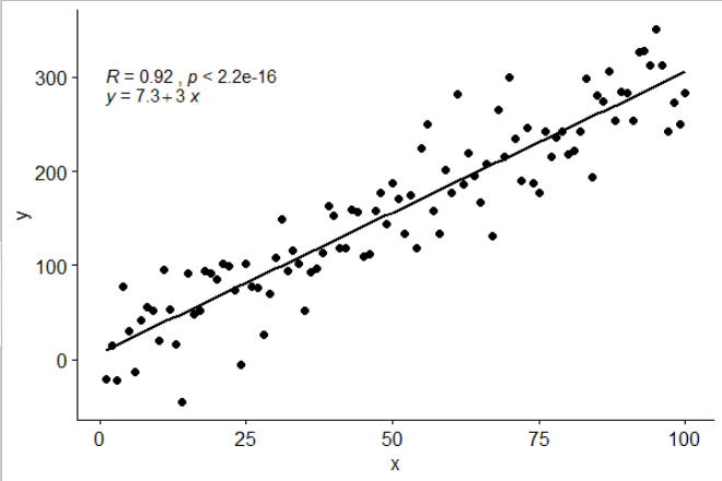
One such example with my own dataset

Mott answered 29/2, 2020 at 18:46 Comment(8)
Same problem as above, in your plot it is shown rho and not R² !Forespeak
actually you can add just the R2 with: stat_cor(aes(label = ..rr.label..))Weddle
I find this to be the simplest solution with the best control over the location of the labels (I was not able to find a simple way to put the R^2 below the equation using stat_poly_eq) and can be combined with stat_regline_equation() to plot the regression equationLingua
'ggpubr' seems not to be actively maintaine; as it has many open issues in GitHub. Anyway, much of the code in stat_regline_equation() and in stat_cor() was just copied without acknowledgement from my package 'ggpmisc'. It was taken from stat_poly_eq() which is actively maintained and has gained several new features since it was copied. The example code needs minimal edits to work with 'ggpmisc'.Hecatomb
@PedroJ.Aphalo While I agree with you that if code was taken from your package you should get acknowledgement, I still find stat_poly_eq() to be more cumbersome. The fact that I can't easily separate the label=..eq.label.. and label=..rr.label.. onto separate lines and intuitively place them on the grid means I will continue to prefer stat_cor() and stat_regline_equation(). This is certainly my own personal opinion and may not be shared by other users but just some things to consider since you're still actively updating ggpmiscLingua
@Lingua You can achieve the same effect by adding two layers using stat_poly_eq() once for the equation and a second one for R2. This is not different to 'ggpubr' but being more flexible requires a bit more typing. Ideally, we would avoid fitting the regression multiple times, but I have not found a way of achieving this. Added an example to my answer.Hecatomb
When using this with groups, e.g. aes(x= x, y= y, color = z) the text for each color gets plotted on top of each other. How would you modify this solution when you have multiple groups being plotted as different colors?Hexateuch
@ruggtub You can use stat_poly_eq() from 'ggpmisc' which will automatically displace the labels to avoid overlaps... There is an example in my long answer above, with one label per group, each with the equation and R^2. I just updated my answer as code can be simpler with the current version of 'ggpmisc'. Based on the very valid critisism by @JJGabe, I have added a simpler approach to selecting different labels. If you want to only add correlation, then stat_correlation() also from 'ggpmisc' could be useful.Hecatomb
G
22

Using ggpubr:

library(ggpubr)

# reproducible data
set.seed(1)
df <- data.frame(x = c(1:100))
df$y <- 2 + 3 * df$x + rnorm(100, sd = 40)

# By default showing Pearson R
ggscatter(df, x = "x", y = "y", add = "reg.line") +
  stat_cor(label.y = 300) +
  stat_regline_equation(label.y = 280)

enter image description here

# Use R2 instead of R
ggscatter(df, x = "x", y = "y", add = "reg.line") +
  stat_cor(label.y = 300, 
           aes(label = paste(..rr.label.., ..p.label.., sep = "~`,`~"))) +
  stat_regline_equation(label.y = 280)

## compare R2 with accepted answer
# m <- lm(y ~ x, df)
# round(summary(m)$r.squared, 2)
# [1] 0.85

enter image description here

Guillerminaguillermo answered 11/10, 2019 at 6:53 Comment(7)
Have you seen a neat programmatic way to specify a number for label.y?Botheration
@MarkNeal maybe get the max of y then multiply by 0.8. label.y = max(df$y) * 0.8Guillerminaguillermo
Probably 0.8 * (max-min) + min is better, though for graphs with negative correlation, the bottom would probably be a preferable location (ie 0.2). The other criteria is whether you cover data with the text, in which case you probably want to change limits as well! Something like ggrepel that automagically handles all that would be great.Botheration
@MarkNeal good points, maybe submit issue as feature request at GitHub ggpubr.Guillerminaguillermo
Issue on auto location submitted hereBotheration
@Guillerminaguillermo , in your plot it is shown rho and not R² ,any easy way to show R² ?Forespeak
@Mark Neal, I think you can do that with label.y.npcPlattdeutsch
C
17

really love @Ramnath solution. To allow use to customize the regression formula (instead of fixed as y and x as literal variable names), and added the p-value into the printout as well (as @Jerry T commented), here is the mod:

lm_eqn <- function(df, y, x){
    formula = as.formula(sprintf('%s ~ %s', y, x))
    m <- lm(formula, data=df);
    # formating the values into a summary string to print out
    # ~ give some space, but equal size and comma need to be quoted
    eq <- substitute(italic(target) == a + b %.% italic(input)*","~~italic(r)^2~"="~r2*","~~p~"="~italic(pvalue), 
         list(target = y,
              input = x,
              a = format(as.vector(coef(m)[1]), digits = 2), 
              b = format(as.vector(coef(m)[2]), digits = 2), 
             r2 = format(summary(m)$r.squared, digits = 3),
             # getting the pvalue is painful
             pvalue = format(summary(m)$coefficients[2,'Pr(>|t|)'], digits=1)
            )
          )
    as.character(as.expression(eq));                 
}

geom_point() +
  ggrepel::geom_text_repel(label=rownames(mtcars)) +
  geom_text(x=3,y=300,label=lm_eqn(mtcars, 'hp','wt'),color='red',parse=T) +
  geom_smooth(method='lm')

enter image description here Unfortunately, this doesn't work with facet_wrap or facet_grid.

Chainey answered 22/8, 2018 at 20:38 Comment(2)
Very neat, I've referenced here. A clarification - is your code missing ggplot(mtcars, aes(x = wt, y = mpg, group=cyl))+ before the geom_point()? A semi-related question - if we refer to hp and wt in the aes() for ggplot, can we then grab them to use in the call to lm_eqn, so then we only have to code in one place? I know we could set up xvar = "hp" before the ggplot() call, and use xvar in both locations to replace hp, but this feels like it ought to be unnecessary.Botheration
Really nice solution! Thanks for sharing it!Boor
A
5

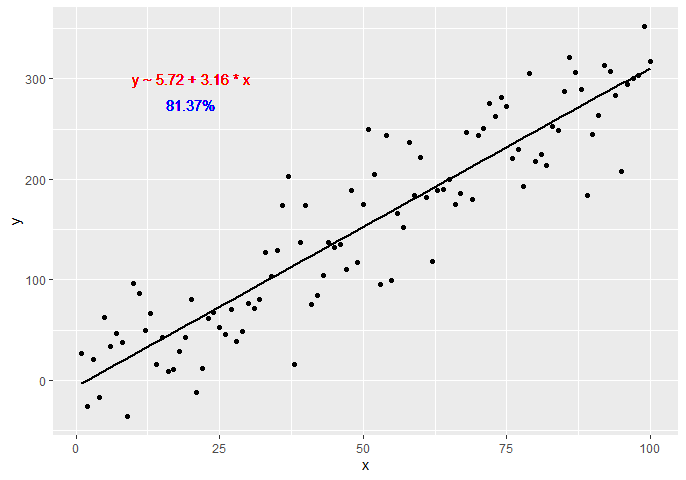
Another option would be to create a custom function generating the equation using dplyr and broom libraries:

get_formula <- function(model) {
  
  broom::tidy(model)[, 1:2] %>%
    mutate(sign = ifelse(sign(estimate) == 1, ' + ', ' - ')) %>% #coeff signs
    mutate_if(is.numeric, ~ abs(round(., 2))) %>% #for improving formatting
    mutate(a = ifelse(term == '(Intercept)', paste0('y ~ ', estimate), paste0(sign, estimate, ' * ', term))) %>%
    summarise(formula = paste(a, collapse = '')) %>%
    as.character
  
}

lm(y ~ x, data = df) -> model
get_formula(model)
#"y ~ 6.22 + 3.16 * x"

scales::percent(summary(model)$r.squared, accuracy = 0.01) -> r_squared

Now we need to add the text to the plot:

p + 
  geom_text(x = 20, y = 300,
            label = get_formula(model),
            color = 'red') +
  geom_text(x = 20, y = 285,
            label = r_squared,
            color = 'blue')

plot

Andersen answered 15/10, 2020 at 16:55 Comment(0)
R
4

Inspired by the equation style provided in this answer, a more generic approach (more than one predictor + latex output as option) can be:

print_equation= function(model, latex= FALSE, ...){
    dots <- list(...)
    cc= model$coefficients
    var_sign= as.character(sign(cc[-1]))%>%gsub("1","",.)%>%gsub("-"," - ",.)
    var_sign[var_sign==""]= ' + '

    f_args_abs= f_args= dots
    f_args$x= cc
    f_args_abs$x= abs(cc)
    cc_= do.call(format, args= f_args)
    cc_abs= do.call(format, args= f_args_abs)
    pred_vars=
        cc_abs%>%
        paste(., x_vars, sep= star)%>%
        paste(var_sign,.)%>%paste(., collapse= "")

    if(latex){
        star= " \\cdot "
        y_var= strsplit(as.character(model$call$formula), "~")[[2]]%>%
            paste0("\\hat{",.,"_{i}}")
        x_vars= names(cc_)[-1]%>%paste0(.,"_{i}")
    }else{
        star= " * "
        y_var= strsplit(as.character(model$call$formula), "~")[[2]]        
        x_vars= names(cc_)[-1]
    }

    equ= paste(y_var,"=",cc_[1],pred_vars)
    if(latex){
        equ= paste0(equ," + \\hat{\\varepsilon_{i}} \\quad where \\quad \\varepsilon \\sim \\mathcal{N}(0,",
                    summary(MetamodelKdifEryth)$sigma,")")%>%paste0("$",.,"$")
    }
    cat(equ)
}

The model argument expects an lm object, the latex argument is a boolean to ask for a simple character or a latex-formated equation, and the ... argument pass its values to the format function.

I also added an option to output it as latex so you can use this function in a rmarkdown like this:


```{r echo=FALSE, results='asis'}
print_equation(model = lm_mod, latex = TRUE)
```

Now using it:

df <- data.frame(x = c(1:100))
df$y <- 2 + 3 * df$x + rnorm(100, sd = 40)
df$z <- 8 + 3 * df$x + rnorm(100, sd = 40)
lm_mod= lm(y~x+z, data = df)

print_equation(model = lm_mod, latex = FALSE)

This code yields: y = 11.3382963933174 + 2.5893419 * x + 0.1002227 * z

And if we ask for a latex equation, rounding the parameters to 3 digits:

print_equation(model = lm_mod, latex = TRUE, digits= 3)

This yields: latex equation

Requital answered 5/4, 2019 at 13:52 Comment(1)
How to modify this function for: model = lm(y ~ x * z, data = my_data) ? X and z are categorical variables with two levels.Azaleeazan
C
2

Similar to @zx8754 and @kdauria answers except using ggplot2 and ggpubr. I prefer using ggpubr because it does not require custom functions such as the top answer to this question.

library(ggplot2)
library(ggpubr)

df <- data.frame(x = c(1:100))
df$y <- 2 + 3 * df$x + rnorm(100, sd = 40)

ggplot(data = df, aes(x = x, y = y)) +
  stat_smooth(method = "lm", se=FALSE, color="black", formula = y ~ x) +
  geom_point() +
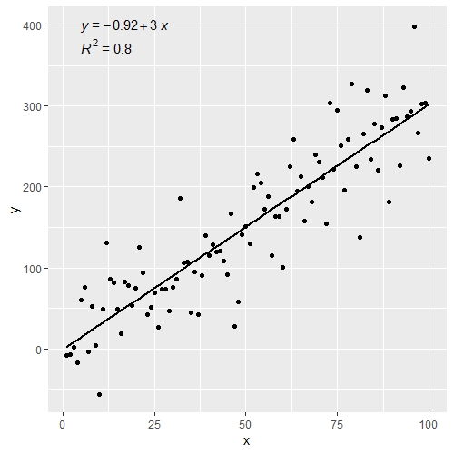
  stat_cor(aes(label = paste(..rr.label..)), # adds R^2 value
           r.accuracy = 0.01,
           label.x = 0, label.y = 375, size = 4) +
  stat_regline_equation(aes(label = ..eq.label..), # adds equation to linear regression
                        label.x = 0, label.y = 400, size = 4)

enter image description here

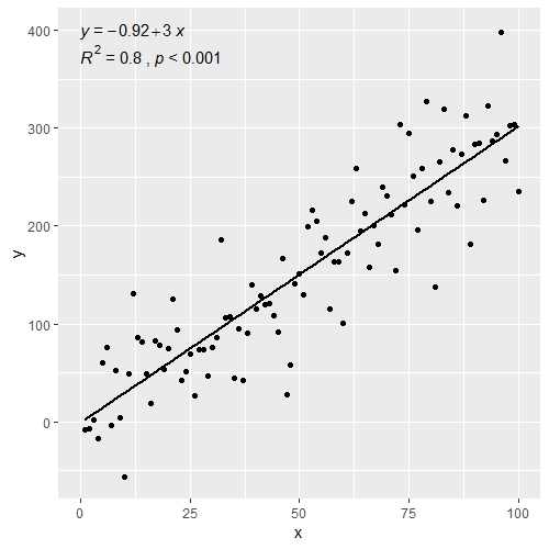
Could also add p-value to the figure above

ggplot(data = df, aes(x = x, y = y)) +
  stat_smooth(method = "lm", se=FALSE, color="black", formula = y ~ x) +
  geom_point() +
  stat_cor(aes(label = paste(..rr.label.., ..p.label.., sep = "~`,`~")), # adds R^2 and p-value
           r.accuracy = 0.01,
           p.accuracy = 0.001,
           label.x = 0, label.y = 375, size = 4) +
  stat_regline_equation(aes(label = ..eq.label..), # adds equation to linear regression
                        label.x = 0, label.y = 400, size = 4)

enter image description here

Also works well with facet_wrap() when you have multiple groups

df$group <- rep(1:2,50)

ggplot(data = df, aes(x = x, y = y)) +
  stat_smooth(method = "lm", se=FALSE, color="black", formula = y ~ x) +
  geom_point() +
  stat_cor(aes(label = paste(..rr.label.., ..p.label.., sep = "~`,`~")),
           r.accuracy = 0.01,
           p.accuracy = 0.001,
           label.x = 0, label.y = 375, size = 4) +
  stat_regline_equation(aes(label = ..eq.label..),
                        label.x = 0, label.y = 400, size = 4) +
  theme_bw() +
  facet_wrap(~group)

enter image description here

Carcass answered 20/7, 2022 at 18:6 Comment(0)

© 2022 - 2024 — McMap. All rights reserved.