Change input placeholder * color only
Asked Answered
M

6

11

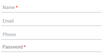
I have multiple input fields some fields are required and required field mention with * so I need to change input placeholder * color only, not change whole placeholder color check below image what I exactly need.

enter image description here
I have tried below code to achieve this but it can change whole color of placeholder

div {
  margin:10px 0px;
}
input {
  width: 200px;
  border: none;
  border-bottom: solid 1px #8d97a0;
  padding: 5px;
  border-radius: 0;
  background: #fff;
  box-shadow: none;
}
::-webkit-input-placeholder {
  color:red;
}
<div>
  <input type="name" name="name" id="name" placeholder="Name *">
</div>
<div>
  <input type="Email" name="email" id="email" placeholder="Email">
</div>
<div>
  <input type="phone" name="phone" id="phone" placeholder="Phone">
</div>
<div>
  <input type="password" name="password" id="password" placeholder="Password *">
</div>
Musculature answered 31/10, 2017 at 5:33 Comment(0)
C
3

Try this:

label {
  display: inline-block;
  width:100%;
  background: linear-gradient(to right, #999 6em, red 5em);
  border: 2px solid #ccc;
  font-family: monospace;/* less surprise about length of text at screen */
}
input {
  font-weight: bold;
  width: 100%;
  height:20px;
  padding:10px;
  border: none;
  display: block;
outline:none;

}
input:invalid {/* color part of text only when placeholder is shown */
  mix-blend-mode: screen;
}
<label>
  <input placeholder="Password *" required />
</label>
Cottbus answered 31/10, 2017 at 6:44 Comment(0)
D
2

Check this...You can achieve your requirement using :before and :after and for input tag there is no support of :before and :after. So you can do it by adding label to your input and give :before and :after CSS to label

input {
    width: 160px;
}

input[required] + label {
    color: #999;
    font-family: Arial;
    font-size: .8em;
    position: relative;
    left: -166px; /* the negative of the input width */
}


input[required] + label:after {
    content:'*';
    color: red;
}
/* show the placeholder when input has no content (no content = invalid) */
input[required]:invalid + label {
    display: inline-block;
}

/* hide the placeholder when input has some text typed in */
input[required]:valid + label{
    display: none;
}
<input type="password" id="name" name="name" required="required" />
    <label for="name">Password</label>
Dumdum answered 31/10, 2017 at 5:52 Comment(2)
I've tried this also but I don't have to use label and required in inputMusculature
Consider specifying vertical bar cursor for that label, to be consistent with what users see and expect from hovering the cursor over an input field.Mervinmerwin
R
2

Just placeholder wont give different styles.If you want different style you need to separate like this.

input {
    width: auto;
}

input + label {
    color: #999;
    font-family: Arial;
    font-size: .8em;
    position: relative;
    left: -166px; 
}

input[required] + label:after {
    content:'*';
    color: red;
}


input[required]:invalid + label {
    display: inline-block;
}

input[required]:valid + label{
    display: none;
}
<div>
  <input type="text" id="name" name="name" required="required" />
  <label for="name">Password</label>
</div>
Rotgut answered 31/10, 2017 at 5:53 Comment(1)
I've tried this already but I don't have to use label and required in inputMusculature
L
2

See This:

$(document).ready(function(){

    $('.colorHolder').click(function(){
        $('.havePlace',this).focus();
    })
    
    $('.havePlace').on('input',function(){
        var len = ($(this).val()).length;
        if (len)
            $(this).next('label').hide();
        else
            $(this).next('label').show();
    })
    
})
input {
    width: 150px;
    border: none;
    border-bottom: solid 1px #8d97a0;
    padding: 5px;
    border-radius: 0;
    background: #fff;
    box-shadow: none;
    outline: none;
}

.colorHolder {
    position: relative;
    margin-bottom: 20px;
    display:inline-block;
}

.colorHolder .havePlace + label {
    position: absolute;
    left: 7px;
    bottom: 2px;
    color: #CCC;
    cursor: text;
}

.colorHolder .havePlace + label:after {
    content: '*';
    color: red;
}
<script src="https://ajax.googleapis.com/ajax/libs/jquery/3.2.1/jquery.min.js"></script>  

<div  class="colorHolder">
    <input type="password" name="password" class="havePlace">
    <label>Password </label>
</div>

<div  class="colorHolder">
    <input type="email" name="email" class="havePlace">
    <label>Email </label>
</div>

<div  class="colorHolder">
    <input type="text" name="text" class="havePlace">
    <label>Text </label>
</div>
List answered 31/10, 2017 at 6:7 Comment(1)
Need all * comes in end not in start. I need exactly above image which I uploaded you changed UIMusculature
R
1

maybe you can use span in the placeholder so you can change the color of *

$(function() {
    $(".holder + input").keyup(function() {
        if($(this).val().length) {
            $(this).prev('.holder').hide();
        } else {
            $(this).prev('.holder').show();
        }
    });
    $(".holder").click(function() {
        $(this).next().focus();
    });
});
.holder {
position: absolute;
margin: 5px 5px;
cursor: auto;
font-size: 11pt;
z-index: 1;
}
.red{
    color: red;
}
<script src="https://ajax.googleapis.com/ajax/libs/jquery/2.1.1/jquery.min.js"></script>
<div class="holder">Email Adress <span class="red">*</span></div>
<input id="input" size="18" type="text" />

credits: Add span inside form's placeholder

Raddle answered 31/10, 2017 at 6:10 Comment(0)
D
1

With the current markup I don't think this is possible with just CSS, but:

This is possible if it's ok to add a label element after the input - like so:

<div>
  <input type="password" name="password" id="password" placeholder=" " />
  <label for="password">Password</label>
</div>

Codepen demo

The trick here is to use the pseudo class:

:placeholder-shown (caniuse)

From the spec:

Input elements can sometimes show placeholder text as a hint to the user on what to type in. See, for example, the placeholder attribute in [HTML5]. The :placeholder-shown pseudo-class matches an input element that is showing such placeholder text.

The idea here is for the text "Password *" to simulate placeholder text.

Placeholders are always shown on input elements - even if they are focused - unless a value is set on them.

By using the :placeholder-shown pseudo class on the input - we can determine when to display the label text.

This is the key selector:

input:placeholder-shown + label {
  display: block;
}

This means: when the input's placeholder is shown - show the "placeholder" label. (otherwise we hide it)

For this reason we still need to set a non-empty placeholder attribute on the input (a simple whitespace is sufficient)

div {
  position: relative;
}
label {
  position: absolute;
  height: 20px;
  left: 5px;
  top: 0;
  bottom: 0;
  margin: auto;
  display: none;
  pointer-events: none;
  color: #757575;
  font-size: 16px;
  font-family: system-ui;
}
label:after {
  content: " *";
  color: red;
}
input:placeholder-shown + label {
  display: block;
}
input {
  width: 200px;
  border: none;
  border-bottom: solid 1px #8d97a0;
  padding: 5px;
  border-radius: 0;
  background: #fff;
  box-shadow: none;
  height: 20px;
  font-size: 16px;
  margin: 5px 0;
}
<div>
  <input type="password" name="name" id="name" placeholder=" " />
  <label for="name">Name</label>
</div>

<div>
  <input type="password" name="name" id="name" placeholder="Email" />
</div>

<div>
  <input type="password" name="name" id="name" placeholder="Phone" />
</div>

<div>
  <input type="password" name="password" id="password" placeholder=" " />
  <label for="name">Password</label>
</div>
Codepen demo

Diastyle answered 31/10, 2017 at 10:15 Comment(4)
Thanks for your answer but I can't use this I have multiple fields and all fields are not required[*]Musculature
This has nothing to do with required, the only question is whether you can add an extra element after the inputDiastyle
Thanks! but placeholder and label are not looking same replace Phone to Password then you can get what I mean so please can you check this.Musculature
I tried to change font-size placeholder and label but still not coming sameMusculature

© 2022 - 2024 — McMap. All rights reserved.