Create a responsive receipt cutoff (zig-zag border)
Asked Answered
T

1

11

I am trying to make some HTML and CSS look like a receipt. I want the bottom of this receipt to look like it was torn off. I have gotten an ::after style that looks close to what I want, however on mobile devices it is showing up with some weird lines. I need a responsive design that looks good on mobile screen sizes.

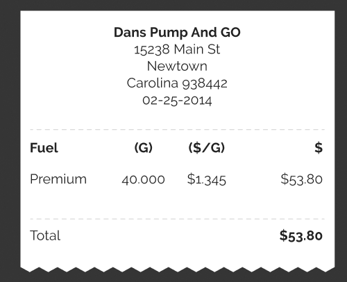
Here is the design I am looking for:

receipt desired look

Here is my attempt that is showing up with weird lines:

receipt bad

Here is my code I am using:

body {
  background: black;
}

.StyledReceipt {
  background-color: #fff;
  width: 22rem;
  position: relative;
  padding: 1rem;
  box-shadow: 0 -0.4rem 1rem -0.4rem rgba(0, 0, 0, 0.2);
}

.StyledReceipt::after {
  background-image: linear-gradient(135deg, #fff 0.5rem, transparent 0),
    linear-gradient(-135deg, #fff 0.5rem, transparent 0);
  background-position: left-bottom;
  background-repeat: repeat-x;
  background-size: 1rem;
  content: '';
  display: block;
  position: absolute;
  bottom: -1rem;
  left: 0;
  width: 100%;
  height: 1rem;
}
<div class="StyledReceipt">Test</div>
Tavern answered 31/8, 2022 at 20:53 Comment(0)
G
11

I have a generator for this kind of shapes (https://css-generators.com/custom-borders/) and it works with any background as well. One gradient and no pseudo element needed.

body {
  background: black;
}

.StyledReceipt {
  background: linear-gradient(45deg,#aaa,#fff);
  width: 22rem;
  padding: 1rem 1rem 2rem;
  --mask: conic-gradient(from -45deg at bottom,#0000,#000 1deg 89deg,#0000 90deg) 50%/30px 100%;
  -webkit-mask: var(--mask);
          mask: var(--mask);
}
<div class="StyledReceipt">Test</div>

If you want shadow you can do like below:

body {
  background: black;
}

.StyledReceipt {
  width: 22rem;
  padding: 1rem 1rem 2rem;
  filter: drop-shadow(0 0 .2rem red); /* update the shadow here */
  position: relative;
  z-index: 0;
}
.StyledReceipt:before {
  content:"";
  position:absolute;
  z-index:-1;
  inset:0;
  background: linear-gradient(45deg,#aaa,#fff);
  --mask: conic-gradient(from -45deg at bottom,#0000,#000 1deg 89deg,#0000 90deg) 50%/30px 100%;
  -webkit-mask: var(--mask);
          mask: var(--mask);
}
<div class="StyledReceipt">Test</div>
Gupton answered 31/8, 2022 at 22:7 Comment(4)
While this does work for the desired effect, it adds a background color to the receipt body which I cannot use for my project.Tavern
@Tavern the background is used for the demo purpose, you can remove it.Gupton
Too bad this uses conic-gradient CSS which is only compatible with the latest Chrome launched 15 minutes ago.Undress
@Undress not sure if you are joking or not but conic-gradient is supported by Chrome since 2018 and by most of the browsers since 2020Gupton

© 2022 - 2024 — McMap. All rights reserved.