Adjust androidx.preference dialogs to follow Material You
Asked Answered
F

4

11

I have two apps containing a preference section, and i'm using the preference library, the latest version available at the time of writing:

    implementation "androidx.preference:preference:1.2.0-rc01"

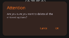
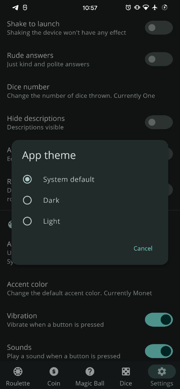
Now, i themed my app to use and follow the new Material3 (or Material You) theme, but a problem i'm facing is that while the normal dialogs are correctly themed, the dialogs in the preference section are only partially themed (corner radius). They clearly don't use the new styles and this inconsistency is killing me :D

Normal Material You dialog Preference dialog

Currently, i didn't find a way to theme them without weird workarounds, so i'll appreciate a suggestion. Here's my styles for dialogs at the moment

<!-- Dialog theme -->
<style name="ThemeOverlay.App.MaterialAlertDialog" parent="ThemeOverlay.Material3.MaterialAlertDialog">
    <item name="colorOnSurface">?colorAccent</item>
    <item name="alertDialogStyle">@style/MaterialAlertDialog.App</item>
    <item name="dialogCornerRadius">@dimen/bottom_sheet_corners</item>
</style>

<!-- Note: shape appearance doesn't work with the preference dialogs (they're not material) -->
<style name="MaterialAlertDialog.App" parent="MaterialAlertDialog.Material3">
    <item name="shapeAppearance">@style/ShapeAppearance.App.MediumComponent</item>
    <item name="shapeAppearanceOverlay">@null</item>
</style>

Maybe it's just a matter of waiting?

Fishmonger answered 10/1, 2022 at 9:15 Comment(0)
F
4

After further investigation, i found out that, as of today, the only way to properly theme the preferences dialogs is to use a slight variation of the solution proposed to @Patrick:

  1. Create a drawable, i named it dialog_bg_monet.xml, containing this layer list:
<layer-list xmlns:android="http://schemas.android.com/apk/res/android"> 
     <item> 
         <shape> 
             <solid android:color="?attr/colorSurface" /> 
             <corners 
                 android:bottomLeftRadius="@dimen/yourcorners" 
                 android:bottomRightRadius="@dimen/yourcorners" 
                 android:topLeftRadius="@dimen/yourcorners" 
                 android:topRightRadius="@dimen/yourcorners" /> 
         </shape> 
     </item> 
     <item> 
         <shape> 
             <solid android:color="@color/m3_popupmenu_overlay_color" /> 
             <corners 
                 android:bottomLeftRadius="@dimen/yourcorners" 
                 android:bottomRightRadius="@dimen/yourcorners" 
                 android:topLeftRadius="@dimen/yourcorners" 
                 android:topRightRadius="@dimen/yourcorners" /> 
         </shape> 
     </item> 
 </layer-list>

Of course make sure to define a custom border radius in dimens or directly in the file. Ignore the warning. There's no other way.

  1. Create a style for the dialogs, like the following:
    <!-- Preference dialog theme -->
    <style name="ThemeOverlay.App.MaterialAlertDialog.Monet" parent="ThemeOverlay.Material3.MaterialAlertDialog">
        <item name="alertDialogStyle">@style/MaterialAlertDialog.App</item>
        <item name="dialogCornerRadius">@dimen/yourcorners</item>
        <item name="android:background">@drawable/dialog_bg_monet</item>
    </style>
  1. Apply this style in your main theme
<item name="materialAlertDialogTheme">@style/ThemeOverlay.App.MaterialAlertDialog.Monet</item>
<item name="alertDialogTheme">@style/ThemeOverlay.App.MaterialAlertDialog.Monet</item>

Result:

Monet preference dialogs

The app in the above screenshot is opensource, you can see the full code here

EDIT: this approach causes a bug with the context menu (the copy/paste menu which pops when a text is long pressed). The solution to this is simple and is in this question

Fishmonger answered 9/9, 2022 at 9:1 Comment(3)
what is @style/MaterialAlertDialog.App in 2Sarpedon
It's just a custom style containing rounded corners and extra stuff, if I remember correctly!Fishmonger
The app store version is not up to date. Just build it yourself from GitHub.Loricate
A
7

At the moment, Preference Dialogs still use AlertDialog to inflate the view. Here's what I defined in my styles.xml to apply the Material3 dialog theme to them:

NOTE: This covers most of the MaterialAlertDialog styling, but you'll still need to define others such as the corner radius and background/text colors.

<item name="alertDialogTheme">@style/ThemeOverlay.Material3.MaterialAlertDialog</item>
<item name="dialogCornerRadius">28dp</item>
Agreed answered 15/5, 2022 at 5:33 Comment(2)
I'll try this as soon as possibile. In the meantime, I'll mark as accepted. Thanks.!Fishmonger
I've sent the M3 team the same question and they had the following solutions: github.com/material-components/material-components-android/…Mortie
F
4

After further investigation, i found out that, as of today, the only way to properly theme the preferences dialogs is to use a slight variation of the solution proposed to @Patrick:

  1. Create a drawable, i named it dialog_bg_monet.xml, containing this layer list:
<layer-list xmlns:android="http://schemas.android.com/apk/res/android"> 
     <item> 
         <shape> 
             <solid android:color="?attr/colorSurface" /> 
             <corners 
                 android:bottomLeftRadius="@dimen/yourcorners" 
                 android:bottomRightRadius="@dimen/yourcorners" 
                 android:topLeftRadius="@dimen/yourcorners" 
                 android:topRightRadius="@dimen/yourcorners" /> 
         </shape> 
     </item> 
     <item> 
         <shape> 
             <solid android:color="@color/m3_popupmenu_overlay_color" /> 
             <corners 
                 android:bottomLeftRadius="@dimen/yourcorners" 
                 android:bottomRightRadius="@dimen/yourcorners" 
                 android:topLeftRadius="@dimen/yourcorners" 
                 android:topRightRadius="@dimen/yourcorners" /> 
         </shape> 
     </item> 
 </layer-list>

Of course make sure to define a custom border radius in dimens or directly in the file. Ignore the warning. There's no other way.

  1. Create a style for the dialogs, like the following:
    <!-- Preference dialog theme -->
    <style name="ThemeOverlay.App.MaterialAlertDialog.Monet" parent="ThemeOverlay.Material3.MaterialAlertDialog">
        <item name="alertDialogStyle">@style/MaterialAlertDialog.App</item>
        <item name="dialogCornerRadius">@dimen/yourcorners</item>
        <item name="android:background">@drawable/dialog_bg_monet</item>
    </style>
  1. Apply this style in your main theme
<item name="materialAlertDialogTheme">@style/ThemeOverlay.App.MaterialAlertDialog.Monet</item>
<item name="alertDialogTheme">@style/ThemeOverlay.App.MaterialAlertDialog.Monet</item>

Result:

Monet preference dialogs

The app in the above screenshot is opensource, you can see the full code here

EDIT: this approach causes a bug with the context menu (the copy/paste menu which pops when a text is long pressed). The solution to this is simple and is in this question

Fishmonger answered 9/9, 2022 at 9:1 Comment(3)
what is @style/MaterialAlertDialog.App in 2Sarpedon
It's just a custom style containing rounded corners and extra stuff, if I remember correctly!Fishmonger
The app store version is not up to date. Just build it yourself from GitHub.Loricate
S
4

Here's what I did.

  1. Create a MaterialListPreference class extending ListPreferenceDialogFragmentCompat

    class MaterialListPreference : ListPreferenceDialogFragmentCompat() {
       private var mWhichButtonClicked = 0
       override fun onCreateDialog(savedInstanceState: Bundle?): Dialog {
          val context: Context? = activity
          mWhichButtonClicked = DialogInterface.BUTTON_NEGATIVE
          val builder = MaterialAlertDialogBuilder(requireActivity()).setTitle(preference.dialogTitle).setIcon(preference.dialogIcon)
            .setPositiveButton(preference.positiveButtonText, this)
            .setNegativeButton(preference.negativeButtonText, this)
          val contentView = context?.let { onCreateDialogView(it) }
          if (contentView != null) {
            onBindDialogView(contentView)
            builder.setView(contentView)
          } else {
            builder.setMessage(preference.dialogMessage)
          }
          onPrepareDialogBuilder(builder)
          return builder.create()
       }
    
       override fun onClick(dialog: DialogInterface, which: Int) {
           mWhichButtonClicked = which
       }
    
       override fun onDismiss(dialog: DialogInterface) {
           onDialogClosedWasCalledFromOnDismiss = true
           super.onDismiss(dialog)
       }
    
       private var onDialogClosedWasCalledFromOnDismiss = false
    
       override fun onDialogClosed(positiveResult: Boolean) {
           if (onDialogClosedWasCalledFromOnDismiss) {
               onDialogClosedWasCalledFromOnDismiss = false
               super.onDialogClosed(mWhichButtonClicked == DialogInterface.BUTTON_POSITIVE)
           } else {
               super.onDialogClosed(positiveResult)
           }
       }
    }
    
  2. On SettingsFragment override the onDisplayPreferenceDialog

    override fun onDisplayPreferenceDialog(preference: Preference) {
        if (preference is ListPreference) {
            showListPreferenceDialog(preference)
        } else {
            super.onDisplayPreferenceDialog(preference)
        }
    }
    
    private void showListPreferenceDialog(ListPreference preference) {
        DialogFragment dialogFragment = new MaterialListPreference();
        Bundle bundle = new Bundle(1);
        bundle.putString("key", preference.getKey());
        dialogFragment.setArguments(bundle);
        dialogFragment.setTargetFragment(this, 0);
        dialogFragment.show(getParentFragmentManager(), "androidx.preference.PreferenceFragment.DIALOG");
    }
    
  3. Thats all. Now you'll see the Material You list preference.

Sarpedon answered 18/10, 2022 at 14:28 Comment(1)
Best solution because it uses MaterialAlertDialogBuilder so displays exactly like other dialogs instead of trying to piece together styling (which could change) to use like the other solutions.Dormer
P
0

Another solution (more drastic, but requiring less code changes) is to create a local copy of the preferences library from https://github.com/androidx/androidx/tree/androidx-main/preference as a module in your project and then modify class PreferenceDialogFragmentCompat to use MaterialAlertDialogBuilder.

Parachronism answered 18/5, 2023 at 13:29 Comment(0)

© 2022 - 2024 — McMap. All rights reserved.