Setting a max character length in CSS
Asked Answered
B

17

324

I am making responsive website for school and my question is:

How do I set a max character length of the sentences (with CSS) on my website (like 75 characters) that when I have a very large screen, the sentences wont go further than 75 characters.

I have tried a max width but that messes up my layout. I am using flexbox and media queries to make it responsive.

Bullace answered 17/11, 2014 at 13:15 Comment(4)
If your using textarea or input there is a max length (maxlength="50" this is in the HTML) property for them or you would have to use Javascript. Also I think I misread this, setting a width will force the sentence to drop to the next line when it hits the end. This is default behaviour.Greathearted
Take a look at this: #20553457 - this is CSS ellipsis, it might help youMarysa
While you can't use CSS alone to do this, you can limit the amount of characters show using CSS as Darren has suggested. You need to set your text container to white-space: no-wrap, text-overflow: ellipsis, and overflow:hidden. Then simply set the size for your container.Reagent
What do you mean by setting such a limit? What should happen when it is exceeded? What do you mean by “sentence”? It is not a CSS concept. How do you intend to recognize or mark up sentences? Or do you actually mean line length? If you do, what is your problem with it? Normally text wraps automatically unless you do special things to prevent it.Hexose
M
434

You could always use a truncate method by setting a max-width and overflow ellipsis like this

p {
  white-space: nowrap;
  overflow: hidden;
  text-overflow: ellipsis;
  max-width: 200px;
}

An example:

.wrapper {
  padding: 20px;
  background: #eaeaea;
  max-width: 400px;
  margin: 50px auto;
}

.demo-1 {
  overflow: hidden;
  display: -webkit-box;
  -webkit-line-clamp: 3;
  -webkit-box-orient: vertical;
}

.demo-2 {
  overflow: hidden;
  white-space: nowrap;
  text-overflow: ellipsis;
  max-width: 150px;
}
<div class="wrapper">
  <p class="demo-1">Lorem ipsum dolor sit amet, consectetur adipisicing elit. Ut odio temporibus voluptas error distinctio hic quae corrupti vero doloribus optio! Inventore ex quaerat modi blanditiis soluta maiores illum, ab velit.</p>
</div>

<div class="wrapper">
  <p class="demo-2">Lorem ipsum dolor sit amet, consectetur adipisicing elit. Ut odio temporibus voluptas error distinctio hic quae corrupti vero doloribus optio! Inventore ex quaerat modi blanditiis soluta maiores illum, ab velit.</p>
</div>

For a multi-line truncation have a look at a flex solution. An example with truncation on 3 rows.

p {
  overflow: hidden;
  display: -webkit-box;
  -webkit-line-clamp: 3;
  -webkit-box-orient: vertical;
}

An example:

p {
  white-space: nowrap;
  overflow: hidden;
  text-overflow: ellipsis;
  max-width: 200px;
}
<p>Lorem ipsum dolor sit amet, consectetur adipisicing elit. Deserunt rem odit quis quaerat. In dolorem praesentium velit ea esse consequuntur cum fugit sequi voluptas ut possimus voluptatibus deserunt nisi eveniet!</p>
Mccluskey answered 17/11, 2014 at 13:20 Comment(10)
Thanks, i understand the use of ellipsis but i dont see how this solves my problem. I think ellipsis is right for when a screen is going smaller but when its going bigger i want it to cut it off at 75 characters. so as @Jean-luc is stating, its only possible with javascript? sorry i am new to codingBullace
You could see what space occur 75 characters according to your typography and set a max-width according to that. Unfortunately you can't set a CSS property to truncate a sentence according to characters. Alternatively you could use a flex truncate method with the benefit that you can specify the truncate method according to rows.Mccluskey
This affects paragraph width, not sentence length. And 200px can be just anything in terms of characters (it even depends on whether you have a lot of i’s or a lot of W’s, and on font face and size).Hexose
You're right about that. Check Paulie_D answer seems to be the proper one for your solutionMccluskey
@VangelTzo This is only for single line. Can this be done for multiple lines? ThanksCombes
@VangelTzo this worked for chrome but didn't work for firefox.Combes
I know @Combes thats why there is always a fallback solution: css-tricks.com/line-clampinMccluskey
Good, but using WebKit only CSS features is not a satisfactory answer for the multiline case. If want a multiline solution check V K Singh answer.Alegar
From now on, the support is pretty solid I think caniuse.com/#feat=css-line-clampMccluskey
This solution could note the security/accessibility implications even if it is more than is necessary for this use case. If someone is using page magnification, the 3 lines of visible text will be far less than 75 words. Screen readers announce the entire block of text and ignore the limit. Site scrapers could just Press Ctrl+A and still copy all of the text.Sible
N
187

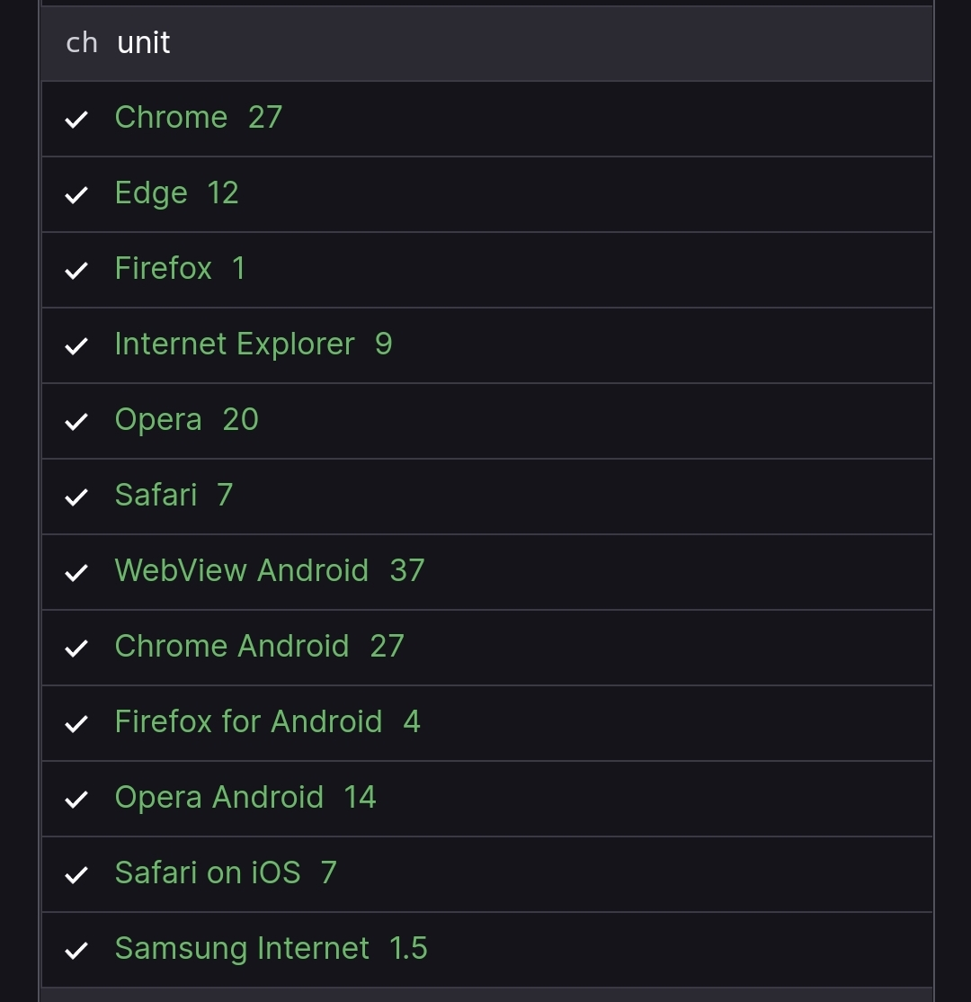
There is a CSS 'length value' of ch.

From MDN

This unit represents the width, or more precisely the advance measure, of the glyph '0' (zero, the Unicode character U+0030) in the element's font.

This may approximate what you are after.

p {
  overflow: hidden;
  max-width: 75ch;
  white-space: nowrap;
}
<p>Lorem ipsum dolor sit amet, consectetur adipisicing elit. Deserunt rem odit quis quaerat. In dolorem praesentium velit ea esse consequuntur cum fugit sequi voluptas ut possimus voluptatibus deserunt nisi eveniet!Lorem ipsum dolor sit amet, consectetur
  adipisicing elit. Dolorem voluptates vel dolorum autem ex repudiandae iste quasi. Minima explicabo qui necessitatibus porro nihil aliquid deleniti ullam repudiandae dolores corrupti eaque.</p>
Nessus answered 17/11, 2014 at 14:48 Comment(11)
Has this been implemented by any browsers? Doesn't seem to work at all for me. Edit: Still draft dev.w3.org/csswg/css-values/#lengthsSudden
I think i will go with your answer, i think this would be the same if i set a max-width: 30em; Its close enough for me. Thanks!Bullace
Not sure about the compatibility tables at MDN... but this (ch unit) does not appear to work (as expected) for me in Chrome 50, IE11 or FF45?!Dyslexia
Yes, I am having the same result as @w3dk. I just set a height and overflow:hidden. I did like the ellipsis, but I was only able to get that to work if I set white-space:no-wrap. In my case, the text can wrap, just not exceed a certain char limit within it's container.Mukden
@1N5818 In what way doesn't it work? If it's not solving a specifc issue for you, perhaps you need to ask a separate question.Nessus
Doesn't em serve the same purpose, while being more abstract than a specific glyph ? > Represents the calculated font-size of the element.Euplastic
em is based on a specific glyph (M)...hence the name.Nessus
Thanks for this fact I didn't know, though it seems this signification has evolved. from sitepoint.com/community/t/what-does-em-mean/3482/2 > “An em is a CSS unit that measures the size of a font, from the top of a font’s cap height to the bottom of its lowest descender. Originally, the em was equal to the width of the capital letter M, which is where its name originated.” Anyway, the point was that it can be used for the same purpose than ch which is more or less true, since it seems to be based on an height rather than a width.Euplastic
This support chart may be helpful: caniuse.com/#feat=ch-unitLiquidambar
Not sure why this has so many up votes because it's clearly incomplete and not working with the provided code. You need to add white-space: nowrap;Ire
Thanks for this answer. I used "max-height" instead and worked great!Archle
B
64

Try this for truncating characters after setting it to max-width. I have used 75ch in this case

p {
    white-space: nowrap;
    overflow: hidden;
    text-overflow: ellipsis;
    max-width: 75ch;
}
<p>Lorem ipsum dolor sit amet, consectetur adipiscing elit. Proin nisi ligula, dapibus a volutpat sit amet, mattis etc. Lorem ipsum dolor sit amet, consectetur adipiscing elit. Proin nisi ligula, dapibus a volutpat sit amet, mattis etc.</p>

For multiline truncating, please follow the link.

An example: https://codepen.io/srekoble/pen/EgmyxV

We will be using webkit css for this. In short WebKit is a HTML/CSS web browser rendering engine for Safari/Chrome. This may be brower specific as every browser is backed by a rendering engine to draw the HTML/CSS web page.

Baggett answered 18/3, 2017 at 22:7 Comment(2)
the text should be also monospaced, right now you're truncating the text after 93 characters : codepen.io/anon/pen/bRELebRuckman
Best answer over here. Specially because you even mention the multiline truncating ;) By the way, if going for a multiline option, you can use as well a max-width:100%; for the wrapper div. So you have a responsive truncating.Alegar
D
28

example code:

.limited-text{
    white-space: nowrap;
    width: 400px;
    overflow: hidden;
    text-overflow: ellipsis;
}
<p class="limited-text">Lorem ipsum dolor sit amet, consectetur adipisicing elit. Ut odio temporibus voluptas error distinctio hic quae corrupti vero doloribus optio! Inventore ex quaerat modi blanditiis soluta maiores illum, ab velit.</p>

    
Devon answered 20/9, 2017 at 8:15 Comment(0)
D
27

With Chrome you can set the number of lines displayed with "-webkit-line-clamp" :

     display: -webkit-box;
    -webkit-box-orient: vertical;
    -webkit-line-clamp: 3;  /* Number of lines displayed before it truncate */
     overflow: hidden;

So for me it is to use in an extension so it is perfect, more information here: https://medium.com/mofed/css-line-clamp-the-good-the-bad-and-the-straight-up-broken-865413f16e5

Derek answered 11/8, 2018 at 23:1 Comment(0)
S
6

That's not possible with CSS, you will have to use the Javascript for that. Although you can set the width of the p to as much as 30 characters and next letters will automatically come down but again this won't be that accurate and will vary if the characters are in capital.

Snowonthemountain answered 17/11, 2014 at 13:20 Comment(3)
better you need to check with @VangelTzo's answerDispassionate
you perfectly right Jean-Luc, @VangelTzo is a workaround but doesn't provide any cout controll at all.Hippocrates
This is the right answer - you cant' tweak by character count in CSS. You need to use JS.Hanoverian
I
5

Modern CSS Grid Answer

View the fully working code on CodePen. Given the following HTML:

<div class="container">
    <p>Several paragraphs of text...</p>
</div>

You can use CSS Grid to create three columns and tell the container to take a maximum width of 70 characters for the middle column which contains our paragraph.

.container
{
  display: grid;
  grid-template-columns: 1fr, 70ch 1fr;
}

p {
  grid-column: 2 / 3;
}

This is what it looks like (Checkout CodePen for a fully working example):

enter image description here

Here is another example where you can use minmax to set a range of values. On small screens the width will be set to 50 characters wide and on large screens it will be 70 characters wide.

.container
{
  display: grid;
  grid-template-columns: 1fr minmax(50ch, 70ch) 1fr;
}

p {
  grid-column: 2 / 3;
}
Irishman answered 1/8, 2018 at 8:58 Comment(2)
Didn't realize you could use ch on columns. Lovely.Erse
Also, considering the subject matter, pretty sweet that your pen's ID is rrdOvr. ;)Erse
H
4

HTML

<div id="dash">
<p>Lorem ipsum dolor sit amet, consectetur adipiscing elit. Proin nisi ligula, dapibus a volutpat sit amet, mattis et dui. Nunc porttitor accumsan orci id luctus. Phasellus ipsum metus, tincidunt non rhoncus id, dictum a lectus. Nam sed ipsum a urna ac
quam.</p>
</div>

jQuery

var p = $('#dash p');
var ks = $('#dash').height();
while ($(p).outerHeight() > ks) {
  $(p).text(function(index, text) {
    return text.replace(/\W*\s(\S)*$/, '...');
  });
}

CSS

#dash {
  width: 400px;
  height: 60px;
  overflow: hidden;
}

#dash p {
  padding: 10px;
  margin: 0;
}

RESULT

Lorem ipsum dolor sit amet, consectetur adipiscing elit. Proin nisi ligula, dapibus a volutpat sit amet, mattis et...

Jsfiddle

Houghton answered 22/2, 2017 at 8:28 Comment(3)
Hi, welcome to SO! I edited your answer adding the code to the body. For future reference please include your code in the answer beside giving the link to jsfiddle!Pierce
this is the best answer because it also addresses the height and not just the width. Good job!Backslide
The question asks for a css solution.Queasy
S
1

Pure CSS solution to truncating multi line characters

I had a similar problem and found this excellent css only solution from Hackingui.com. You can read the article for information but below is the main code.

I tested it and it works perfectly. Hopefully someone finds it useful before opting for JS or server side options

  /* styles for '...' */ 
.block-with-text {
  /* hide text if it more than N lines  */
  overflow: hidden;
  /* for set '...' in absolute position */
  position: relative; 
  /* use this value to count block height */
  line-height: 1.2em;
  /* max-height = line-height (1.2) * lines max number (3) */
  max-height: 3.6em; 
  /* fix problem when last visible word doesn't adjoin right side  */
  text-align: justify;  
  /* place for '...' */
  margin-right: -1em;
  padding-right: 1em;
}

/* create the ... */
.block-with-text:before {
  /* points in the end */
  content: '...';
  /* absolute position */
  position: absolute;
  /* set position to right bottom corner of block */
  right: 0;
  bottom: 0;
}

/* hide ... if we have text, which is less than or equal to max lines */
.block-with-text:after {
  /* points in the end */
  content: '';
  /* absolute position */
  position: absolute;
  /* set position to right bottom corner of text */
  right: 0;
  /* set width and height */
  width: 1em;
  height: 1em;
  margin-top: 0.2em;
  /* bg color = bg color under block */
  background: white;
}
Southward answered 9/1, 2018 at 19:56 Comment(0)
D
1

This post is for a CSS solution, but the post is quite old, so just in case others stumble on this and are using a modern JS framework such as Angular 4+, there is a simple way to do this through Angular Pipes without having to mess around with CSS.

There are probably "React" or "Vue" ways of doing this as well. This is just to showcase how it could be done within a framework.

truncate-text.pipe.ts

/**
 * Helper to truncate text using JS in view only.
 *
 * This is pretty difficult to do reliably with CSS, especially when there are
 * multiple lines.
 *
 * Example: {{ value | truncateText:maxLength }} or {{ value | truncateText:45 }}
 *
 * If maxLength is not provided, the value will be returned without any truncating. If the
 * text is shorter than the maxLength, the text will be returned untouched. If the text is greater
 * than the maxLength, the text will be returned with 3 characters less than the max length plus
 * some ellipsis at the end to indicate truncation.
 *
 * For example: some really long text I won't bother writing it all ha...
 */
@Pipe({ name: 'truncateText' })
export class TruncateTextPipe implements PipeTransform {
  transform(value: string, ...args: any[]): any {
    const maxLength = args[0]
    const maxLengthNotProvided = !maxLength
    const isShorterThanMaximumLength = value.length < maxLength
    if (maxLengthNotProvided || isShorterThanMaximumLength) {
      return value
    }
    const shortenedString = value.substr(0, maxLength - 3)
    return `${shortenedString}...`
  }
}

app.component.html

<h1>{{ application.name | truncateText:45 }}</h1>
Dioptric answered 8/6, 2020 at 4:31 Comment(0)
M
1

From mdn

Fully supported in all browsers.

Menstruum answered 15/3, 2022 at 9:22 Comment(0)
S
1

.wrapper {
  padding: 20px;
  background: #eaeaea;
  max-width: 400px;
  margin: 50px auto;
}

.demo-1 {
  overflow: hidden;
  display: -webkit-box;
  -webkit-line-clamp: 3;
  -webkit-box-orient: vertical;
}

.demo-2 {
  overflow: hidden;
  white-space: nowrap;
  text-overflow: ellipsis;
  max-width: 150px;
}
<div class="wrapper">
  <p class="demo-1">Lorem ipsum dolor sit amet, consectetur adipisicing elit. Ut odio temporibus voluptas error distinctio hic quae corrupti vero doloribus optio! Inventore ex quaerat modi blanditiis soluta maiores illum, ab velit.</p>
</div>

<div class="wrapper">
  <p class="demo-2">Lorem ipsum dolor sit amet, consectetur adipisicing elit. Ut odio temporibus voluptas error distinctio hic quae corrupti vero doloribus optio! Inventore ex quaerat modi blanditiis soluta maiores illum, ab velit.</p>
</div>
Seducer answered 8/2 at 2:6 Comment(1)
Your answer could be improved with additional supporting information. Please edit to add further details, such as citations or documentation, so that others can confirm that your answer is correct. You can find more information on how to write good answers in the help center.Dissemblance
A
0

Try my solution with 2 different ways.

<div class="wrapper">
      <p class="demo-1">Lorem ipsum dolor sit amet, consectetur adipisicing elit. Ut odio temporibus voluptas error distinctio hic quae corrupti vero doloribus optio! Inventore ex quaerat modi blanditiis soluta maiores illum, ab velit.</p>
</div>

<div class="wrapper">
  <p class="demo-2">Lorem ipsum dolor sit amet, consectetur adipisicing elit. Ut odio temporibus voluptas error distinctio hic quae corrupti vero doloribus optio! Inventore ex quaerat modi blanditiis soluta maiores illum, ab velit.</p>
</div>

.wrapper {
  padding: 20px;
  background: #eaeaea;
  max-width: 400px;
  margin: 50px auto;
}

.demo-1 {
  overflow: hidden;
  display: -webkit-box;
  -webkit-line-clamp: 3;
  -webkit-box-orient: vertical;
}

.demo-2 {
  overflow: hidden;
  white-space: nowrap;
  text-overflow: ellipsis;
  max-width: 150px;
}
Amoritta answered 14/7, 2017 at 5:42 Comment(0)
L
0

You can always look at how wide your font is and take the average character pixel size. Then just multiply that by the number of characters you want. It's a bit tacky but it works as a quick fix.

Lucilla answered 4/12, 2020 at 18:15 Comment(0)
B
0

75 characters

I have tried a max width but that messes up my layout.

Use max-width: 75ch and then create a layout that does not mess up when you go over this width.

Basic answered 27/5, 2022 at 13:27 Comment(0)
C
0

This code works:

.on_table{
    table-layout: fixed;
}

.on_tr_td{
    border:1px solid grey;
    max-width: 20ch;
    color: green;
    word-break:break-all
}
Cuzco answered 8/11, 2022 at 3:28 Comment(0)
S
0

.demo{
   width:300px;
   overflow: hidden;
   text-overflow: ellipsis;
   display: -webkit-box;
   -webkit-box-orient: vertical;
   -webkit-line-clamp: 3;
}
<div class='demo'>
Lorem Ipsum is simply dummy text of the printing and typesetting industry. Lorem Ipsum has been the industry's standard dummy text ever since the 1500s, when an unknown printer took a galley of type and scrambled it to make a type specimen book. It has survived not only five centuries, but also the leap into electronic typesetting, remaining essentially unchanged. It was popularised in the 1960s with the release of Letraset sheets containing Lorem Ipsum passages, and more recently with desktop publishing software like Aldus PageMaker including versions of Lorem Ipsum.


</div>
Saturday answered 17/9, 2023 at 8:16 Comment(0)

© 2022 - 2024 — McMap. All rights reserved.