How to make AppBarLayout background transparent
Asked Answered
P

4

11

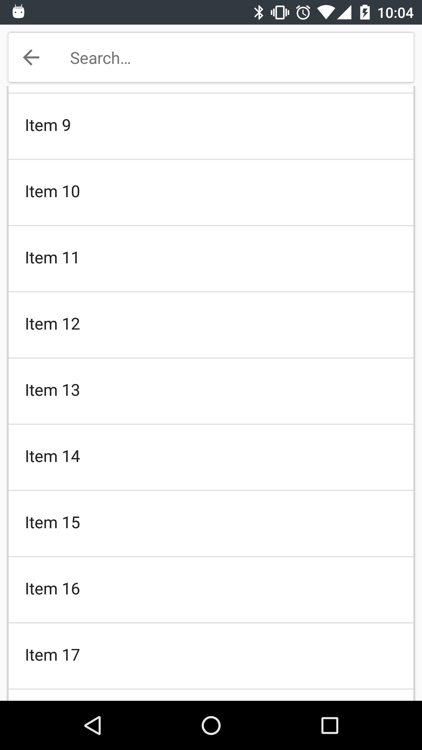
I'm trying to make a search fragment similar to the one in the Play Store:

Google Play Store

My AppBarLayout has a CardView in it, and the background is set to transparent:

<android.support.design.widget.CoordinatorLayout
    android:layout_width="match_parent"
    android:layout_height="match_parent"
    android:fitsSystemWindows="true">

    <android.support.design.widget.AppBarLayout
        android:layout_width="match_parent"
        android:layout_height="wrap_content"
        android:background="@android:color/transparent"
        android:theme="@style/ThemeOverlay.AppCompat.ActionBar"
        app:elevation="0dp">

        <!-- CardView -->

    </android.support.design.widget.AppBarLayout>

    <android.support.v4.widget.NestedScrollView
        android:layout_width="match_parent"
        android:layout_height="match_parent"
        android:scrollbars="vertical"
        app:layout_behavior="@string/appbar_scrolling_view_behavior">

        <!-- Main content -->

    </android.support.v4.widget.NestedScrollView>
</android.support.design.widget.CoordinatorLayout>

But as you can see, there is a solid background behind the CardView so that the content behind it is hidden:

Hidden content

How can I make the AppBarLayout's background transparent so that the content behind is visible?

Poppas answered 25/7, 2016 at 8:50 Comment(4)
Do you want the NestedScrollView to scroll under the AppbarLayout?Bombshell
I want the content of the NestedScrollView to hug the search area closely, but right now no content is visible above the search area, and below it there is a line of gray separating the search area from the content. Edit: Yes, that's what I want.Poppas
Try adding android:fitsSystemWindows="true" to AppbarLayout and NestedScrollViewBombshell
That creates even more margin below the search area, and the scrolling behavior acts strange.Poppas
F
7

The same problem happened to me and at this point it has nothing to do with the transparency of the AppBarLayout. But the AppBarLayout pushes the content of your NestedScrollView below itself when fading in.

You can solve this by

  1. moving your NestedScrollView up and behind the AppBarLayout and
  2. adding a space element to your NestedScrollView with the size of the AppBar

Step 1 can be easily achieved by adding this to your onCreate()

mNestedScroll.getViewTreeObserver().addOnGlobalLayoutListener(new ViewTreeObserver.OnGlobalLayoutListener() {
    @Override
    public void onGlobalLayout() {
        mNestedScroll.getViewTreeObserver().removeOnGlobalLayoutListener(this);

        final int appBarHeight = mAppBar.getHeight();
        mNestedScroll.setTranslationY(-appBarHeight);
        mNestedScroll.getLayoutParams().height = mNestedScroll.getHeight() + appBarHeight;
    }
});

For Step 2 you need to add an empty view with the height of the appBar as a spacer to your NestedScrollView. Note: I used a RecyclerView instead of a NestedScrollView in my approach, so I had to add an empty ViewHolder with the appBarHeight to my RecyclerView. So this snippet is not tested, but it should do the trick for you:

<View
    android:layout_width="match_parent"
    android:layout_height="?attr/actionBarSize"/>
Feebleminded answered 21/12, 2016 at 9:28 Comment(4)
This fixes the problem in the question nicely. Thanks! However, the other problem you describe, where the snap behavior pushes the NestedScrollView content down, still persists. Were you able to fix that using this workaround?Poppas
@Poppas Sorry, but I do not quite understand your question. The problem I described is that all the content will be drawn below the AppBarLayout, making the AppBarLayout exclusively claim the space it occupies. Therefore the scrollable content is displayed below the AppBar. What I described are two steps to overcome this drawback. The first step will move the content below the AppBar and solves the whole problem. The second step is only to align the scrollable content back to normal (and may not be needed for your implementation)Feebleminded
I may have misunderstood, so please disregard my previous comment. Still, I do have a problem with your solution. If the content in the NestedScrollView is taller than the screen, it will appear scrolled up and behind the AppBarLayout when the activity loads. When I start scrolling, everything behaves fine.Poppas
@Poppas Okay, sounds to me like the second step did not work correctly for you. I can just assume but it could be that the spacer view from Step 2 is too small or you center you align your content in the scrollview weirdly (e.g. center it). You can try out to increase the layout_height of the view added in Step 2Feebleminded
J
10

Another option is to add negative top margin to NestedScrollView (or whatever view is using appbar_scrolling_view_behavior) and the same positive top margin (or padding) to its direct child:

<androidx.core.widget.NestedScrollView
    android:layout_width="match_parent"
    android:layout_height="match_parent"
    app:layout_behavior="@string/appbar_scrolling_view_behavior"
    android:layout_marginTop="-100dp" >

    <androidx.constraintlayout.widget.ConstraintLayout
        android:layout_width="match_parent"
        android:layout_height="match_parent"
        android:paddingTop="100dp" >

        ...

    </androidx.constraintlayout.widget.ConstraintLayout>

</androidx.core.widget.NestedScrollView>

<com.google.android.material.appbar.AppBarLayout
    android:layout_width="match_parent"
    android:layout_height="wrap_content"
    android:background="@null" >

    <com.google.android.material.appbar.CollapsingToolbarLayout
        android:layout_width="match_parent"
        android:layout_height="wrap_content"
        app:layout_scrollFlags="scroll|exitUntilCollapsed" >

        ...

    </com.google.android.material.appbar.CollapsingToolbarLayout>

</com.google.android.material.appbar.AppBarLayout>

Note that in order for this approach to work the AppBarLayout should be placed below NestedScrollView in the layout-file. In case fading edges of NestedScrollView produce visual artifacts, add android:overScrollMode="never" to its parameters. Also take care when using elevation since it, when used in wrong place (say, when applied to whole AppBarLayout), may also produce visual artifacts.

Julienne answered 20/8, 2019 at 13:49 Comment(1)
this should be the accepted answer, works perfectlyThrippence
F
7

The same problem happened to me and at this point it has nothing to do with the transparency of the AppBarLayout. But the AppBarLayout pushes the content of your NestedScrollView below itself when fading in.

You can solve this by

  1. moving your NestedScrollView up and behind the AppBarLayout and
  2. adding a space element to your NestedScrollView with the size of the AppBar

Step 1 can be easily achieved by adding this to your onCreate()

mNestedScroll.getViewTreeObserver().addOnGlobalLayoutListener(new ViewTreeObserver.OnGlobalLayoutListener() {
    @Override
    public void onGlobalLayout() {
        mNestedScroll.getViewTreeObserver().removeOnGlobalLayoutListener(this);

        final int appBarHeight = mAppBar.getHeight();
        mNestedScroll.setTranslationY(-appBarHeight);
        mNestedScroll.getLayoutParams().height = mNestedScroll.getHeight() + appBarHeight;
    }
});

For Step 2 you need to add an empty view with the height of the appBar as a spacer to your NestedScrollView. Note: I used a RecyclerView instead of a NestedScrollView in my approach, so I had to add an empty ViewHolder with the appBarHeight to my RecyclerView. So this snippet is not tested, but it should do the trick for you:

<View
    android:layout_width="match_parent"
    android:layout_height="?attr/actionBarSize"/>
Feebleminded answered 21/12, 2016 at 9:28 Comment(4)
This fixes the problem in the question nicely. Thanks! However, the other problem you describe, where the snap behavior pushes the NestedScrollView content down, still persists. Were you able to fix that using this workaround?Poppas
@Poppas Sorry, but I do not quite understand your question. The problem I described is that all the content will be drawn below the AppBarLayout, making the AppBarLayout exclusively claim the space it occupies. Therefore the scrollable content is displayed below the AppBar. What I described are two steps to overcome this drawback. The first step will move the content below the AppBar and solves the whole problem. The second step is only to align the scrollable content back to normal (and may not be needed for your implementation)Feebleminded
I may have misunderstood, so please disregard my previous comment. Still, I do have a problem with your solution. If the content in the NestedScrollView is taller than the screen, it will appear scrolled up and behind the AppBarLayout when the activity loads. When I start scrolling, everything behaves fine.Poppas
@Poppas Okay, sounds to me like the second step did not work correctly for you. I can just assume but it could be that the spacer view from Step 2 is too small or you center you align your content in the scrollview weirdly (e.g. center it). You can try out to increase the layout_height of the view added in Step 2Feebleminded
O
0

Try putting the CardView into a FrameLayout with match_parent dimensions, so that the CardView has the space around it. I'm not 100% confident that it will work, but it's worth trying.

Opaline answered 25/7, 2016 at 9:7 Comment(1)
I actually already had a FrameLayout around it to adjust some paddings. Doesn't work unfortunately.Poppas
T
0

I tried a lot of codes to give me more or less what you looking for. It's an alternative solution, but you will need change the AppBarLayout to a simple view... Look this:

<android.support.design.widget.CoordinatorLayout xmlns:android="http://schemas.android.com/apk/res/android"
xmlns:app="http://schemas.android.com/apk/res-auto"
xmlns:tools="http://schemas.android.com/tools"
android:id="@+id/annonce.main.coordinator"
android:layout_width="match_parent"
android:layout_height="match_parent"
tools:ignore="RtlHardcoded">

<android.support.v7.widget.RecyclerView
    android:id="@+id/rv"
    android:layout_width="match_parent"
    android:layout_height="match_parent"/>

<!-- here you put your search bar, can be any view !-->
<android.support.v7.widget.CardView
    android:id="@+id/searchbar"
    android:layout_width="match_parent"
    android:layout_height="wrap_content"
    app:cardElevation="4dp"
    app:cardUseCompatPadding="true"
    app:layout_behavior="[package].RecyclerSearchBehavior">

    <EditText
        android:layout_width="match_parent"
        android:layout_height="wrap_content"
        android:layout_gravity="center"
        android:hint="Pesquise aqui"
        android:minHeight="58dp"/>

</android.support.v7.widget.CardView>

Note: this is inside a CoordinatorLayout. Create a Behavior that view is the type of the search bar you using:

public class RecyclerSearchBehavior extends CoordinatorLayout.Behavior<CardView> {
//Initial height and location
private int mViewHeight;
private int[] mViewStartLocation;


public RecyclerSearchBehavior(Context context, AttributeSet attrs) {
}

@Override
public boolean layoutDependsOn(CoordinatorLayout parent, final CardView child, View dependency) {
    //the first function called. The initial variables settings.
    //getting height 
    mViewHeight = child.getHeight();
    //getting location on screen
    mViewStartLocation = new int[2];
    child.getLocationOnScreen(mViewStartLocation);
    //if the dependecy is your recycler
    if (dependency instanceof RecyclerView)
        //add scroll listener
        ((RecyclerView) dependency).addOnScrollListener(new RecyclerView.OnScrollListener() {
            @Override
            public void onScrollStateChanged(RecyclerView recyclerView, int newState) {
                super.onScrollStateChanged(recyclerView, newState);
            }
            //here the magic happens
            @Override
            public void onScrolled(RecyclerView recyclerView, int dx, int dy) {
                super.onScrolled(recyclerView, dx, dy);
                //animate function
                animate(child, dy);
            }
        });
    return dependency instanceof RecyclerView;
}

private void animate(CardView child, int dy) {
    //the initial position of your search bar is 0, because it is on top, so...
    if (child.getY() <= 0)
        //dy is an integer that shows you if user scrolls up or down
        if (dy >= 0) {
            //move to top is a negative value, so *-1
            //if that is < than height, scrools up
            if ((child.getY() * -1) <= (mViewHeight))
                child.setTranslationY(child.getY() - dy * 0.1f);
        } else {
            //if the position of search bar is < than zero, scrolls down
            if (child.getY() < 0)
                child.setTranslationY(child.getY() - dy * 0.1f);
            //else, put the view on 0y
            else child.setY(0);
        }
    //else, put the view on 0y again. this function is called after any user                    
    //touches... so everything happens fast and with numbers different than 
    //1 
    else child.setY(0);
}

}

And done. Your "search bar" is here.

The only problem here, it's you will need add padding to your first item on Recycler, or a transparent view as a first item.


Tasia answered 18/10, 2016 at 23:17 Comment(0)

© 2022 - 2024 — McMap. All rights reserved.