How to build trapezoid shape in xml android?
Asked Answered
T

4

11

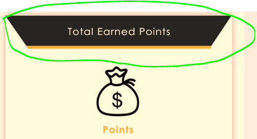
I want to build this shape with bottom line and text inside it i'm confused little bit how to achieve this i tired some code but don't get required thing.

desired result

so far i have tried this code

shape.xml

<?xml version="1.0" encoding="UTF-8"?>
<layer-list xmlns:android="http://schemas.android.com/apk/res/android" >

    <!-- Colored rectangle-->
    <item>
        <shape android:shape="rectangle">
            <size
                android:width="100dp"
                android:height="40dp" />
            <solid android:color="#13a89e" />
        </shape>
    </item>


    <!-- This rectangle for the right side -->
    <!-- Their color should be the same as layout's background -->
    <item
        android:right="-100dp"
        android:left="100dp"
        android:top="-100dp"
        android:bottom="-100dp">
        <rotate
            android:fromDegrees="45">
            <shape android:shape="rectangle">
                <solid android:color="#ffffff" />
            </shape>
        </rotate>
    </item>

</layer-list>

it provide the following result.my attempt

i also need yellow line below this shape.

thanks for help.

Tonometer answered 30/9, 2017 at 8:43 Comment(3)
Looks like you are almost there. Put another rectangle below the first one (with a low height). Make another tilted rectangle for the left side. Make both tilted rectangle a little smaller. And do something about the colors ...Schoolmate
i have tried to put the same white shape on left but i don't know how to do thisTonometer
This post helped me a lot in creating a trapezium view arkapp.medium.com/trapezium-view-for-android-584799c7e849Yuonneyup
S
11

Here is your XML:

<?xml version="1.0" encoding="UTF-8"?>
<layer-list xmlns:android="http://schemas.android.com/apk/res/android" >

<!-- Colored rectangle-->
<item>
    <shape android:shape="rectangle">
        <padding android:top="35dp"/>
        <size android:width="200dp" android:height="40dp" />
        <solid android:color="#13a89e" />
    </shape>
</item>
<!-- Darker colored line-->
<item>
    <shape android:shape="line">
        <size android:width="100dp"/>
        <stroke android:width="4dp" android:color="#123456" />
    </shape>
</item>


<!-- This rectangle for the right side -->
<!-- Their color should be the same as layout's background -->
<item
    android:right="-200dp"
    android:left="200dp"
    android:top="-200dp"
    android:bottom="-200dp">
    <rotate android:fromDegrees="45">
        <shape android:shape="rectangle">
           <padding android:top="-35dp"/>
           <solid android:color="#ffffff" />
        </shape>
    </rotate>
</item>
<!-- This rectangle for the left side -->
<item
    android:right="200dp"
    android:left="-200dp"
    android:top="-200dp"
    android:bottom="-200dp">
    <rotate android:fromDegrees="-45">
        <shape android:shape="rectangle">
            <padding android:top="-35dp"/>
            <solid android:color="#ffffff" />
        </shape>
    </rotate>
</item>

And this is what it renders to:

Result

Here is my TextView XML:

<?xml version="1.0" encoding="utf-8"?>
<android.support.constraint.ConstraintLayout xmlns:android="http://schemas.android.com/apk/res/android"
xmlns:app="http://schemas.android.com/apk/res-auto"
xmlns:tools="http://schemas.android.com/tools"
android:layout_width="match_parent"
android:layout_height="match_parent"
tools:context="io.kalabalik.tilted.MainActivity">

<TextView
    android:layout_width="wrap_content"
    android:layout_height="wrap_content"
    android:background="@drawable/box"
    android:text="Your Text!"
    android:textColor="#000000"
    android:gravity="center_horizontal|bottom"
    android:paddingBottom="10dp"
    app:layout_constraintBottom_toBottomOf="parent"
    app:layout_constraintLeft_toLeftOf="parent"
    app:layout_constraintRight_toRightOf="parent"
    app:layout_constraintTop_toTopOf="parent" />
</android.support.constraint.ConstraintLayout>
Schoolmate answered 30/9, 2017 at 9:30 Comment(7)
i used this with textview as backgorund its not showing anything.Tonometer
You were displaying it somehow before, weren't you?Schoolmate
sorry i didn't understand what you saidTonometer
dear just tell me how can i put text on itTonometer
It should display just like you displayed your own example.Schoolmate
Just added the TextView XML to my answer.Schoolmate
Let us continue this discussion in chat.Tonometer
D
5

I highly recommend create custom text view for do that it would be more flexible and under control. You need to create path object and with that object you will define your view corners. And if you want view as text you need to override onDraw(Canvas canvas) function you will call canvas.draw(path, paint) method. If you need not only for text field you should override any view group class but for view groups you should override onDispatchDraw function to do that.

You can create your shape like below example

    // you can define all points
    Point topLeft = new Point(0,0);
    Point topRight = new Point(getWidth(),0); // your view width
    //... 

    //cover your corner points
    Path path = new Path();
    path.moveTo(topLeft.x, topLeft.y);
    path.lineTo(topRight.x, topRight.y);
    path.lineTo(bottomRight.x, bottomRight.y);
    path.lineTo(shapeBottomRight.x, shapeBottomRight.y);
    path.lineTo(shapeTop.x, shapeTop.y);
    path.lineTo(shapeBottomLeft.x, shapeBottomLeft.y);
    path.lineTo(bottomLeft.x, bottomLeft.y);
    path.lineTo(topLeft.x, topLeft.y);

    canvas.draw(path, paint);
Dolhenty answered 30/9, 2017 at 9:2 Comment(6)
sorry gokhan i don't have any idea working with custom views can you please help in how can i use this code.Tonometer
@NoumanCh for to do that you can create custom view or view groups. For simplicity you can extend frame layout with default constructors. You need to override onDispatch function for draw your intended shape like my example. You can try path object for rectangle. define four corner and call canvas.draw(yourPath, paint) with paint object you can define your color border with etc. Finall go to xml layout and put your created layout thats all you will see your shapeDolhenty
i need to put this above code in onDispatch method?Tonometer
@NoumanCh If your view type of view group(FrameLayout, LinearLayout ..) you will use onDispatch or your view type of view(Textview, ImageView ...) you will use onDrawDolhenty
you dont need a custom View for that at all, what you need instead is a custom DrawablePantia
@Pantia would you like to add an answerIncalescent
Y
2

This post helped me a lot in creating a trapezium view https://arkapp.medium.com/trapezium-view-for-android-584799c7e849

<com.arkapp.trapeziumview.TrapeziumCustomView
        android:id="@+id/trapeziumCustomView"
        android:layout_width="match_parent"
        android:layout_height="350dp"
        android:layout_margin="16dp"
        app:layout_constraintEnd_toEndOf="parent"
        app:layout_constraintStart_toStartOf="parent"
        app:layout_constraintTop_toTopOf="parent"
        app:shapeColor="@color/teal_200"
        app:edgeRadius="18"
        app:slopeLength="88"
        app:slopeType="bottomRight" />

With the help of this I was able to create a custom view with one edge as a slope

Yuonneyup answered 29/11, 2020 at 15:27 Comment(0)
R
1
<vector xmlns:android="http://schemas.android.com/apk/res/android"
xmlns:aapt="http://schemas.android.com/aapt"
android:width="28dp"
android:height="5dp"
android:viewportWidth="800"
android:viewportHeight="304">
<path

    android:pathData="M215,41.4c0,0.2 -22.9,58.3 -51,129.1 -28,70.8 -51,129.8 -51,131.1l0,2.4 296.1,-0c281.6,-0 296.1,-0.1 295.6,-1.8 -0.2,-0.9 -11.9,-31 -25.9,-66.7 -14.1,-35.8 -36.9,-94.1 -50.9,-129.8l-25.3,-64.7 -193.8,-0c-106.6,-0 -193.8,0.2 -193.8,0.4z">
    <aapt:attr name="android:fillColor">
        <gradient
            android:endX="50"
            android:endY="99"
            android:startX="50"
            android:startY="1"
            android:type="linear">
            <item
                android:color="#FFFFFF"
                android:offset="0.0" />
            <item
                android:color="#AAA8A8"
                android:offset="0.8" />
            <item
                android:color="#AAA8A8"
                android:offset="1.0" />
        </gradient>
    </aapt:attr>
</path>
Reserve answered 11/8, 2020 at 10:58 Comment(0)

© 2022 - 2024 — McMap. All rights reserved.