What font is used on the following Windows 95 screenshot and how can I refer it (without smoothing the edges of letters) in CSS3 ?

I finally managed to convert Windows 95 Sans Serif font to True Type font. You can download it here: MS Sans Serif, MS Sans Serif Bold.
The font is "MS Sans Serif " or "Microsoft MS Sans Serif "
Here is a way that worked quite well. These are actual browser screenshots:
The first screenshot is from Firefox on Linux while the second one is from Firefox on macOS. On Linux, the font rendering is actually pixel-perfect, while macOS adds slight anti-aliasing. You might want to right-click the image above and open it in a separate tab to view it in its original size to see the difference.
A workaround to get pixel-perfect rendering on macOS is to draw the font at 80px on a <canvas> element and then scale down the canvas element down to 10% of its size. This will result in a pixel-perfect rendering on macOS:

(The second line is the non-canvas approach.)
Steps to Create a Web Font From a .fon File
Here is what I did to convert the original Microsoft font (called sserife.fon) to the web font (woff2 format) that is used in the screenshots above.
Prerequisites
This required the following tools:
If you are on macOS, you can install them like this:
brew install woff2 psftools imagemagick
brew install --cask fontforge
.fon to .png Conversion
First, we extract the .fon file. It is worth noting that a .fon file is a container that can contain multiple raster fonts for different sizes.
$ fon2fnts sserife.fon
sserife.fon: 6 fonts extracted
$ ls -1A
MS Sans Serif_10.fnt
MS Sans Serif_12.fnt
MS Sans Serif_14.fnt
MS Sans Serif_18.fnt
MS Sans Serif_24.fnt
MS Sans Serif_8.fnt
sserife.fon
Nice! So MS Sans Serif exists in sizes 8pt, 10pt, 12pt, 14pt, 18pt, and 24pt. These numbers might seem familiar to you from the good old days.
I’m not going to convert all of them, but only use the smallest at 8pt, as this is the default size in Windows 95.
I convert them to PSF first, and then to XBM (an old bitmap graphics format), and finally to PNG:
$ fnt2psf MS\ Sans\ Serif_8.fnt MS\ Sans\ Serif_8.psf
Warning: Variable-width!
$ psf2xbm MS\ Sans\ Serif_8.psf MS\ Sans\ Serif_8.xbm
$ convert MS\ Sans\ Serif_8.xbm MS\ Sans\ Serif_8.png
The result looks like this:
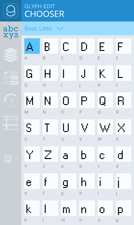
You will notice that I used the Latin 1 variant (code page 1252) of the font.
In addition to the PNG file, you will also need a text string that just contains all the characters that are in the image.
Using a Python script with FontForge, we can print all the ASCII characters that are available in the original file.
Store the following script in a file called script.py (or any other name that you prefer):
import os
from fontforge import *

font = open(os.sys.argv[1])
count = 0
for g in font:
        if count % 32 == 0: print()
        try:
                print(chr(font[g].unicode), end='')
        except:
                print(" ", end='')
        count += 1
Run the script:
/Applications/FontForge.app/Contents/MacOS/FontForge -script script.py MS\ Sans\ Serif_8.fnt
(This assumes macOS. Adjust the FontForge path accordingly for Windows or Linux.)
Result:
PKGBASE: /Applications/FontForge.app
Copyright (c) 2000-2020. See AUTHORS for Contributors.
 License GPLv3+: GNU GPL version 3 or later <http://gnu.org/licenses/gpl.html>
 with many parts BSD <http://fontforge.org/license.html>. Please read LICENSE.
 Version: 20201107
 Based on sources from 2020-11-07 20:56 UTC-ML-D-GDK3.
 Based on source from git with hash: 21ad4a18fb3d4becfe566d8215eba4483b0ddc4b

 !"#$%&'()*+,-./0123456789:;<=>?
@ABCDEFGHIJKLMNOPQRSTUVWXYZ[\]^_
`abcdefghijklmnopqrstuvwxyz{|}~
€ ‚ƒ„…†‡ˆ‰Š‹Œ Ž  ‘’“”•–—˜™š›œ žŸ
 ¡¢£¤¥¦§¨©ª«¬®¯°±²³´µ¶·¸¹º»¼½¾¿
ÀÁÂÃÄÅÆÇÈÉÊËÌÍÎÏÐÑÒÓÔÕÖ×ØÙÚÛÜÝÞß
àáâãäåæçèéêëìíîïðñòóôõö÷øùúûüýþÿ
Copy the block starting after Based on source from git with hash: 21ad4a18fb3d4becfe566d8215eba4483b0ddc4b to the clipboard. Make sure to include the first line which is blank!
TTF Font Creation
We’re now uploading the generated PNG file to an online tool that was specifically made for creating TrueType fonts that look like pixel fonts.
Head over to: https://yal.cc/r/20/pixelfont/
Note that there is also an offline version of this tool available at https://yellowafterlife.itch.io/pixelfont.
- Upload the PNG image generated above
- Paste the block from the previous section to the “Glyphs in image” section
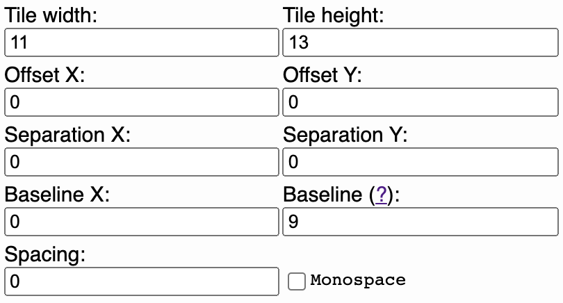
- Set up tile width, offset, separation, baseline, and spacing according to the screenshot below
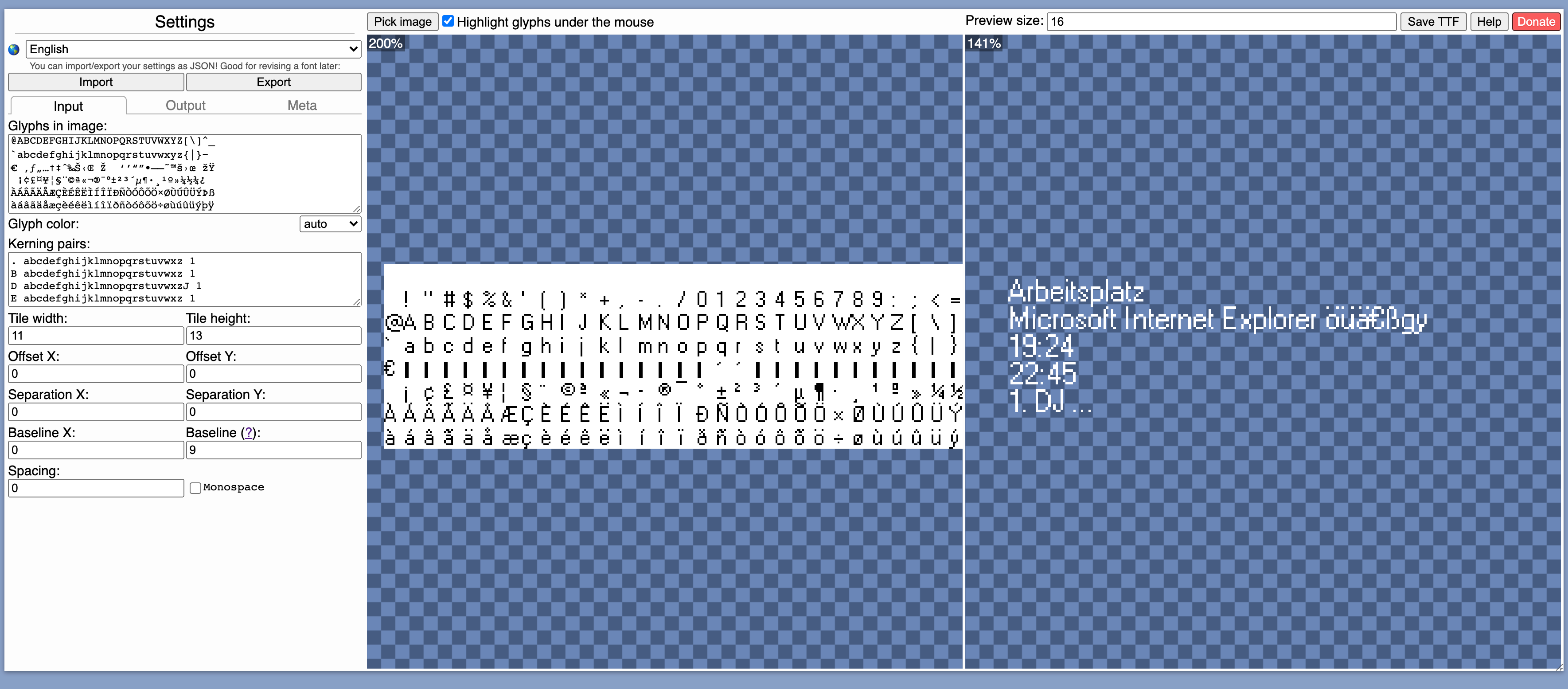
It should now look like this:
Click “Save TTF”
TTF to WOFF Conversion
The resulting TTF file won’t work in all browser. For example, Firefox is picky when it comes to TTF files. Therefore, we convert the TTF file to a WOFF2 file.
$ woff2_compress MS\ Sans\ Serif\ 8pt.ttf
Embedding the Font
Use the following CSS:
@font-face {
   font-family: 'sserife_8';
   src: url('MS Sans Serif 8pt.woff2') format('woff2');
}

body {
   font-family: 'sserife_8';
   font-size: 8px;
}
Caveats
Kerning
To achieve 100% pixel perfection, one piece is still missing: Kerning.
While doing all this, I found out that despite being an old raster font, the original font seems to have kerning information. This means when, for example, typing Microsoft, a 1px gap is being inserted between the capital M and the i.
The Pixel font converter used above actually supports this by specifying kerning pairs. I’ve used the following which is definitely incomplete or even incorrect, but fixed a few annoying cases for me.
. abcdefghijklmnopqrstuvwxz 1
B abcdefghijklmnopqrstuvwxz 1
D abcdefghijklmnopqrstuvwxzJ 1
E abcdefghijklmnopqrstuvwxz 1
G abcdefghijklmnopqrstuvwxz 1
H abcdefghijklmnopqrstuvwxz 1
I abcdefghijklmnopqrstuvwxz 1
J abcdefghijklmnopqrstuvwxz 1
M abcdefghijklmnopqrstuvwxz 1
N abcdefghijklmnopqrstuvwxz 1
O abcdefghijklmnopqrstuvwxz 1
Q abcdefghijklmnopqrstuvwxz 1
R abcdefghijklmnopqrstuvwxz 1
S abcdefghijklmnopqrstuvwxz 1
T abcdefghijklmnopqrstuvwxz 1
U abcdefghijklmnopqrstuvwxz 1
X abcdefghijklmnopqrstuvwxz 1
Z abcdefghijklmnopqrstuvwxz 1
: 0123456789 1
1 0123456789. 1
2 1. 1
3 1. 1
4 1. 1
5 1. 1
6 1. 1
7 1. 1
8 1. 1
9 1. 1
0 1. 1
. . 1
If anyone knows how to determine the correct kerning pairs from the original font, please let me know. Highly appreciated.
Anti-Aliasing
As outlined above, macOS still applies some slight anti-aliasing to the pixel fonts. To circumvent this, use the following script:
<style>
    #text {
        width: 400px;
        height: 20px;
    }

    #text canvas {
        width: 100%;
        height: 100%;
    }
</style>

<canvas id="myCanvas" width="4000" height="200"></canvas>

<script>
    window.setTimeout(function () {

        var canvas = document.getElementById("myCanvas");
        var ctx = canvas.getContext("2d");
        ctx.font = "80px 'sserife_8'";
        ctx.fillStyle = "#000000";
        ctx.fillText("Arbeitsplatz www.example.com Microsoft Internet Explorer öüä€ßgy", 0, 120);
    }, 500);

</script>
(The setTimeout function is a hacky why to wait until the web font has loaded. This will fail on slow internet connections. Don’t use in production!)

The first line in the image is rendered using the canvas approach.
However, depending on what you want to achieve with this, this might not be a viable approach.
© 2022 - 2024 — McMap. All rights reserved.


text-shadow: 0.5px 0px white, 1.5px 0px white;color: transparent;letter-spacing: 1px;The trick is that the bold Windows 95 font is not really a bold font, it's just the thin letters stacked on top of eachother, offset by 1px. – Anguish