How can I change the width of the bars in a highchart?
Asked Answered
S

5

11

With a bar chart like this one, is is possible to change the width of the bars to represent another data attribute, say the weight of the fruits. The heavier the fruit is, the thicker the bar.

You play with the script here. I am open to other javascript plotting libraries that could do that as long as they are free.

$(function () {
    var chart;
    $(document).ready(function() {
        chart = new Highcharts.Chart({
            chart: {
                renderTo: 'container',
                type: 'column'
            },
            title: {
                text: 'Column chart with negative values'
            },
            xAxis: {
                categories: ['Apples', 'Oranges', 'Pears', 'Grapes', 'Bananas']
            },
            tooltip: {
                formatter: function() {
                    return ''+
                        this.series.name +': '+ this.y +'';
                }
            },
            credits: {
                enabled: false
            },
            series: [{
                name: 'John',
                data: [5, 3, 4, 7, 2]
                // I would like something like this (3.5, 6 etc is the width) :
                // data: [[5, 3.4], [3, 6], [4, 3.4], [7, 2], [2, 5]]
            }, {
                name: 'Jane',
                data: [2, -2, -3, 2, 1]
            }, {
                name: 'Joe',
                data: [3, 4, 4, -2, 5]
            }]
        });
    });

});​
Strain answered 24/10, 2012 at 21:38 Comment(6)
Doesn't look like it with Highcharts since it's sized based on the content width. Widen your browser and the chart is redrawn to fit its new width if it's not fixed, though I am relatively new to Highcharts.Capstone
api.highcharts.com/highcharts#plotOptions.column.pointWidthKwapong
@HardikMishra Good point, unfortunately I want a different width for each bar.Strain
What you want is called a Marimekko chart. It is not possible to create Marimekko charts with HighCharts. However: you can vote for a Marimekko chart in Highcharts Uservoice: highcharts.uservoice.com/forums/55896-general/suggestions/…Sacrificial
You can also split series so each bar will be different series, and then manage points width. To connect bars int oone series in legend use linkedTo: id option.Shel
Note: I think the solution to this newer question #33059877 will also work for your needs.Fusible
A
46


pointWidth is what you require to set the width of the bars. try

plotOptions: {
            series: {
                pointWidth: 15
            }
        }


This display bars with the width of 15px. Play around here. Just made an edit to the already existing code.

Ashia answered 30/10, 2012 at 7:37 Comment(2)
worked for me and easy to apply to a chart kick object when using that gem in rubyMatteroffact
Thanks, I was actually searching this for bar with negative stacks. It worked well!Bloc
H
8

I use a set of area charts to simulate a variable-width-column/bar-chart. Say, each column/bar is represented by a rectangle area.

See my fiddle demo (http://jsfiddle.net/calfzhou/TUt2U/).

$(function () {
    var rawData = [
        { name: 'A', x: 5.2, y: 5.6 },
        { name: 'B', x: 3.9, y: 10.1 },
        { name: 'C', x: 11.5, y: 1.2 },
        { name: 'D', x: 2.4, y: 17.8 },
        { name: 'E', x: 8.1, y: 8.4 }
    ];

    function makeSeries(listOfData) {
        var sumX = 0.0;
        for (var i = 0; i < listOfData.length; i++) {
            sumX += listOfData[i].x;
        }
        var gap = sumX / rawData.length * 0.2;
        var allSeries = []
        var x = 0.0;
        for (var i = 0; i < listOfData.length; i++) {
            var data = listOfData[i];
            allSeries[i] = {
                name: data.name,
                data: [
                    [x, 0], [x, data.y],
                    {
                        x: x + data.x / 2.0,
                        y: data.y,
                        dataLabels: { enabled: true, format: data.x + ' x {y}' }
                    },
                    [x + data.x, data.y], [x + data.x, 0]
                ],
                w: data.x,
                h: data.y
            };
            x += data.x + gap;
        }
        return allSeries;
    }

    $('#container').highcharts({
        chart: { type: 'area' },
        xAxis: {
            tickLength: 0,
            labels: { enabled: false}
        },
        yAxis: {
            title: { enabled: false}
        },
        plotOptions: {
            area: {
                marker: {
                    enabled: false,
                    states: {
                        hover: { enabled: false }
                    }
                }
            }
        },
        tooltip: {
            followPointer: true,
            useHTML: true,
            headerFormat: '<span style="color: {series.color}">{series.name}</span>: ',
            pointFormat: '<span>{series.options.w} x {series.options.h}</span>'
        },
        series: makeSeries(rawData)
    });
});

my demo chart

Honan answered 13/12, 2013 at 15:10 Comment(1)
rawData should be listOfData on line 15.Frontogenesis
E
1

Fusioncharts probably is the best option if you have a license for it to do the more optimal Marimekko charts…

I've done a little work trying to get a Marimekko charts solution in highcharts. It's not perfect, but approximates the first Marimekko charts example found here on the Fusion Charts page…

http://www.fusioncharts.com/resources/chart-tutorials/understanding-the-marimekko-chart/

The key is to use a dateTime axis, as that mode provides you more flexibility for the how you distribute points and line on the X axis which provides you the ability to have variably sized "bars" that you can construct on this axis. I use 0-1000 second space and outside the chart figure out the mappings to this scale to approximate percentage values to pace your vertical lines. Here ( http://jsfiddle.net/miken/598d9/2/ ) is a jsfiddle example that creates a variable width column chart.

    $(function () {

    var chart;
        Highcharts.setOptions({
            colors: [ '#75FFFF', '#55CCDD', '#60DD60' ]
        });
        $(document).ready(function() {
            var CATEGORY = {  // number out of 1000
            0: '',    
            475: 'Desktops',
            763: 'Laptops',
            1000: 'Tablets'  
        };
        var BucketSize = {  
            0: 475,
            475: 475,
            763: 288,
            1000: 237   
        };
        chart = new Highcharts.Chart({
            chart: {
                renderTo: 'container',
                type: 'area'
            },
            title: {
                text: 'Contribution to Overall Sales by Brand & Category (in US$)<br>(2011-12)'
            },
            xAxis: {
                min: 0,
                max: 1000,
                title: {
                    text: '<b>CATEGORY</b>'
                },
                tickInterval: 1,
                minTickInterval: 1,
                dateTimeLabelFormats: {
                    month: '%b'
                },
                labels: {
                    rotation: -60,
                    align: 'right',
                    formatter: function() {
                        if (CATEGORY[this.value] !== undefined) {
                            return '<b>' + CATEGORY[this.value] + ' (' + 
                                this.value/10 + '%)</b>';
                        }
                    }
                }
            },
            yAxis: {
                max: 100,
                gridLineWidth: 0,
                title: {
                    text: '<b>% Share</b>'
                },
                labels: {
                    formatter: function() {
                        return this.value +'%'
                    }
                }
            },
            tooltip: {
                shared: true,
                useHTML: true,
                formatter: function () {
                    var result = 'CATEGORY: <b>' +
                        CATEGORY[this.x] + ' (' + Highcharts.numberFormat(BucketSize[this.x]/10,1) + '% sized bucket)</b><br>';
                    $.each(this.points, function(i, datum) {
                        if (datum.point.y !== 0) {
                            result += '<span style="color:' +
                                datum.series.color + '"><b>' +
                                datum.series.name + '</b></span>: ' +
                                    '<b>$' + datum.point.y + 'K</b> (' +
                                Highcharts.numberFormat(
                                    datum.point.percentage,2) +
                                '%)<br/>';
                        }
                    });
                return (result);
                }
            },
            plotOptions: {
                area: {
                    stacking: 'percent',
                    lineColor: 'black',
                    lineWidth: 1,
                    marker: {
                        enabled: false
                    },
                    step: true
                }
            },
            legend: {
                layout: 'vertical',
                align: 'right',
                verticalAlign: 'top',
                x: 0,
                y: 100,
                borderWidth: 1,
                title: {
                text : 'Brand:'
                }
            },
            series: [ {
                name: 'HP',
                data: [
                    [0,298],
                    [475,109],
                    [763,153],
                    [1000,153]          
                ]
            }, {
               name: 'Dell',
                data: [
                    [0,245],
                    [475,198],
                    [763,120],
                    [1000,120]
               ]
            }, {
                name: 'Sony',
                data: [
                    [0,335],
                    [475,225],
                    [763,164],
                    [1000,164]          
               ]
            }]
        },
        function(chart){    
            // Render bottom line.
            chart.renderer.path(['M', chart.plotLeft, chart.plotHeight + 66, 'L', chart.plotLeft+chart.plotWidth, chart.plotHeight + 66])
            .attr({
                'stroke-width': 3,
                stroke: 'black',
                zIndex:50
            })
            .add();
            for (var category_idx in CATEGORY) {
                chart.renderer.path(['M', (Math.round((category_idx / 1000) * chart.plotWidth)) + chart.plotLeft, 66, 'V', chart.plotTop + chart.plotHeight])
                .attr({
                    'stroke-width': 1,
                    stroke: 'black',
                    zIndex:4
                })
                .add();
            }
        });
    });
});

It adds an additional array to allow you to map category names to second tic values to give you a more "category" view that you might want. I've also added code at the bottom that adds vertical dividing lines between the different columns and the bottom line of the chart. It might need some tweaks for the size of your surrounding labels, etc. that I've hardcoded in pixels here as part of the math, but it should be doable.

Using a 'percent' type accent lets you have the y scale figure out the percentage totals from the raw data, whereas as noted you need to do your own math for the x axis. I'm relying more on a tooltip function to provide labels, etc than labels on the chart itself.

Another big improvement on this effort would be to find a way to make the tooltip hover area and labels to focus and be centered and encompass the bar itself instead of the right border of each bar that it is now. If someone wants to add that, feel free to here.

Enriquetaenriquez answered 12/8, 2013 at 4:37 Comment(0)
R
1

If I got it right you want every single bar to be of different width. I had same problem and struggled a lot to find a library offering this option. I came to the conclusion - there's none.

Anyways, I played with highcharts a little, got creative and came up with this:
You mentioned that you'd like your data to look something like this: data: [[5, 3.4], [3, 6], [4, 3.4]], with the first value being the height and the second being the width.

Let's do it using the highcharts' column graph.

Step 1:
To better differentiate the bars, input each bar as a new series. Since I generated my data dynamically, I had to assign new series dynamically:

const objects: any = [];
const extra = this.data.length - 1;
this.data.map((range) => {
  const obj = {
    type: 'column',
    showInLegend: false,
    data: [range[1]],
    animation: true,
    borderColor: 'black',
    borderWidth: 1,
    color: 'blue'
  };
  for (let i = 0; i < extra; i++) {
    obj.data.push(null);
  }
  objects.push(obj);
});
this.chartOptions.series = objects;

That way your different series would look something like this:

series: [{
  type: 'column',
  data: [5, 3.4]
}, {
  type: 'column',
  data: [3, 6]
}, {
  type: 'column',
  data: [4, 3.4]
}]


Step 2:
Assign this as plot options for highcharts:

plotOptions: {
  column: {
    pointPadding: 0,
      borderWidth: 0,
      groupPadding: 0,
      shadow: false
  }
}


Step 3:
Now let's get creative - to have the same starting point for all bars, we need to move every single one to the graph's start:

setColumnsToZero() {
  this.data.map((item, index) => {
    document.querySelector('.highcharts-series-' + index).children[0].setAttribute('x', '0');
  });
}


Step 4:

getDistribution() {
  let total = 0;

  // Array including all of the bar's data: [[5, 3.4], [3, 6], [4, 3.4]]
  this.data.map(item => {
    total = total + item[0];
  });

  // MARK: Get xAxis' total width
  const totalWidth = document.querySelector('.highcharts-axis-line').getBoundingClientRect().width;

  let pos = 0;
  this.data.map((item, index) => {
    const start = item[0];
    const width = (start * totalWidth) / total;
    document.querySelector('.highcharts-series-' + index).children[0].setAttribute('width', width.toString());
    document.querySelector('.highcharts-series-' + index).children[0].setAttribute('x', pos.toString());
    pos = pos + width;
    this.getPointsPosition(index, totalWidth, total);
  });
}


Step 4:
Let's get to the xAxis' points. In the first functions modify the already existing points, move the last point to the end of the axis and hide the others. In the second function we clone the last point, modify it to have either 6 or 3 total xAxis points and move each of them to the correct position

getPointsPosition(index, totalWidth, total) {
  const col = document.querySelector('.highcharts-series-' + index).children[0];
  const point = (document.querySelector('.highcharts-xaxis-labels').children[index] as HTMLElement);
  const difference = col.getBoundingClientRect().right - point.getBoundingClientRect().right;
  const half = point.getBoundingClientRect().width / 2;
  if (index === this.data.length - 1) {
    this.cloneNode(point, difference, totalWidth, total);
  } else {
    point.style.display = 'none';
  }
  point.style.transform = 'translateX(' + (+difference + +half) + 'px)';

  point.innerHTML = total.toString();
}

cloneNode(ref: HTMLElement, difference, totalWidth, total) {
  const width = document.documentElement.getBoundingClientRect().width;

  const q = total / (width > 1000 && ? 6 : 3);
  const w = totalWidth / (width > 1000 ? 6 : 3);
  let val = total;
  let valW = 0;
  for (let i = 0; i < (width > 1000 ? 6 : 3); i++) {
    val = val - q;
    valW = valW + w;
    const clone = (ref.cloneNode(true) as HTMLElement);

    document.querySelector('.highcharts-xaxis-labels').appendChild(clone);

    const half = clone.getBoundingClientRect().width / 2;

    clone.style.transform = 'translateX(' + (-valW + difference + half) + 'px)';
    const inner = Math.round(val * 100) / 100;
    clone.innerHTML = inner.toString();
  }
}


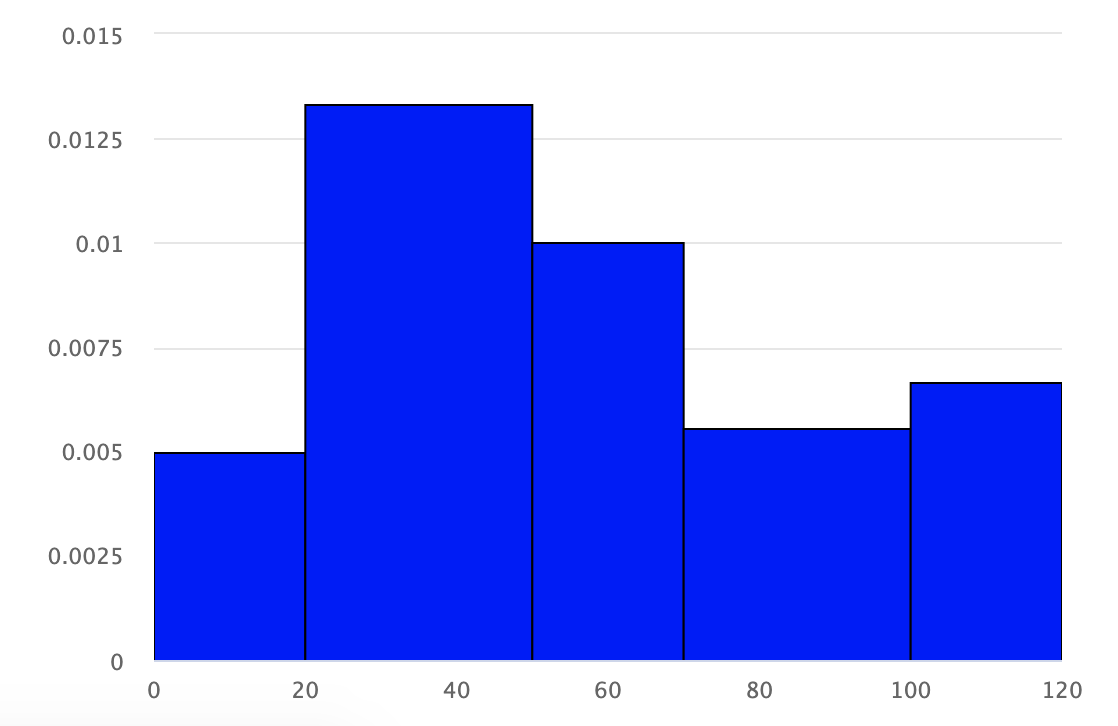
In the end we have a graph looking something like this (not the data from this given example, but for [[20, 0.005], [30, 0.013333333333333334], [20, 0.01], [30, 0.005555555555555555], [20, 0.006666666666666666]] with the first value being the width and the second being the height): enter image description here


There might be some modifications to do to 100% fit your case. F.e. I had to adjust the xAxis' points a specific starting and end point - I spared this part.

Roast answered 13/2, 2020 at 15:21 Comment(0)
S
-1

Set pointWidth for set column width in HighChart:

var options = {
  chart: {
    // Your chart configuration options
  },
  plotOptions: {
    column: {
      pointWidth: 20, // Set the desired width for columns
    
    }
  },
};
Southport answered 14/6, 2023 at 9:54 Comment(1)
What does the top answer from 11 years ago already say?Motivate

© 2022 - 2024 — McMap. All rights reserved.