Yesterday I observed some really strange behaviour and wrote a looooong question on it. As @tacoshy correctly pointed out, the question lacked focus. I will therefore, in this post, focus on one single question:
Why does resizing the window behave differently from resizing the "responsive box" in chrome developer tools?
Preface
The <head>-element contain the following viewport meta-tag
<meta name="viewport" content="width=device-width, initial-scale=1" />
Before any video shown below, the following have both been performed in Chrome-devtools
Settings > Preferences > Reset defaults and reload
and
The kebab-icon in the responsive view > Reset to defaults
The application.
The code can be found here. It's deployed and can be inspected here.
A React-application with a state (windowWidth) that is updated to window.innerWidth when the resize-event triggers. I also have a container div with min-width set to windowWidth. In short, the container should always have the same min-width as window.innerWidth. The container contains a div with min-width statically set to 400px.
The behaviour
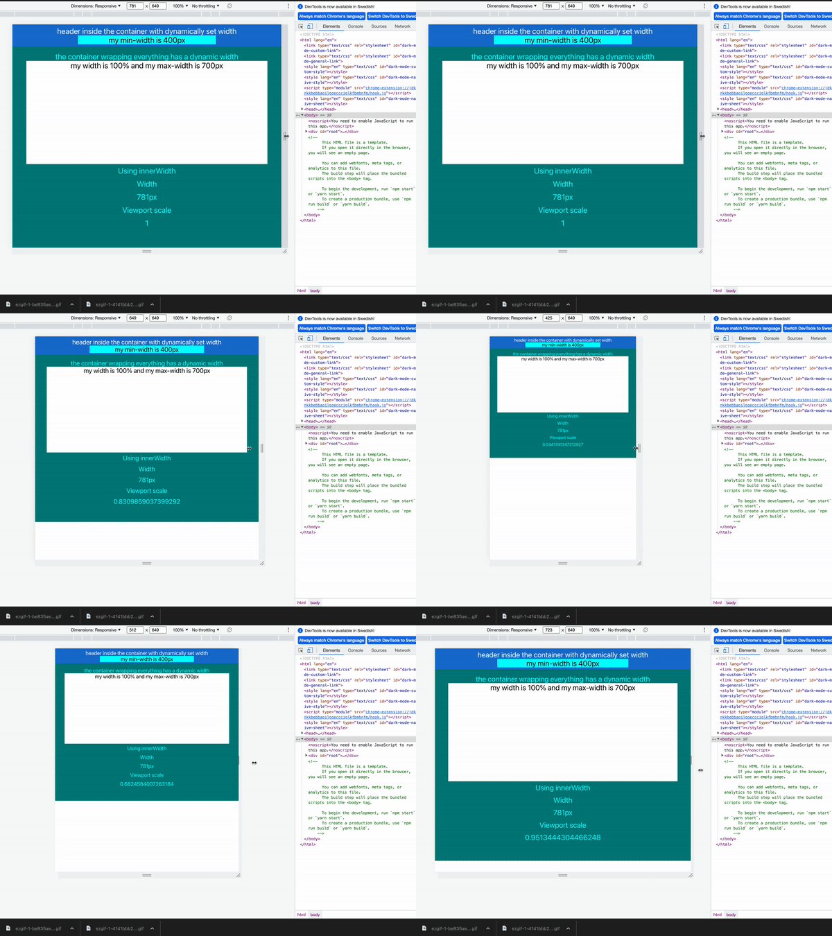
When I only open chrome developer tools and resize the visible window by changing the width of the developer tools, this is the observed behaviour:
window.innerWidthcorresponds to the size of the window.- The scale (from
window.visualViewport.scale) remains at 1.
Now we try in Chrome developer tools responsive mode:
- The width remains static (781px)
- The entire scale of the viewport goes down.
Further investigations
window.visualViewport.widthwill produce nearly identical behaviour- (apart from width sometime shifting to a decimal-point value)
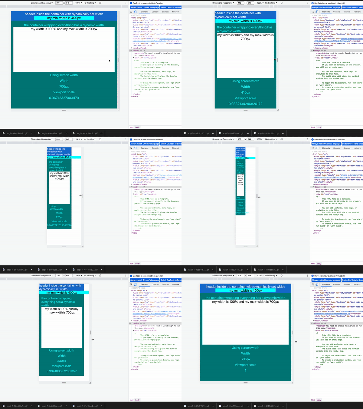
window.screen.widthwill produce a different but also erroneous behaviour:
- The layout doesn't break until the screen becomes smaller than the cyan-coloured element (in the header with min-width: 400px). Then the container seem to shrink quicker and at this point we can also see how the scale starts to go down.
- Setting
windowWidthstatically to 100vw produces exactly the same behaviour as above.
Solution to the weird behaviour
All of the examples above on the layout breaking have one thing in common: The scale starts to go down instead of the actual width of the viewport. So one could imagine that updating the viewport meta-tag to include minimum-scale=1 would solve the problem, and it does! Using
<meta
  name="viewport"
  content="width=device-width, initial-scale=1, minimum-scale=1"
/>
Produces the following behaviour:
As you can see, the Scale remains at 1 and the layout doesn't break. In fact, adding minimum-scale=1 makes innerWidth, visualViewport.width and screen.width all produce the same expected behaviour in the responsive view of chrome developer tools.
Unfortunately solving that was not the question, the question is and remains:
Why does resizing the window behave differently from resizing the "responsive box" in chrome developer tools?
Edit
This strange scaling-behaviour is not mirrored when viewing the page in the Firefox developer tools responsive view.
Edit2
Similar questions
Does Mobile View in Chrome-Dev-Tools force scaling?
Exactly the same problem, solved by adding the meta-tag:
<meta name="viewport" content="width=device-width, initial-scale=1.0">
Which apparently did solve the problem in January 2020, but does not solve the problem today (as we cab see here).
Resize Chrome responsive mode window without changing scale
Also solved by adding:
<meta name="viewport" content="width=device-width, initial-scale=1.0">
which is already present this time around.
Why is Chrome shrinking the view in responsive mode?
Exactly the same behaviour as this mine but the selected solution was a jQuery-hack. The poser also mentioned a similar scaling-problem when tilting your phone and then tilting it back again which I too have experienced (it goes away when adding minimum-width=1 to the viewport metatag).
Summary
It looks like this issue used to be solved by adding
<meta name="viewport" content="width=device-width, initial-scale=1.0">
but now requires
<meta name="viewport" content="width=device-width, initial-scale=1, minimum-scale=1">
my question in that case remains
- Why have they changed this?
- What use is there for the developer to change the scale of the page when resizing the responsive window?
- Is this a feature or a bug?
Edit3
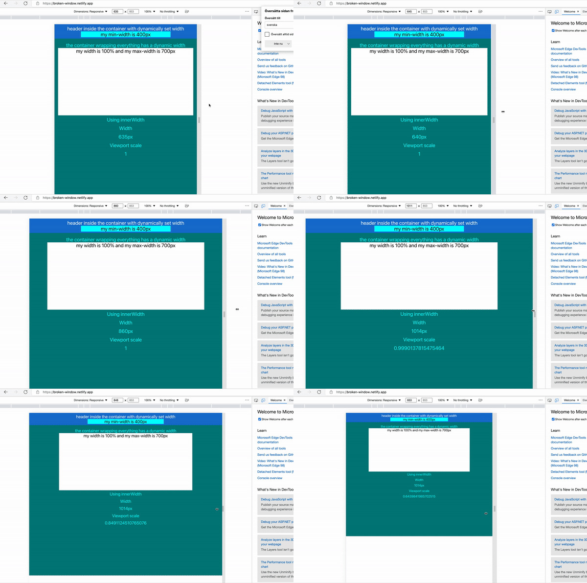
Edge on the other hand does seem to mirror this behaviour.


