Side-by-side boxplot of multiple columns of a pandas DataFrame
Asked Answered
M

3

12

One year of sample data:

import pandas as pd
import numpy.random as rnd
import seaborn as sns
n = 365
df = pd.DataFrame(data = {"A":rnd.randn(n), "B":rnd.randn(n)+1},
                  index=pd.date_range(start="2017-01-01", periods=n, freq="D"))

I want to boxplot these data side-by-side grouped by the month (i.e., two boxes per month, one for A and one for B).

For a single column sns.boxplot(df.index.month, df["A"]) works fine. However, sns.boxplot(df.index.month, df[["A", "B"]]) throws an error (ValueError: cannot copy sequence with size 2 to array axis with dimension 365). Melting the data by the index (pd.melt(df, id_vars=df.index, value_vars=["A", "B"], var_name="column")) in order to use seaborn's hue property as a workaround doesn't work either (TypeError: unhashable type: 'DatetimeIndex').

(A solution doesn't necessarily need to use seaborn, if it is easier using plain matplotlib.)

Edit

I found a workaround that basically produces what I want. However, it becomes somewhat awkward to work with once the DataFrame includes more variables than I want to plot. So if there is a more elegant/direct way to do it, please share!

df_stacked = df.stack().reset_index()
df_stacked.columns = ["date", "vars", "vals"]
df_stacked.index = df_stacked["date"]
sns.boxplot(x=df_stacked.index.month, y="vals", hue="vars", data=df_stacked)

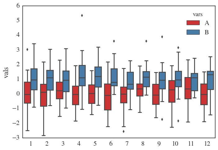
Produces: Side-by-side boxplot of A and B, grouped by month.

Moneychanger answered 13/3, 2017 at 10:6 Comment(1)
Can you elaborate on "However, it becomes somewhat awkward to work with once the DataFrame includes more variables than I want to plot?"Galcha
R
8

here's a solution using pandas melting and seaborn:

import pandas as pd
import numpy.random as rnd
import seaborn as sns
n = 365
df = pd.DataFrame(data = {"A": rnd.randn(n),
                          "B": rnd.randn(n)+1,
                          "C": rnd.randn(n) + 10, # will not be plotted
                         },
                  index=pd.date_range(start="2017-01-01", periods=n, freq="D"))
df['month'] = df.index.month
df_plot = df.melt(id_vars='month', value_vars=["A", "B"])
sns.boxplot(x='month', y='value', hue='variable', data=df_plot)
Ridley answered 30/5, 2019 at 18:40 Comment(0)
H
0
month_dfs = []
for group in df.groupby(df.index.month):
    month_dfs.append(group[1])

plt.figure(figsize=(30,5))
for i,month_df in enumerate(month_dfs):
    axi = plt.subplot(1, len(month_dfs), i + 1)
    month_df.plot(kind='box', subplots=False, ax = axi)
    plt.title(i+1)
    plt.ylim([-4, 4])

plt.show()

Will give this

Not exactly what you're looking for but you get to keep a readable DataFrame if you add more variables.

You can also easily remove the axis by using

if i > 0:
        y_axis = axi.axes.get_yaxis()
        y_axis.set_visible(False)

in the loop before plt.show()

Herrera answered 19/5, 2019 at 19:15 Comment(0)
F
0

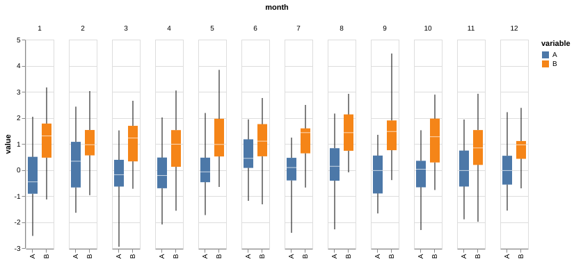
This is quite straight-forward using Altair:

alt.Chart(
    df.reset_index().melt(id_vars = ["index"], value_vars=["A", "B"]).assign(month = lambda x: x["index"].dt.month)
).mark_boxplot(
    extent='min-max'
).encode(
    alt.X('variable:N', title=''),
    alt.Y('value:Q'),
    column='month:N',
    color='variable:N'
)

enter image description here The code above melts the DataFrame and adds a month column. Then Altair creates box-plots for each variable broken down by months as the plot columns.

Fridell answered 19/5, 2019 at 19:46 Comment(0)

© 2022 - 2024 — McMap. All rights reserved.