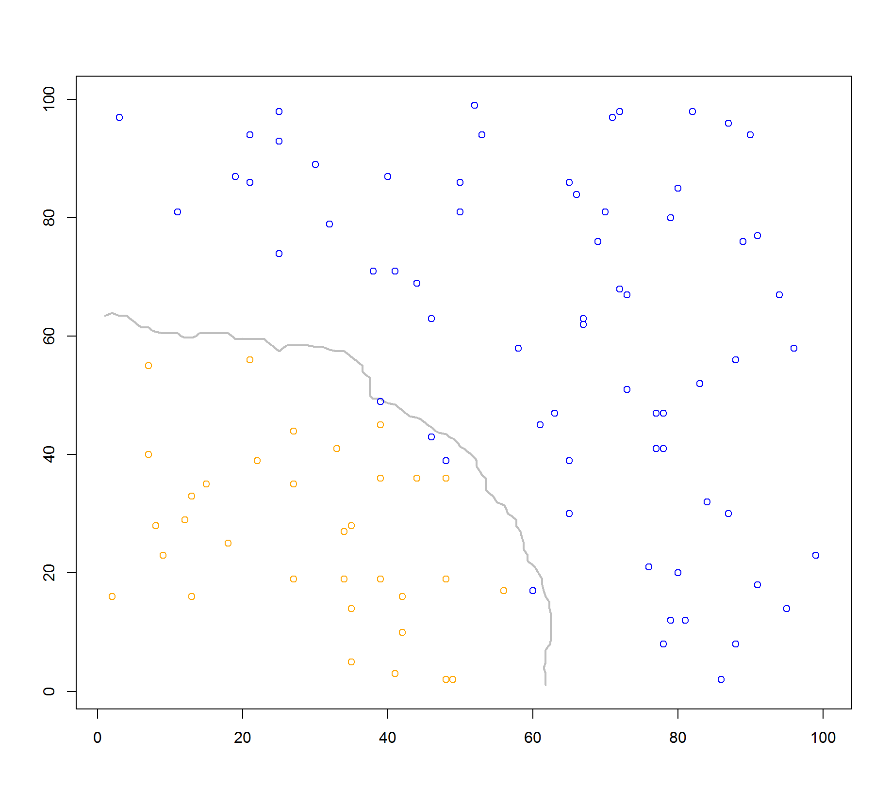
I've got a series of modelled class labels from the knn function. I've got a data frame with basic numeric training data, and another data frame for test data. How would I go about drawing a decision boundary for the returned values from the knn function? I'll have to replicate my findings on a locked-down machine, so please limit the use of 3rd party libraries if possible.
I only have two class labels, "orange" and "blue". They're plotted on a simple 2D plot with the training data. Again, I just want to draw a boundary around the results from the knn function.
Code:
library(class)

n <- 100

set.seed(1)
x <- round(runif(n, 1, n))
set.seed(2)
y <- round(runif(n, 1, n))
train.df <- data.frame(x, y)

set.seed(1)
x.test <- round(runif(n, 1, n))
set.seed(2)
y.test <- round(runif(n, 1, n))
test.df <- data.frame(x.test, y.test)

k <- knn(train.df, test.df, classes, k=25)

plot(test.df, col=k)
classes is just a vector of class labels determined from an earlier bit of code.
If you need it, below is the complete code for my work:
library(class)

n <- 100
set.seed(1)
x <- round(runif(n, 1, n))
set.seed(2)
y <- round(runif(n, 1, n))

# ============================================================
# Bayes Classifier + Decision Boundary Code
# ============================================================

classes <- "null"
colours <- "null"

for (i in 1:n)
{

    # P(C = j | X = x, Y = y) = prob
    # "The probability that the class (C) is orange (j) when X is some x, and Y is some y"
    # Two predictors that influence classification: x, y
    # If x and y are both under 50, there is a 90% chance of being orange (grouping)
    # If x and y and both over 50, or if one of them is over 50, grouping is blue
    # Algorithm favours whichever grouping has a higher chance of success, then plots using that colour
    # When prob (from above) is 50%, the boundary is drawn

    percentChance <- 0
    if (x[i] < 50 && y[i] < 50)
    {
        # 95% chance of orange and 5% chance of blue
        # Bayes Decision Boundary therefore assigns to orange when x < 50 and y < 50
        # "colours" is the Decision Boundary grouping, not the plotted grouping
        percentChance <- 95
        colours[i] <- "orange"
    }
    else
    {
        percentChance <- 10
        colours[i] <- "blue"
    }

    if (round(runif(1, 1, 100)) > percentChance)
    {
        classes[i] <- "blue"
    }
    else
    {
        classes[i] <- "orange"
    }
}

boundary.x <- seq(0, 100, by=1)
boundary.y <- 0
for (i in 1:101)
{
    if (i > 49)
    {
        boundary.y[i] <- -10 # just for the sake of visual consistency, real value is 0
    }
    else
    {
        boundary.y[i] <- 50
    }
}
df <- data.frame(boundary.x, boundary.y)

plot(x, y, col=classes)
lines(df, type="l", lty=2, lwd=2, col="red")

# ============================================================
# K-Nearest neighbour code
# ============================================================

#library(class)

#n <- 100

#set.seed(1)
#x <- round(runif(n, 1, n))
#set.seed(2)
#y <- round(runif(n, 1, n))
train.df <- data.frame(x, y)

set.seed(1)
x.test <- round(runif(n, 1, n))
set.seed(2)
y.test <- round(runif(n, 1, n))
test.df <- data.frame(x.test, y.test)

k <- knn(train.df, test.df, classes, k=25)

plot(test.df, col=k)


classesvector. So that we can work with content of this object. – Absurd