What is the difference between a Mobile and a Desktop device?
Asked Answered
C

3

12

Using Chrome Browser DevTools I wanted to add a custom device in the Emulated devices tab. You can choose several options such as the width and height. And also choose between:

  • Mobile
  • Mobile (no touch)
  • Desktop
  • Desktop (touch)

So the difference between Mobile and Desktop doesn't seem to be the touch events.


Is a device of 1000*1000px screen size Mobile (no touch)

and a device of 1000*1000px screen size Desktop

the same?

Or a device of 1000*1000px screen size Mobile

and a device of 1000*1000px screen size Desktop (touch)

the same?


So my question is:

What is the difference between Desktop and Mobile from a technical point of view?

Please explain the difference both conceptually (I'm specially interested in this one) and in the DevTools.


Edit for bounty:

I came to this doubt after answering other question and seeing how Google, Amazon and probably some other big companies make the differentiation on the way they display their pages. It is not on screen size but on device type (if I am correct). So I am wondering what are the technical aspects that make them discern between a desktop and a mobile, other than "a mobile can be moved".

Canvas answered 20/11, 2016 at 19:58 Comment(1)
Good question. I'm not aware of any real differences in terms of emulation but one could take a quick look at the source code to see if there are any programmatic differences between the modes to find out. When I get a free moment, I'll take a look.Evacuee
E
5

I had a look at the source code. It's a little tricky to follow it all through, but I couldn't really see any big differences other than the fact there is capabilities array, which contains touch and mobile options. When touch is enabled, there are four touch events that are emulated. Other than that, there seems to be some scaling logic that differs between the modes.

Not sure if this is of much help. If you or anyone else is interested in looking deeper into this, I'd check out inspector.js, with most of the logic found in the _calculateAndEmulate and _applyDeviceMetrics functions.

Evacuee answered 21/11, 2016 at 23:26 Comment(1)
it would be interesting if you specify which touch events are emulatedWonky
T
5

One main difference is the User-Agent request header Chrome will send.

If you choose Mobile, you will get something like this,

Mozilla/5.0 (Linux; Android 6.0; Nexus 5 Build/MRA58N) AppleWebKit/537.36 (KHTML, like Gecko)
  Chrome/46.0.2490.76 Mobile Safari/537.36

whereas with Desktop, it will look like this:

Mozilla/5.0 (Windows NT 6.1; WOW64) AppleWebKit/537.36 (KHTML, like Gecko)
  Chrome/54.0.2840.99 Safari/537.36

(Specifics depending on your OS, Chrome version etc. of course.)

So it will help you in testing/debugging, if you are doing server-side User-Agent sniffing. (For purposes such as to deliver different content for Desktop vs Mobile, to redirect to a mobile subdomain, …)

Tager answered 23/11, 2016 at 12:30 Comment(0)
F
5

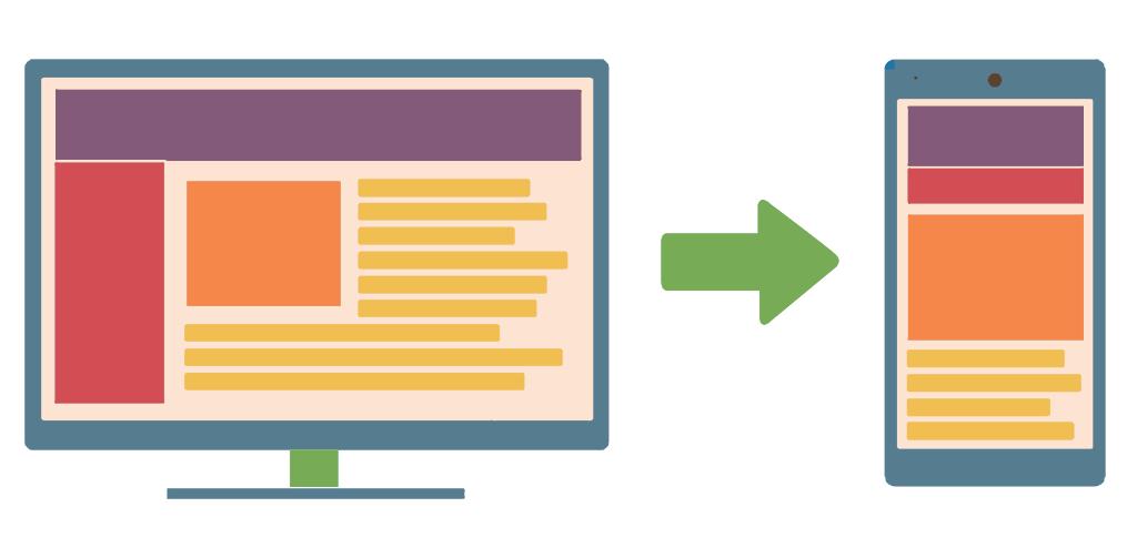
enter image description here

Targetting Desktop and Mobile

The key difference between a mobile device and a desktop device, at least as far as the mobile/desktop setting in web browsers are concerned, is the physical size of the screen. This is not to be confused with the resolution of the screen.

When targetting a design at desktop, the interface is expected to include more expanded content on screen at one time, with the mobile version having the majority of the content hidden within icons to be expanded at a touch. The mobile version will be space optimised in comparison.

In fact, when a tablet has a larger than standard screen size e.g. the tablets with detachable keyboards available these days, mobile versions of the site can look over-optimised for space, which is the reason why browsers allow tablet users to opt to display sites in desktop mode.

The resolution of a mobile device might well be higher than on a desktop, but the fact that the screen is (at least assumed to be) so much bigger on a desktop machine, people using desktop machines are comfortable with more expanded content on screen at once than a people viewing on mobile devices.

Prime consideration comparison

Desktop:

  • Bigger, multiple screens that accomodate more content on screen at once.
  • More typing - Common input is keyboard.
  • Hover and click links - Common input is mouse.
  • Located on desk.
  • Heavy use.
  • More capable hardware (memory and processing power is cheaper).
  • Power performance.

Mobile:

  • Smaller, single screen where space optimisation is paramount.
  • Less typing - Common input type is touch-screen.
  • Touch and gesture.
  • Located in pocket.
  • Casual use.
  • Less capable hardware. I.e. Small and cool running memory and processing means less bang for your money.
  • Power efficiency.
Flam answered 28/11, 2016 at 15:57 Comment(5)
Very nice answer. I'm not sure I agree with the "casual use" on mobile though.Canvas
Do you have any resource about it?Canvas
@Canvas Thank you for your kind words and input. The versatility of computer driven devices is so vast and becoming more so all the time. So, when I coined the term 'casual use', I intended to convey the way the most popular apps over the three main mobile operating systems have been significantly slimmed when compared to their desktop siblings, but my perspective is clearly skewed from my digital and printed media background. They have so many uses that it's almost impossible to consider them all. I'd be very interested to hear more of your point of view to help me rethink my use of words.Flam
This is a description of the difference between mobile and desktop devices. I think the OP (and I) wanted more on the technical differences, for example how the viewport is handled on the different devices (and different settings in Dev Tools).Kyl
Yeah this didn't really answer the question in terms of Chrome's dev tools.Accumbent

© 2022 - 2024 — McMap. All rights reserved.