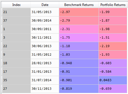
I have the following dataframe which I have obtained from a larger dataframe which lists the worst 10 "Benchmark Returns" and their corresponding portfolio returns and dates:
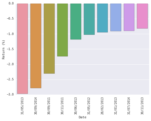
I've managed to create a Seaborn bar plot which lists Benchmark Returns against their corresponding dates with this script:
import pandas as pd
import seaborn as sns

df = pd.read_csv('L:\\My Documents\\Desktop\\Data NEW.csv', parse_dates = True)

df = df.nsmallest(10, columns = 'Benchmark Returns')
df = df[['Date', 'Benchmark Returns', 'Portfolio Returns']]
p6 = sns.barplot(x = 'Date', y = 'Benchmark Returns', data = df)
p6.set(ylabel = 'Return (%)')
for x_ticks in p6.get_xticklabels():
    x_ticks.set_rotation(90)
And it produces this plot:
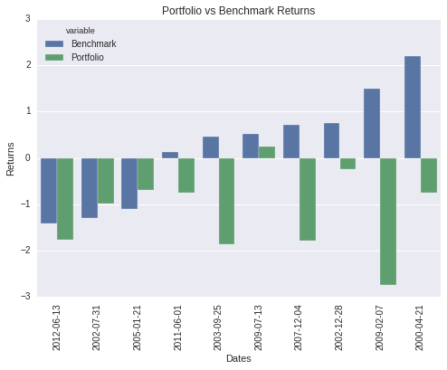
However, what I'd like is a grouped bar plot that contains both Benchmark Returns and Portfolio Returns, where two different colors are used to distinguish between these two categories.
I've tried several different methods but nothing seems to work.


