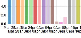
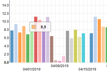
This is ugly:
I need something that is not ugly. Time series are very usual, but I not see how to build a "plug and play" chart with ISO dates.
Perhaps an equivalent question is "How to use d3-scalelinear/Non-numeric range/Date with NVD3?"
(or d3-scaletime)
Notes
This is the main code:
    nv.addGraph(function () {

        var chart = nv.models.discreteBarChart()
          //.x( d=> d.label )  // very Ugly!
          .x( d=> {
                let dd = new Date(d.label);
                return d3.time.format('%b %d')(dd)
           })  // Ugly, because need to jump some days before show next
          .y( d=> d.value )
          .staggerLabels(true) // not solved

        d3.select('#chart svg')
          .datum(data)
          .transition().duration(500)
          .call(chart);

        nv.utils.windowResize(chart.update); // necessary?

        return chart;
    }); // \nv.add
I try some variations, no one work fine (all ugly).
My data is something as
    [ {
      key: "ExampleData",
      color: "#ff7f0e",
      values: [
         { label: "2019-03-28", value: 7.8389242307 },
         { label: "2019-03-29", value: 9.4185632435 },
         { label: "2019-03-30", value: 7.3553138346 },
         { label: "...", value: ... }
      ]
    } ];
The values Array have ~100 items.
Problematic workarounds
This (not elegant) solution loss the tooltip, as illustrated,
var chart = nv.models.discreteBarChart()
   .x( d=> d.label )
   .y( d=> d.value )
   .staggerLabels(true);
chart.xAxis
  .showMaxMin(false)
  .tickFormat(function(d) {
    let dd =  new Date(d)
    return (dd.getDay()==1)? d3.time.format('%x')(aux): '';
  });  // each 7 days format, else empty string
This other solution, http://jsfiddle.net/ee2todev/3Lu46oqg/
seems good and elegant, using d3.scale.ordinal().domain(valuesForXAxis).rangePoints([0,width]), but is not NVD3, is pure D3...
The NVD3 Live Line Plus Bar Chart seems good (!), but the input data is not ISO date, is something very strange (unix time?) that is a ordinal domain and is automatically displayed with non-ugly algorithm.


