Plotting the degree distribution of a graph using nx.degree_histogram
Asked Answered
T

3

12

I've tried to use the following code to plot the degree distribution of the networkx.DiGraph G:

def plot_degree_In(G):
    in_degrees = G.in_degree()
    in_degrees=dict(in_degrees)
    in_values = sorted(set(in_degrees.values()))
    in_hist = [list(in_degrees.values()).count(x) for x in in_values]

    plt.figure() 
    plt.grid(False)
    plt.loglog(in_values, in_hist, 'r.') 
    #plt.loglog(out_values, out_hist, 'b.') 
    #plt.legend(['In-degree', 'Out-degree'])
    plt.xlabel('k')
    plt.ylabel('p(k)')
    plt.title('Degree Distribution')
    plt.xlim([0, 2*100**1])

But then I realized that this is not the proper way to do it and so I changed it to:

def plot_degree_dist(G):
    degree_hist = nx.degree_histogram(G) 
    degree_hist = np.array(degree_hist, dtype=float)
    degree_prob = degree_hist/G.number_of_nodes()
    plt.loglog(np.arange(degree_prob.shape[0]),degree_prob,'b.')
    plt.xlabel('k')
    plt.ylabel('p(k)')
    plt.title('Degree Distribution')
    plt.show()

But this gives me an empty plot with with no data in it.

Touched answered 28/12, 2018 at 12:33 Comment(0)
M
15

One way of printing the (in- plus out-)degree histogram with test code:

import matplotlib.pyplot as plt
import networkx as nx

def plot_degree_dist(G):
    degrees = [G.degree(n) for n in G.nodes()]
    plt.hist(degrees)
    plt.show()

plot_degree_dist(nx.gnp_random_graph(100, 0.5, directed=True))

The number of bins for the histogram can be adjusted by adding a second parameter to plt.hist.

Mannie answered 29/12, 2018 at 14:55 Comment(0)
O
11

We could make use of nx.degree_histogram, which returns a list of frequencies of the degrees in the network, where the degree values are the corresponding indices in the list. However, this function is only implemented for undirected graphs. I'll first illustrate how to use it in the case of an undirected graph, and then show an example with a directed graph, were we can see how to obtain the degree distributions by slightly adapting nx.degree_histogram.

  • For undirected graphs

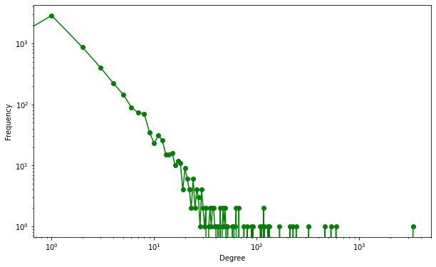
For a directed graph we can make use of nx.degree_histogram. Bellow is an example using the random graph generator nx.barabasi_albert_graph.

Normally the logarithm of both x and y axes is taken when plotting the degree distribution, this helps seeing if a networkx is scale-free (a network with a degree distribution following a power law), so we can use matplotlib's plt.loglog for that :

m=3
G = nx.barabasi_albert_graph(1000, m)

degree_freq = nx.degree_histogram(G)
degrees = range(len(degree_freq))
plt.figure(figsize=(12, 8)) 
plt.loglog(degrees[m:], degree_freq[m:],'go-') 
plt.xlabel('Degree')
plt.ylabel('Frequency')

enter image description here


  • For directed graphs

For directed graphs, we could slightly modify the function nx.degree_histogram to contemplate both in and out degrees:

def degree_histogram_directed(G, in_degree=False, out_degree=False):
    """Return a list of the frequency of each degree value.

    Parameters
    ----------
    G : Networkx graph
       A graph
    in_degree : bool
    out_degree : bool

    Returns
    -------
    hist : list
       A list of frequencies of degrees.
       The degree values are the index in the list.

    Notes
    -----
    Note: the bins are width one, hence len(list) can be large
    (Order(number_of_edges))
    """
    nodes = G.nodes()
    if in_degree:
        in_degree = dict(G.in_degree())
        degseq=[in_degree.get(k,0) for k in nodes]
    elif out_degree:
        out_degree = dict(G.out_degree())
        degseq=[out_degree.get(k,0) for k in nodes]
    else:
        degseq=[v for k, v in G.degree()]
    dmax=max(degseq)+1
    freq= [ 0 for d in range(dmax) ]
    for d in degseq:
        freq[d] += 1
    return freq

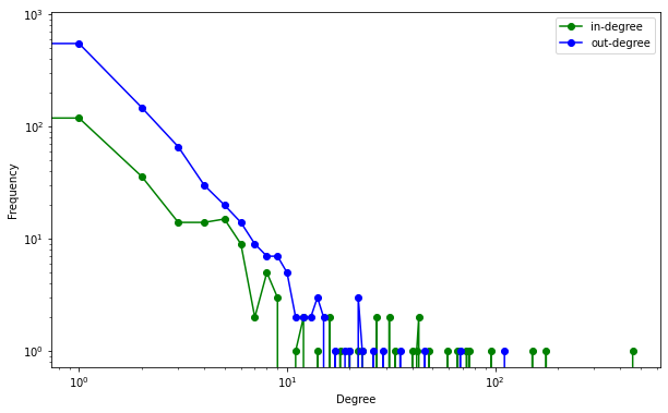
And similarly to above, we could generate a graph for the in-degree or/and the out-degree. Here's an example with a random scale-gree graph:

G = nx.scale_free_graph(5000)

in_degree_freq = degree_histogram_directed(G, in_degree=True)
out_degree_freq = degree_histogram_directed(G, out_degree=True)
degrees = range(len(in_degree_freq))
plt.figure(figsize=(12, 8)) 
plt.loglog(range(len(in_degree_freq)), in_degree_freq, 'go-', label='in-degree') 
plt.loglog(range(len(out_degree_freq)), out_degree_freq, 'bo-', label='out-degree')
plt.xlabel('Degree')
plt.ylabel('Frequency')

enter image description here

Occupational answered 30/6, 2020 at 17:27 Comment(1)
We need to add plt.legend(loc="upper right") to the last code piece, just before plt.xlabel('Degree') to see name of legends as presented in the last plot.Stipulate
T
5

Encountered the same problem today. Some typical degree distribution plots (examples) do not bin the degree counts. Instead, they scatter the count for each degree on a log-log plot.

Here's what I came up with. As it seems difficult to turn off binning in common histogram functions, I decided to opt for a standard Counter to do the job.

degrees is expected to be some iterable over node degrees (as returned by networkx).

The Counter.items() give a list of pairs [(degree, count)]. After unzipping the list to x and y we can prepare axes with log scales, and issue the scatter plot.

from collections import Counter
from operator import itemgetter
import matplotlib.pyplot as plt

# G = some networkx graph

degrees = G.in_degree()
degree_counts = Counter(degrees)                                                                                                 
x, y = zip(*degree_counts.items())                                                      
                                                                                                 
plt.figure(1)   
                                                                                                                                                                                                                                                      
# prep axes                                                                                                                      
plt.xlabel('degree')                                                                                                             
plt.xscale('log')                                                                                                                
plt.xlim(1, max(x))  
                                                                                                           
plt.ylabel('frequency')                                                                                                          
plt.yscale('log')                                                                                                                
plt.ylim(1, max(y))                                                                                                             
                                                                                                                                     # do plot                                                                                                                        
plt.scatter(x, y, marker='.')                                                                                                    
plt.show()

I manually clipped xlim and ylim because autoscaling leaves the points a bit lost in the log scale. Small dot-markers work best.

Hope it helps

EDIT: an earlier version of this post included sorting the degree-count pairs which are, of course, not necessary for a scatter plot with well-defined x and y. See an example image:

See example image here

Tiercel answered 4/2, 2020 at 11:50 Comment(0)

© 2022 - 2024 — McMap. All rights reserved.