Change the color of a TextInput placeholder with Styled Components in React Native
Asked Answered
S

6

12

How do you set the color of TextInput its placeholder with Styled Components in React Native?

I tried the following without any luck:

1.

const Input = styled.TextInput`
   border: 1px solid green;
   display: block;
   margin: 0 0 1em;

   ::placeholder {
       color: green;
   }
`

2.

const Input = styled.TextInput`
   border: 1px solid green;
   display: block;
   margin: 0 0 1em;

   &::placeholder {
       color: green;
   }
`
Soekarno answered 27/5, 2019 at 17:10 Comment(0)
Q
16

The best way to make this:

export const Input = styled.TextInput.attrs({
  placeholderTextColor: "red"
})`
  background-color: "#000";
`;
Quadrature answered 29/5, 2019 at 0:46 Comment(3)
This works for me but I can't access the theme object to get the colors. hard coded values seem to work fine.Willyt
@HaseebBurki try color: ${themeColor};Rolanda
Thank you for this! I've been trying to do something similar but had ended up just adding the placeholderTextColor attribute to the element in JSX instead of putting it into my styled components. This is almost exactly what I needed. The only thing I had to change is that I wanted to use a theme object that's passed in as props so my final working code looks like export const RecoveryQuestionTextInput = styled.TextInput.attrs(props => ({ placeholderTextColor: props.theme.guide_placeholder, }))Rothwell
F
9

you can try:

export const NewTodo = styled.input`
  padding: 16px 16px 16px 60px;
  font-weight: 300;
  font-size: 15px;
  ::placeholder,
  ::-webkit-input-placeholder {
    color: red;
  }
  :-ms-input-placeholder {
     color: red;
  }
`;

How do I style an input placeholder with Styled Components?

Fisk answered 2/6, 2021 at 11:44 Comment(1)
That doesn't work for me. Only &::placeholder works (with two semicolons).Flirtatious
K
6

Adding on to @Fernando Pascoal Gomes's answer, if you wish to access the theme object, consider passing a function to .attrs() that returns an object that the component inherits for its props.

For your case, TextInput accepts a placeholderTextColor prop, so it might look like this:

const Input = styled.TextInput.attrs((props) => ({
  placeholderTextColor: props.theme.palette.placeholderColor,
}))`
  background-color: #fff;
  color: #000;
  ...
`
Kersten answered 13/7, 2021 at 5:36 Comment(1)
This should be the accepted answer since it's more complete. I know that in the comment on the accepted answer is the same thing, but stillPyrone
S
4

You cannot style the placeholder color with styled-components directly, but you can pass the placeholderTextColor property to your styled Textinput.

Example:

const Input = styled.TextInput`
   border: 1px solid green;
   display: block;
   margin: 0 0 1em;

`

and then inside your render function:

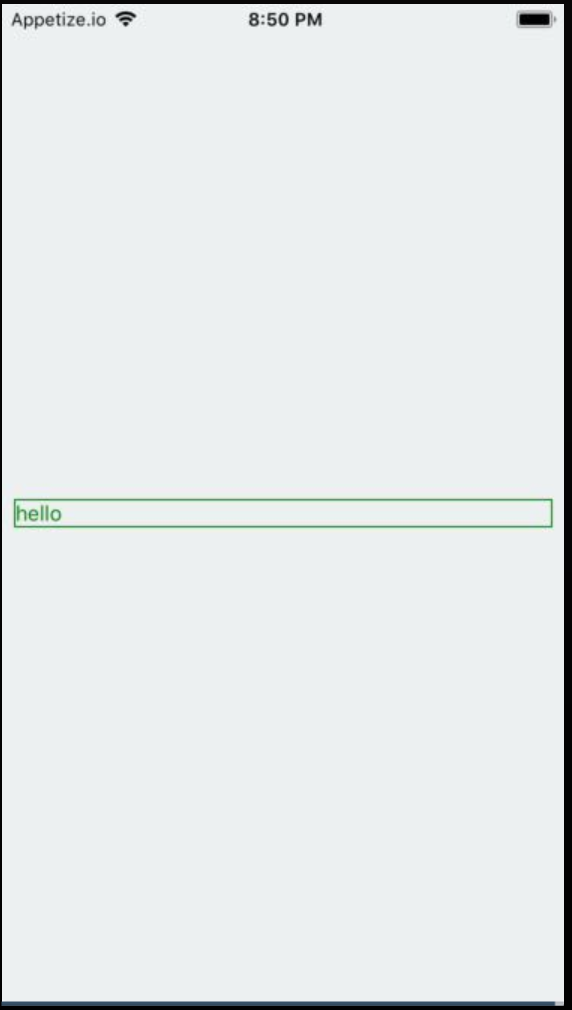
<Input placeholder="hello" placeholderTextColor="green" />

Output:

output

Working example:

https://snack.expo.io/rybp-nKaE

Sapsucker answered 27/5, 2019 at 18:54 Comment(2)
Ok, thanks. Of course, this is not what I hoped. How can I know which properties are possible and which not? Is this somewhere documented?Soekarno
@Soekarno This is not really documented, but everything which is related to specific browsers is not supported. Like for example ::placeholder and so onSapsucker
Y
1

Not sure why this answer is so outdated, but none of these worked for me, it was as simple as this:

export const SearchInput = styled.input<MTStyledProps>`
    
    &::placeholder {
        color: ${onlyTheme.color.lightGrey};
    }

`;
Youngran answered 19/8, 2023 at 6:0 Comment(1)
Actually, you would need the webkit to ensure it works, &::-webkit-input-placeholderAngelynanger
T
0

To change the textinputs placeholder's text color user prperty "placeholderTextColor" eg

<TextInput
        style={{height: 40, borderColor: 'gray', borderWidth: 1}}
        onChangeText={(text) => this.setState({text})}
        placeholder = 'Enter text'
        placeholderTextColor = 'red'
        value={this.state.text}
      />
Telpher answered 27/5, 2019 at 18:4 Comment(0)

© 2022 - 2024 — McMap. All rights reserved.