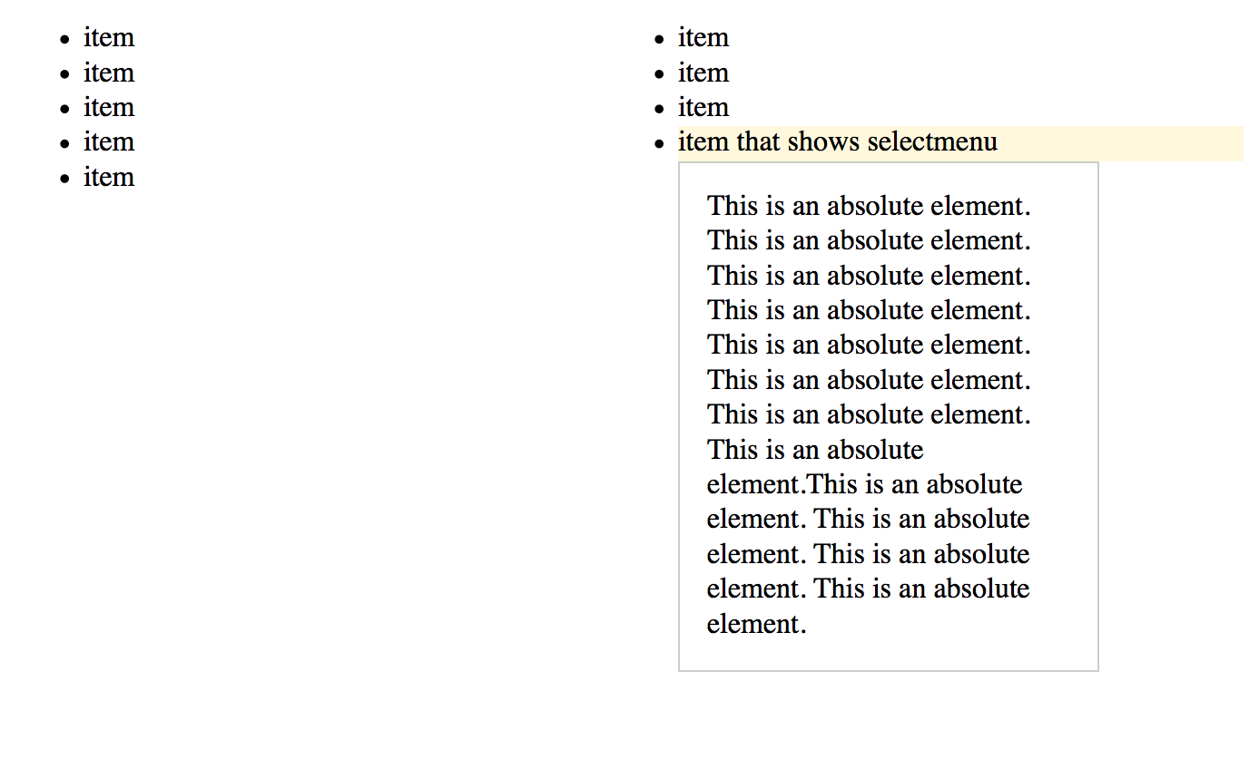
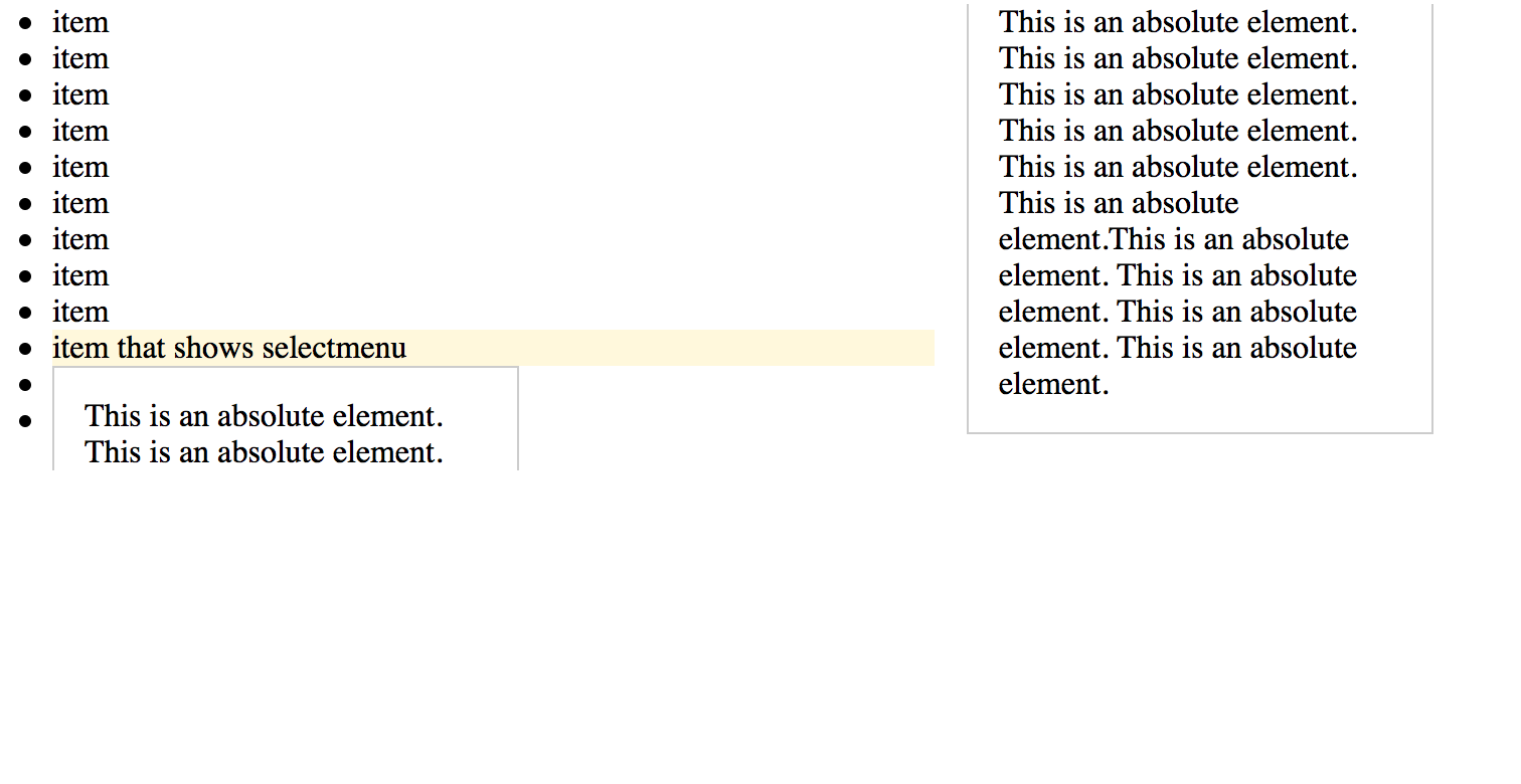
I have a 2 column layout using HTML and CSS. Within these columns, I have a selectmenu that will show when one of these list items are clicked. I need to position this selectmenu relative to the clicked item and not affect the layout of the elements around it, like a traditional select option menu. However, I cannot use traditional selects, as this is an autosuggest input/menu. So, I am using an absolutely positioned item for the menu container within its relatively positioned parent.
My problem is the absolutely positioned item is breaking as if it were part of the columns. This goes against everything I understand about position: absolute, but it appears it is within spec. What is more frustrating is that the browser shows the absolutely positioned item as I intend it (as long as I don’t set position: relative on the parent), but I need to set position: relative on the parent, or the selectmenu (as an absolutely positioned item) won’t always show adjoining its corresponding element.
I have also tried a column-like layout using using flexbox, but with this, the items are shown left to right, when I need them to be shown top to bottom, in order, as in a traditional columned layout. I could use flexbox with flex-flow: column wrap, but that would require me to know/set the height of the container element, which I cannot do. CSS columns wrap the list nicely without having to set a height.
I think the easiest solutions would be to somehow fake absolute positioning or to get flexbox to show the items in order (top to bottom) without explicitly setting a height on the container. Both of which I tried with no satisfactory results. I am open to using a JavaScript solution, but am trying my best to avoid it and solve this with CSS only.
.columns-two {
  column-count: 2;
  column-width: 300px;
  -moz-column-count: 2;
  -moz-column-width: 300px;
}
.parent {
  -webkit-column-break-inside: avoid;
  page-break-inside: avoid;
  break-inside: avoid;
  position: relative;
}
.highlight {
  background-color: #FFF8DC;
}
.absolute-element {
  width: 200px;
  position: absolute;
  background: #ffffff;
  border: 1px solid #cccccc;
  padding: 15px;
  -webkit-column-break-inside: avoid;
  page-break-inside: avoid;
  break-inside: avoid;
}
<ul class="columns-two">
<li>item</li>
<li>item</li>
<li>item</li>
<li>item</li>
<li>item</li>
<li>item</li>
<li>item</li>
<li>item</li>
<li>item</li>
<li class="parent highlight">item that shows selectmenu
<div class="absolute-element">This is an absolute element. This is an absolute element. This is an absolute element. This is an absolute element. This is an absolute element. This is an absolute element. This is an absolute element. This is an absolute element.This is an absolute
element. This is an absolute element. This is an absolute element. This is an absolute element.</div>
</li>
<li>item</li>
<li>item</li>
<li>item</li>
<li>item</li>
<li>item</li>
<li>item</li>
<li>item</li>
<li>item</li>
</ul>Here is a codepen with an example showing my problem. Remove the parent class from the HTML to see the absolutely positioned item as intended (note that this will cause the positioning to sometimes be incorrect).


transform: translate3d(0,0,0);is marked as the accepted answer, but when I tested this it appears to still retain the original layout but just hides the excess that has wrapped at the right. Did you ever find a solution? – Interior