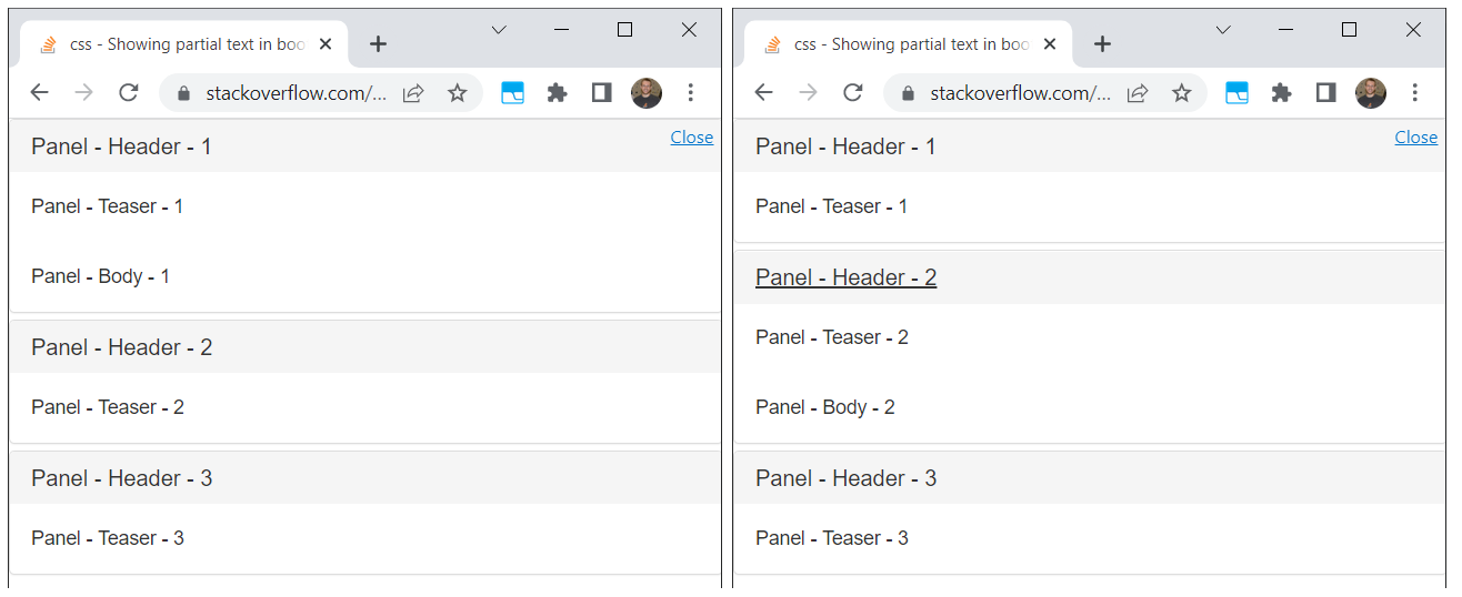
Here's another approach if you can't breakup your DOM into different pieces for the preview + expanded text, but have one long block of content.
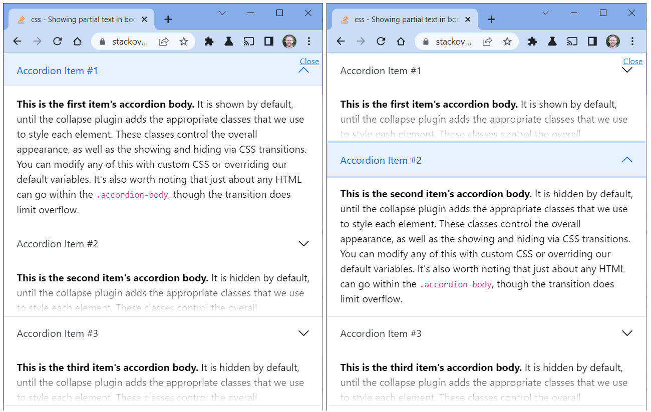
Bootstrap uses the selector .collapse:not(.show) to hide the accordion-body. We can override those styles to be visible, but only up to a certain height. Then, to indicate there's additional text, we can borrow some styling from How to apply a CSS gradient over a text, from a transparent to an opaque colour.
Add the accordion-preview class to the top level component and add the following styles:
.accordion-preview .collapse:not(.show) {
    display: block;
}
.accordion-preview .collapse:not(.show) .accordion-body {
    max-height: 90px;
    position: relative;
    overflow: hidden;
}

.accordion-preview .collapse:not(.show) .accordion-body:after {
    position: absolute;
    bottom: 0;
    left: 0;
    height: 100%;
    width: 100%;
    content: "";
    background: linear-gradient(to top,
       rgba(255,255,255, 1) 5%,
       rgba(255,255,255, 0) 60%
    );
    pointer-events: none; /* so the text is still selectable */
}
Example
![Example screenshot of Accordion with Preview]()
Demo in Stack Snippets
.accordion-preview .collapse:not(.show) {
    display: block;
}
.accordion-preview .collapse:not(.show) .accordion-body {
    max-height: 90px;
    position: relative;
    overflow: hidden;
}

.accordion-preview .collapse:not(.show) .accordion-body:after {
    position: absolute;
    bottom: 0;
    left: 0;
    height: 100%;
    width: 100%;
    content: "";
    background: linear-gradient(to top,
       rgba(255,255,255, 1) 5%,
       rgba(255,255,255, 0) 60%
    );
    pointer-events: none; /* so the text is still selectable */
}
<link href="https://cdn.jsdelivr.net/npm/[email protected]/dist/css/bootstrap.min.css" rel="stylesheet" >
<script src="https://cdn.jsdelivr.net/npm/[email protected]/dist/js/bootstrap.bundle.min.js" ></script>

<div class="accordion accordion-preview" id="accordionExample">
  <div class="accordion-item">
    <h2 class="accordion-header" id="headingOne">
      <button class="accordion-button" type="button" data-bs-toggle="collapse" data-bs-target="#collapseOne" aria-expanded="true" aria-controls="collapseOne">
        Accordion Item #1
      </button>
    </h2>
    <div id="collapseOne" class="accordion-collapse collapse show" aria-labelledby="headingOne" data-bs-parent="#accordionExample">
      <div class="accordion-body">
        <strong>This is the first item's accordion body.</strong> It is shown by default, until the collapse plugin adds the appropriate classes that we use to style each element. These classes control the overall appearance, as well as the showing and hiding via CSS transitions. You can modify any of this with custom CSS or overriding our default variables. It's also worth noting that just about any HTML can go within the <code>.accordion-body</code>, though the transition does limit overflow.
      </div>
    </div>
  </div>
  <div class="accordion-item">
    <h2 class="accordion-header" id="headingTwo">
      <button class="accordion-button collapsed" type="button" data-bs-toggle="collapse" data-bs-target="#collapseTwo" aria-expanded="false" aria-controls="collapseTwo">
        Accordion Item #2
      </button>
    </h2>
    <div id="collapseTwo" class="accordion-collapse collapse" aria-labelledby="headingTwo" data-bs-parent="#accordionExample">
      <div class="accordion-body">
        <strong>This is the second item's accordion body.</strong> It is hidden by default, until the collapse plugin adds the appropriate classes that we use to style each element. These classes control the overall appearance, as well as the showing and hiding via CSS transitions. You can modify any of this with custom CSS or overriding our default variables. It's also worth noting that just about any HTML can go within the <code>.accordion-body</code>, though the transition does limit overflow.
      </div>
    </div>
  </div>
  <div class="accordion-item">
    <h2 class="accordion-header" id="headingThree">
      <button class="accordion-button collapsed" type="button" data-bs-toggle="collapse" data-bs-target="#collapseThree" aria-expanded="false" aria-controls="collapseThree">
        Accordion Item #3
      </button>
    </h2>
    <div id="collapseThree" class="accordion-collapse collapse" aria-labelledby="headingThree" data-bs-parent="#accordionExample">
      <div class="accordion-body">
        <strong>This is the third item's accordion body.</strong> It is hidden by default, until the collapse plugin adds the appropriate classes that we use to style each element. These classes control the overall appearance, as well as the showing and hiding via CSS transitions. You can modify any of this with custom CSS or overriding our default variables. It's also worth noting that just about any HTML can go within the <code>.accordion-body</code>, though the transition does limit overflow.
      </div>
    </div>
  </div>
</div>


<div class="accordion" id="accordion2"> <div class="accordion-group"> <div class="accordion-heading"> <a class="accordion-toggle" data-toggle="collapse" data-parent="#accordion2" href="#collapseOne"> TITLE OF THE COLLAPSE </a> </div> <div id="collapseOne" class="accordion-body collapse in"> <div class="accordion-inner"> DATA IN THE COLLAPSE </div> </div> </div>– Covert