Order Bars in ggplot2 bar graph
Asked Answered
D

16

390

I am trying to make a bar graph where the largest bar would be nearest to the y axis and the shortest bar would be furthest. So this is kind of like the Table I have

    Name   Position
1   James  Goalkeeper
2   Frank  Goalkeeper
3   Jean   Defense
4   Steve  Defense
5   John   Defense
6   Tim    Striker

So I am trying to build a bar graph that would show the number of players according to position

p <- ggplot(theTable, aes(x = Position)) + geom_bar(binwidth = 1)

but the graph shows the goalkeeper bar first then the defense, and finally the striker one. I would want the graph to be ordered so that the defense bar is closest to the y axis, the goalkeeper one, and finally the striker one. Thanks

Dogs answered 6/3, 2011 at 4:20 Comment(5)
can't ggplot reorder them for you without having to mess around with the table (or dataframe)?Nicol
@MattO'Brien I find it incredible that this is not done in a single, simple commandCastera
@Zimano Too bad that's what you're getting from my comment. My observation was towards the creators of ggplot2, not the OPCastera
@Castera Thank you for clarifying, my sincere apologies for jumping on you like that. I have deleted my original remark.Rabah
ggplot2 currently ignores binwidth = 1 with a warning. To control the width of the bars (and have no gaps between bars), you might want to use width = 1 instead.Magaretmagas
O
258

The key with ordering is to set the levels of the factor in the order you want. An ordered factor is not required; the extra information in an ordered factor isn't necessary and if these data are being used in any statistical model, the wrong parametrisation might result — polynomial contrasts aren't right for nominal data such as this.

## set the levels in order we want
theTable <- within(theTable, 
                   Position <- factor(Position, 
                                      levels=names(sort(table(Position), 
                                                        decreasing=TRUE))))
## plot
ggplot(theTable,aes(x=Position))+geom_bar(binwidth=1)

barplot figure

In the most general sense, we simply need to set the factor levels to be in the desired order. If left unspecified, the levels of a factor will be sorted alphabetically. You can also specify the level order within the call to factor as above, and other ways are possible as well.

theTable$Position <- factor(theTable$Position, levels = c(...))
Outrange answered 6/3, 2011 at 13:42 Comment(9)
@Gavin: 2 simplifications: since you already are using within, there's no need to use theTable$Position, and you could just do sort(-table(...)) for decreasing order.Crumple
@Prasad the former was a leftover from testing so thanks for pointing that out. As far the latter, I prefer explicitly asking for the reversed sort than the - you use as it is far easier to get the intention from decreasing = TRUE than noticing the - in all the rest of the code.Outrange
@Gavin ok I see what you meanCrumple
@Prasad - it it just personal preference after many years writing analysis scripts in my work that I have had to revisit at times and cursed myself for not writing clearer code. There is nothing wrong with using -.Outrange
@Gavin, sure your approach makes sense. I frequently choose shorter syntax over clarity but I know it can come back to bite me sometimes!Crumple
geom_bar() no longer has a binwidth parameter. Please use geom_histogram() instead.Salto
@GavinSimpson; I think the part about levels(theTable$Position) <- c(...) leads to undesired behaviour where the actual entries of the data frame gets reordered, and not just the levels of the factor. See this question. Maybe you should modify or remove those lines?Indictable
Strongly agree with Anton. I just saw this question and went poking around on where they got the bad advice to use levels<-. I'm going to edit that part out, at least tentatively.Bozen
@Indictable Thanks for the suggestion (and to Gregor for the edit); I would never do this via levels<-() today. This is something from from 8 years back and I can't recall if things were different back then or whether I was just plain wrong, but regardless, it is wrong and should be erased! Thanks!Outrange
M
274

@GavinSimpson: reorder is a powerful and effective solution for this:

ggplot(theTable,
       aes(x=reorder(Position,Position,
                     function(x)-length(x)))) +
       geom_bar()
Moresque answered 10/2, 2012 at 17:13 Comment(3)
Indeed +1, and especially in this case where there is a logical order that we can exploit numerically. If we consider arbitrary ordering of categories and we don't want alphabetical then it is just as easy (easier?) to specify the levels directly as shown.Outrange
This is the neatest. Nullify the need to modify original dataframeSapp
Lovely, just noticed that you can do this a little more succincly, if all you want is to order by the length function and ascending order is okay, which is something I often want to do: ggplot(theTable,aes(x=reorder(Position,Position,length))+geom_bar()Kanaka
O
258

The key with ordering is to set the levels of the factor in the order you want. An ordered factor is not required; the extra information in an ordered factor isn't necessary and if these data are being used in any statistical model, the wrong parametrisation might result — polynomial contrasts aren't right for nominal data such as this.

## set the levels in order we want
theTable <- within(theTable, 
                   Position <- factor(Position, 
                                      levels=names(sort(table(Position), 
                                                        decreasing=TRUE))))
## plot
ggplot(theTable,aes(x=Position))+geom_bar(binwidth=1)

barplot figure

In the most general sense, we simply need to set the factor levels to be in the desired order. If left unspecified, the levels of a factor will be sorted alphabetically. You can also specify the level order within the call to factor as above, and other ways are possible as well.

theTable$Position <- factor(theTable$Position, levels = c(...))
Outrange answered 6/3, 2011 at 13:42 Comment(9)
@Gavin: 2 simplifications: since you already are using within, there's no need to use theTable$Position, and you could just do sort(-table(...)) for decreasing order.Crumple
@Prasad the former was a leftover from testing so thanks for pointing that out. As far the latter, I prefer explicitly asking for the reversed sort than the - you use as it is far easier to get the intention from decreasing = TRUE than noticing the - in all the rest of the code.Outrange
@Gavin ok I see what you meanCrumple
@Prasad - it it just personal preference after many years writing analysis scripts in my work that I have had to revisit at times and cursed myself for not writing clearer code. There is nothing wrong with using -.Outrange
@Gavin, sure your approach makes sense. I frequently choose shorter syntax over clarity but I know it can come back to bite me sometimes!Crumple
geom_bar() no longer has a binwidth parameter. Please use geom_histogram() instead.Salto
@GavinSimpson; I think the part about levels(theTable$Position) <- c(...) leads to undesired behaviour where the actual entries of the data frame gets reordered, and not just the levels of the factor. See this question. Maybe you should modify or remove those lines?Indictable
Strongly agree with Anton. I just saw this question and went poking around on where they got the bad advice to use levels<-. I'm going to edit that part out, at least tentatively.Bozen
@Indictable Thanks for the suggestion (and to Gregor for the edit); I would never do this via levels<-() today. This is something from from 8 years back and I can't recall if things were different back then or whether I was just plain wrong, but regardless, it is wrong and should be erased! Thanks!Outrange
M
206

Using scale_x_discrete (limits = ...) to specify the order of bars.

positions <- c("Goalkeeper", "Defense", "Striker")
p <- ggplot(theTable, aes(x = Position)) + scale_x_discrete(limits = positions)
Mobcap answered 1/12, 2014 at 13:20 Comment(5)
Your solution is the most suitable to my situation, as I want to program to plot with x being an arbitrary column expressed by a variable in a data.frame. The other suggestions would be harder to express the arrangement of the order of x by an expression involving the variable. Thanks! If there is interest, I can share my solution using your suggestion. Just one more issue, adding scale_x_discrete(limits = ...), I found that there is blank space as wide as the bar-chart, on the right of the chart. How can I get rid of the blank space? As it does not serve any purpose.Romilly
This seems necessary for ordering histogram barsVeritable
QIBIN: Wow...the other answers here work, but your answer by far seems not just the most concise and elegant, but the most obvious when thinking from within ggplot's framework. Thank you.Righthander
When I tried this solution, on my data it, didn't graph NAs. Is there a way to use this solution and have it graph NAs?Middleman
This solution worked for me where the others above did not.Leupold
H
109

I think the already provided solutions are overly verbose. A more concise way to do a frequency sorted barplot with ggplot is

ggplot(theTable, aes(x=reorder(Position, -table(Position)[Position]))) + geom_bar()

It's similar to what Alex Brown suggested, but a bit shorter and works without an anynymous function definition.

Update

I think my old solution was good at the time, but nowadays I'd rather use forcats::fct_infreq which is sorting factor levels by frequency:

require(forcats)

ggplot(theTable, aes(fct_infreq(Position))) + geom_bar()
Hygro answered 12/12, 2014 at 16:58 Comment(3)
I do not understand the second argument to reorder function and what does it do. Can you kindly explain what is happening?Glazier
@user3282777 have you tried the docs stat.ethz.ch/R-manual/R-devel/library/stats/html/… ?Hygro
Great solution! Good to see others employing tidyverse solutions!Quiddity
C
42

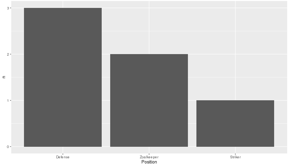
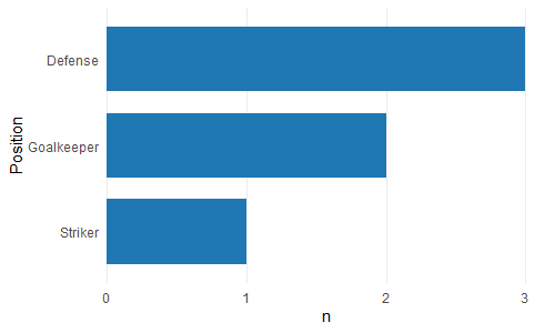
Like reorder() in Alex Brown's answer, we could also use forcats::fct_reorder(). It will basically sort the factors specified in the 1st arg, according to the values in the 2nd arg after applying a specified function (default = median, which is what we use here as just have one value per factor level).

It is a shame that in the OP's question, the order required is also alphabetical as that is the default sort order when you create factors, so will hide what this function is actually doing. To make it more clear, I'll replace "Goalkeeper" with "Zoalkeeper".

library(tidyverse)
library(forcats)

theTable <- data.frame(
                Name = c('James', 'Frank', 'Jean', 'Steve', 'John', 'Tim'),
                Position = c('Zoalkeeper', 'Zoalkeeper', 'Defense',
                             'Defense', 'Defense', 'Striker'))

theTable %>%
    count(Position) %>%
    mutate(Position = fct_reorder(Position, n, .desc = TRUE)) %>%
    ggplot(aes(x = Position, y = n)) + geom_bar(stat = 'identity')

enter image description here

Charmain answered 8/12, 2016 at 13:22 Comment(2)
IMHO best solution as forcats is as well as dplyr a tidyverse package.Bradfordbradlee
thumbs up for ZoalkeeperSession
E
33

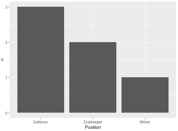
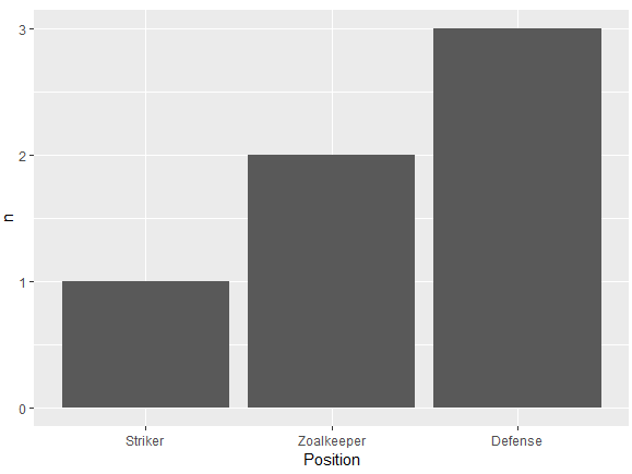
Another alternative using reorder to order the levels of a factor. In ascending (n) or descending order (-n) based on the count. Very similar to the one using fct_reorder from the forcats package:

Descending order

df %>%
  count(Position) %>%
  ggplot(aes(x = reorder(Position, -n), y = n)) +
  geom_bar(stat = 'identity') +
  xlab("Position")

enter image description here

Ascending order

df %>%
  count(Position) %>%
  ggplot(aes(x = reorder(Position, n), y = n)) +
  geom_bar(stat = 'identity') +
  xlab("Position")

enter image description here

Data frame:

df <- structure(list(Position = structure(c(3L, 3L, 1L, 1L, 1L, 2L), .Label = c("Defense", 
"Striker", "Zoalkeeper"), class = "factor"), Name = structure(c(2L, 
1L, 3L, 5L, 4L, 6L), .Label = c("Frank", "James", "Jean", "John", 
"Steve", "Tim"), class = "factor")), class = "data.frame", row.names = c(NA, 
-6L))
Elmore answered 3/2, 2019 at 15:27 Comment(1)
adding count before hand i think is the simplest approachVariegate
O
29

A simple dplyr based reordering of factors can solve this problem:

library(dplyr)

#reorder the table and reset the factor to that ordering
theTable %>%
  group_by(Position) %>%                              # calculate the counts
  summarize(counts = n()) %>%
  arrange(-counts) %>%                                # sort by counts
  mutate(Position = factor(Position, Position)) %>%   # reset factor
  ggplot(aes(x=Position, y=counts)) +                 # plot 
    geom_bar(stat="identity")                         # plot histogram
Orland answered 29/7, 2016 at 16:15 Comment(0)
I
21

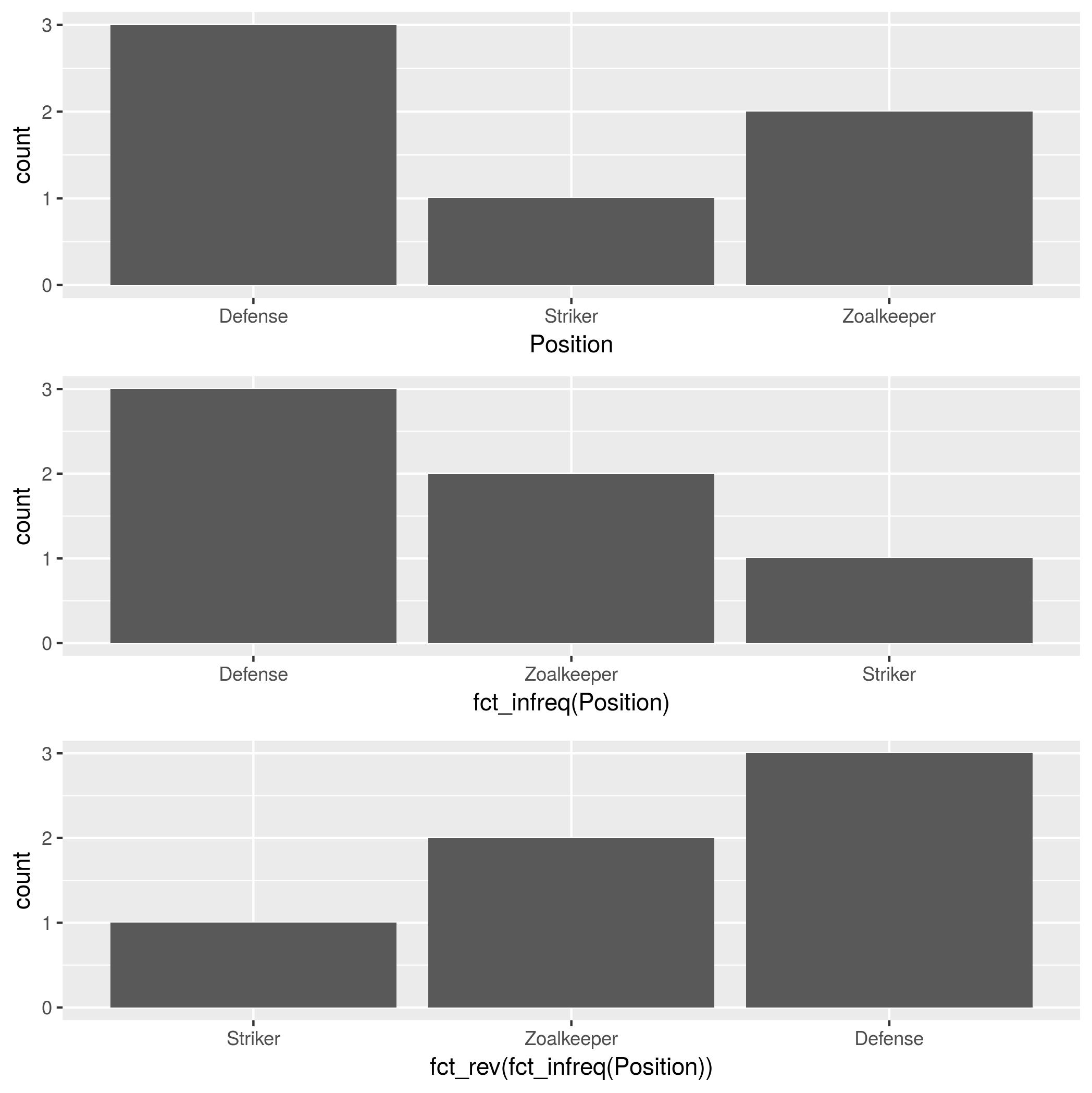
In addition to forcats::fct_infreq, mentioned by @HolgerBrandl, there is forcats::fct_rev, which reverses the factor order.

theTable <- data.frame(
    Position= 
        c("Zoalkeeper", "Zoalkeeper", "Defense",
          "Defense", "Defense", "Striker"),
    Name=c("James", "Frank","Jean",
           "Steve","John", "Tim"))

p1 <- ggplot(theTable, aes(x = Position)) + geom_bar()
p2 <- ggplot(theTable, aes(x = fct_infreq(Position))) + geom_bar()
p3 <- ggplot(theTable, aes(x = fct_rev(fct_infreq(Position)))) + geom_bar()

gridExtra::grid.arrange(p1, p2, p3, nrow=3)             

enter image description here

Investiture answered 24/2, 2018 at 4:19 Comment(1)
"fct_infreq(Position)" is the little thing that does so much, thanks!!Prefabricate
C
20

You just need to specify the Position column to be an ordered factor where the levels are ordered by their counts:

theTable <- transform( theTable,
       Position = ordered(Position, levels = names( sort(-table(Position)))))

(Note that the table(Position) produces a frequency-count of the Position column.)

Then your ggplot function will show the bars in decreasing order of count. I don't know if there's an option in geom_bar to do this without having to explicitly create an ordered factor.

Crumple answered 6/3, 2011 at 4:44 Comment(6)
I didn't fully parse your code up there, but I'm pretty sure reorder() from the stats library accomplishes the same task.Tam
@Tam how do you propose using reorder() in this case? The factor requiring reordering needs to be reordered by some function of itself and I'm struggling to see a good way to do that.Outrange
ok, with(theTable, reorder(Position, as.character(Position), function(x) sum(duplicated(x)))) is one way, and another with(theTable, reorder(Position, as.character(Position), function(x) as.numeric(table(x)))) but these are just as convoluted...Outrange
I simplified the answer slightly to use sort rather than orderCrumple
@Gavin - perhaps I misunderstood Prasad's original code (I don't have R on this machine to test...) but it looked as if he was reordering the categories based on frequency, which reorder is adept at doing. I agree for this question that something more involved is needed. Sorry for the confusion.Tam
This does proposal not work with the data set provided in my other comments today.Latini
B
14

If the chart columns come from a numeric variable as in the dataframe below, you can use a simpler solution:

ggplot(df, aes(x = reorder(Colors, -Qty, sum), y = Qty)) 
+ geom_bar(stat = "identity")  

The minus sign before the sort variable (-Qty) controls the sort direction (ascending/descending)

Here's some data for testing:

df <- data.frame(Colors = c("Green","Yellow","Blue","Red","Yellow","Blue"),  
                 Qty = c(7,4,5,1,3,6)
                )

**Sample data:**
  Colors Qty
1  Green   7
2 Yellow   4
3   Blue   5
4    Red   1
5 Yellow   3
6   Blue   6

When I found this thread, that was the answer I was looking for. Hope it's useful for others.

Boldfaced answered 3/8, 2018 at 7:17 Comment(0)
B
13

I agree with zach that counting within dplyr is the best solution. I've found this to be the shortest version:

dplyr::count(theTable, Position) %>%
          arrange(-n) %>%
          mutate(Position = factor(Position, Position)) %>%
          ggplot(aes(x=Position, y=n)) + geom_bar(stat="identity")

This will also be significantly faster than reordering the factor levels beforehand since the count is done in dplyr not in ggplot or using table.

Backscratcher answered 31/7, 2016 at 19:11 Comment(0)
B
12

I found it very annoying that ggplot2 doesn't offer an 'automatic' solution for this. That's why I created the bar_chart() function in ggcharts.

ggcharts::bar_chart(theTable, Position)

enter image description here

By default bar_chart() sorts the bars and displays a horizontal plot. To change that set horizontal = FALSE. In addition, bar_chart() removes the unsightly 'gap' between the bars and the axis.

Bunko answered 12/4, 2020 at 15:18 Comment(0)
C
3

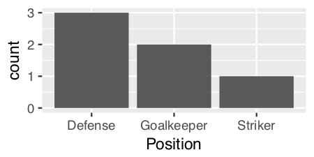
Since we are only looking at the distribution of a single variable ("Position") as opposed to looking at the relationship between two variables, then perhaps a histogram would be the more appropriate graph. ggplot has geom_histogram() that makes it easy:

ggplot(theTable, aes(x = Position)) + geom_histogram(stat="count")

enter image description here

Using geom_histogram():

I think geom_histogram() is a little quirky as it treats continuous and discrete data differently.

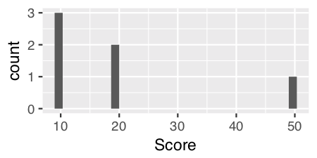
For continuous data, you can just use geom_histogram() with no parameters. For example, if we add in a numeric vector "Score"...

    Name   Position   Score  
1   James  Goalkeeper 10
2   Frank  Goalkeeper 20
3   Jean   Defense    10
4   Steve  Defense    10
5   John   Defense    20
6   Tim    Striker    50

and use geom_histogram() on the "Score" variable...

ggplot(theTable, aes(x = Score)) + geom_histogram()

enter image description here

For discrete data like "Position" we have to specify a calculated statistic computed by the aesthetic to give the y value for the height of the bars using stat = "count":

 ggplot(theTable, aes(x = Position)) + geom_histogram(stat = "count")

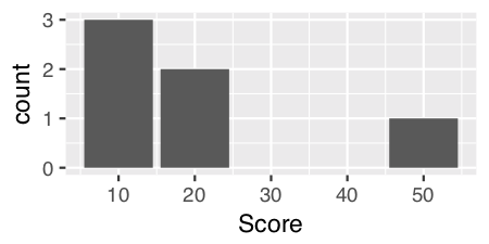
Note: Curiously and confusingly you can also use stat = "count" for continuous data as well and I think it provides a more aesthetically pleasing graph.

ggplot(theTable, aes(x = Score)) + geom_histogram(stat = "count")

enter image description here

Edits: Extended answer in response to DebanjanB's helpful suggestions.

Cineaste answered 14/2, 2019 at 11:41 Comment(1)
I'm not sure why this solution is mentioned, as your first example is exactly equivalent to ggplot(theTable, aes(x = Position)) + geom_bar() (i.e., with the current version 3.3.2 of ggplot2, the order is alphabetical for a char variable, or respects the factor order if it is an ordered factor). Or maybe there used to be a difference?Magaretmagas
F
2
library(ggplot2)
library(magrittr)

dd <- tibble::tribble(
    ~Name,    ~Position,
  "James", "Goalkeeper",
  "Frank", "Goalkeeper",
   "Jean",    "Defense",
   "John",    "Defense",
  "Steve",    "Defense",
    "Tim",    "Striker"
  )


dd %>% ggplot(aes(x = forcats::fct_infreq(Position))) + geom_bar()

Created on 2022-08-30 with reprex v2.0.2

Flash answered 30/8, 2022 at 5:6 Comment(0)
J
0

If you don't want to use ggplot2, there is also ggpubr with a really helpful argument for the ggbarplot function. You can sort the bars by sort.val in "desc" and "asc" like this:

library(dplyr)
library(ggpubr)
# desc
df %>%
  count(Position) %>%
  ggbarplot(x = "Position", 
            y = "n",
            sort.val = "desc")

# asc
df %>%
  count(Position) %>%
  ggbarplot(x = "Position", 
            y = "n",
            sort.val = "asc")

Created on 2022-08-14 by the reprex package (v2.0.1)

As you can see, it is really simple to sort the bars. This can also be done if the bars are grouped. Check the link above for some helpful examples.

Jamin answered 14/8, 2022 at 16:43 Comment(0)
M
-2

you can simply use this code:

ggplot(yourdatasetname, aes(Position, fill = Name)) + 
     geom_bar(col = "black", size = 2)

enter image description here

Mucor answered 5/8, 2020 at 21:30 Comment(1)
Can you please edit your answer to contain an explanation?Development

© 2022 - 2024 — McMap. All rights reserved.