Android handling multiple screens... (Relative Layout or Linear Layout)?
Asked Answered
C

4

13

I have finished my application and now need to handle adapting to multiple screen sizes.

At this point it seems my only option is to do the following:

Have a seperate xml layout for: Small, Normal, Large and X-Large screen sizes. Have a seperate xml layout within that for: ldpi, mdpi, hdpi, and xhdpi Have a seperate xml layout within that for portrait and landscape.

That is a total of 32 layouts for one activity.

I am just wondering if there is a better way to do this as this would be very time consuming, however if it is required to support all the possible devices I would not mind it.

I did some reading and people said to use Linear Layout and use gravity as that is a percentage so it will look the same on all screens. Or I could use RelativeLayout and use "AlignAbove or Below" etc.

However my main problem is that the sizes are wrong, while the location of the elements seem to be generally in the right place.

Is there a widely accepted way to do this?

I am really just looking for what the "main stream" way that the average developer handles all screen sizes.

Clairclairaudience answered 10/6, 2012 at 19:6 Comment(2)
How it is not supporting devices with different densities? Would you describe a little?Kr
@ranjith Are you having any problem with the answer that i posted? Can I help you in any other way?Pompea
P
15

Good question. But that way you are doing is not how a "professional" developer would do. You do not need 32 layouts for a single Activity, Android is intelligent enough to handle things.

Without multi-definition of layouts/multi-definition of dimens.xml multi-device support possible or not?

Yes, it is absolutely possible and this is what you should be doing. Defining 32 layouts for a single Activity layout is not a good thing.

Suppose, I have a considerably large app in Play Store with more than 20 Activities, now if I had defined 32 layouts for a single Activity, then there would have been more than 600 layouts for my app. Is that feasible? Just ask yourself.

You need to start by giving this page a very very good read. It contains almost everything you need to know. But I will help you get things right.

You do not need to provide alternative resources for every combination of screen size and density. The system provides robust compatibility features that can handle most of the work of rendering your application on any device screen, provided that you've implemented your UI using techniques that allow it to gracefully resize

This statement is enough to convince you that you should not be doing this. The Android system is intelligent enough to resize your layout accordingly. And trust me, its really good in that.

As you design your UI for different screen sizes, you'll discover that each design requires a minimum amount of space. So, each generalized screen size above has an associated minimum resolution that's defined by the system. These minimum sizes are in "dp" units—the same units you should use when defining your layouts

I will try to point out some of the important things you need to consider.

  • Never ever hardcode pixels in your layout
  • Always use dp or sp in your layouts. As the name suggests, they are independent of the density of different devices, so will look same in every device.
  • Always use wrap_content or match_parent for heights and widths
  • Never ever use the AbsoluteLayout
  • RelativeLayout or LinearLayout both would work great for you, you just need to decide which one you want to use depending on the scenario
  • Always provide different versions of your drawables for different screen sizes. This is something that you can't skip. If you do not do it, not only will your layout look awful in different devices but it will make your app consume unnecessary resources.
  • Though a single layout will work great on tablets too, but as the screen sizes of tables are much larger than that of typical phones, you should provide separate layouts only for them.

Android Studio Rich Layout Editor

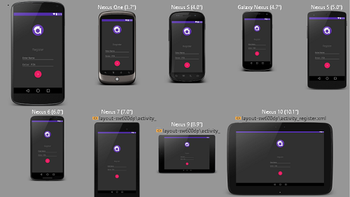
Android Studio has an amazing layout editor where you can preview your layout instantly. Just see this screenshot below,

enter image description here

I am previewing a particular screen of my app in a variety of screen sizes all at once and my layout looks just as I wanted it to look, in all of them.

I just have two layouts for this Activity, one for all the phones and one for all the tablets.

Practical Experience

If you want a practical experience, I have an app running on the Play Store which is used by thousands of users on more than 8000 different devices of different screen sizes.

I only have 2 layouts for a particular Activity, one for the phones and one for the tablets. The UI of my app looks good in all devices and I never had a complaint about it from any user. In case if you need, here is the link to the app.

I am sure this detailed answer could clarify all your doubts, if not, do not hesitate to let me know. I would love to help further.

UDPATE

I would try to clear your confusion once again. But firstly I would RECOMMEND you to read my answer more than once.

Either you need one layout or two, it all depends on the particular layout you are designing. All layouts are different from the other. It can't be defined technically as its subjective. There is no thumb rule for it. But I will try to help you formally.

You need to make good use of the Android Studio Rich Layout Editor and its awesome live preview feature.

  • First try to design the layout targeting any average device size (like 5 inch of Nexus 5). Just choose Nexus 5 to preview your layout.

  • Once you are satisfied with the design, select other screen sizes to preview them. You can also choose "Preview all sizes" like the screenshot above.

  • Try to see if your layout looks good in all the screen sizes, varying from a 4 inch to a 10 inch tablet. See if the spacing's, image sizes, font sizes are all correct.

  • All the phones ranging from 4 inch to 6 inch will generally have perfect previews, but you may need to design an another layout separately for the tablets screens (as they are large enough). Only here comes the need for 2 layouts, but not always.

Like in my app, I have 2 separate layouts only for 5-6 activities, but for the rest I just have a single layout. It all depends on the particular layout.

Designing is a whole lot different from programming. Programming can be defined formally and grammatically, but design can't be. Design is absolutely subjective and depends on the designers perspective. Be creative in your own way, that's the magic of design.

Pompea answered 13/8, 2015 at 5:9 Comment(9)
1+ for well described answer !Sinh
@KingofMasses Thank you!Pompea
Your answer was nice..first vote from me..But I decompile some famous applications, they only use the same layout for all screen-sizes.But you say 2 layouts for one activity..so I am confused.Phenanthrene
@ranjith I have updated the answer. I have tried my best to clear your confusion. If you still have any query, do no hesitate to let me know.Pompea
I decide my bounty for you..My last question -> Can you explain how to handle margin & padding values for different devices?Phenanthrene
I use 4 dimens.xml values(small,normal,large,xlarge).. this approach correct or not?Phenanthrene
Yes, that's correct. There is nothing wrong in using 4 dimens.xml. But be sure to check the layouts using the live preview to make sure correct dimensions are being applied.Pompea
Great answer for beginners..(including me)Phenanthrene
@ranjith Thanks. Glad to help.Pompea
T
3

However my main problem is that the sizes are wrong, while the location of the elements seem to be generally in the right place.

Are you using dp and sp units correctly?

dp

Density-independent Pixels - An abstract unit that is based on the physical density of the screen. These units are relative to a 160 dpi (dots per inch) screen, on which 1dp is roughly equal to 1px. When running on a higher density screen, the number of pixels used to draw 1dp is scaled up by a factor appropriate for the screen's dpi. Likewise, when on a lower density screen, the number of pixels used for 1dp is scaled down. The ratio of dp-to-pixel will change with the screen density, but not necessarily in direct proportion. Using dp units (instead of px units) is a simple solution to making the view dimensions in your layout resize properly for different screen densities. In other words, it provides consistency for the real-world sizes of your UI elements across different devices.

sp

Scale-independent Pixels - This is like the dp unit, but it is also scaled by the user's font size preference. It is recommend you use this unit when specifying font sizes, so they will be adjusted for both the screen density and the user's preference.

from Android documention.

Tension answered 10/6, 2012 at 19:14 Comment(4)
All of my units are in dp however when using different densities the value of one dp is different. So on an Hdpi phone the value of a dp is half as much of an ldpi. So on an ldpi phone all of the margins are half of what they should be. In this case dp doesn't help at all.Clairclairaudience
Obviously, making 32 different layouts isn't the right option. In my opinion using LinearLayout to use percentage values is a good choice. What kind of views are you working with? Maybe changing scaling properties may help.Tension
Well my main activity in my application the main feature is an imageview. Based on continuing research I have found that one method would be do a layoutland/port for each of the screen sizes and then provide a different image based on ldpi, mdpi, hdpi and xhdpi. I am going to do some tests and see if this provides the desired result.Clairclairaudience
check this thread, it may help you: #2522459Tension
G
1

i think its good to read documentation, they have explain each and every thing about support multiple screen.

but everyone confuse HOW and WHEN we have to use that, m i right?

before confuse just download official sample code like iosched, try to understand how they manage support screen-

first time its very hard to understand that code, but we are developer so...

Example: i have one Android which support for API 10-22 and all device start from(Galaxy star s5280- very small screen) to 10inch Tablet(Nexus 10).

how manage resource,


POINT-1 start with layout

create two layout like below

res/layout/my_layout.xml   
res/layout-sw600dp/my_layout.xml // 7 inch tablets

below is optional just in case when you need very small or large layout

res/layout-small/my_layout.xml
res/layout-sw720dp/my_layout.xml // 10 inch tablets

POINT-2 you can also manage layouts using dimension

res/values/dimens.xml
res/values-sw600dp/dimens.xml // 7 inch tablets
res/values-sw720dp/dimens.xml // 10 inch tablets

POINT-3 add different drawables

res/drawable-mdpi/graphic.png 
res/drawable-hdpi/graphic.png 
res/drawable-xhdpi/graphic.png 
res/drawable-xxhdpi/graphic.png 

As per my experience every one is use combination of POINT 1 & 2(as per requirement) and POINT-3 is universal:). read Best Practices


End don't forgot to use <supports-screens> and <compatible-screens> in android manifest file


EDIT:

can I use values-large & values-xlarge? I am confused with values-large & values-sw600dp

Note: Beginning with Android 3.2 (API level 13), these size groups are deprecated in favor of a new technique for managing screen sizes based on the available screen width. If you're developing for Android 3.2 and greater, see Declaring Tablet Layouts for Android 3.2 for more information.

first read above guide lines, as per them we don't have to use such as large or xlarge just use 600dp of width. that is for >= 3.2 android os. its working expected in every device, but you may face issue in GALAXY series devices like GALAXY TAB-2, GRAND because they have old API at time you can use values-large & values-xlarge. this is device specific issue do only when required.


one more note, create above layout multiple file as required like we have listview in layout then just create one file its same for all devices include tablets, like this way you can manage your app size also.

LINEAR, RELATIVE and FRAME layout make you life easier.

Greeley answered 17/8, 2015 at 13:26 Comment(3)
can I use values-large & values-xlarge? I am confused with values-large & values-sw600dpPhenanthrene
@ranjith: check my edit in answer, comment if any thing elseGreeley
Thanks for another great answer..But I can`t vote twice..I already give the bounty to another guy.Have a good day..Phenanthrene
D
0

You can acheive this by designing layouts dynamically.It can fit for all screens.In Android We can't get conclusions on available mobile screens.There are lot of screens with different resolutions.In order to make UI has flexible.You need to design an layout dynamically. For example i added one xml which can fix for all screens(in portrait).

xml is :

<?xml version="1.0" encoding="utf-8"?>
<LinearLayout xmlns:android="http://schemas.android.com/apk/res/android"
android:orientation="vertical" android:layout_width="match_parent"
android:layout_height="match_parent"
android:weightSum="10"
android:gravity="center">


<LinearLayout
    android:orientation="horizontal"
    android:layout_width="match_parent"
    android:layout_height="0dip"
    android:layout_weight="4"
    android:weightSum="10"
    android:gravity="center">

    <ImageView
         android:layout_width="0dip"
        android:layout_weight="3"
        android:layout_height="match_parent"
        android:src="@mipmap/ic_launcher"
        android:id="@+id/imageView3" />
</LinearLayout>

</LinearLayout>
Dextran answered 17/8, 2015 at 13:0 Comment(0)

© 2022 - 2024 — McMap. All rights reserved.