seaborn pairgrid: using kdeplot with 2 hues
Asked Answered
S

4

13

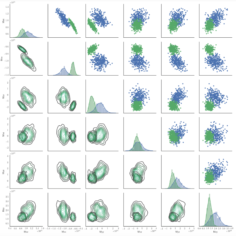
Here is my effort to plot a pairgrid plot that use the kdeplot in the lower part with 2 hues:

enter image description here

My script is:

import seaborn as sns
g = sns.PairGrid(df2,hue='models')  
g.map_upper(plt.scatter)
g.map_lower(sns.kdeplot)
g.map_diag(sns.distplot)

Is there a way in seaborn 0.6.0 to use more color scales in the kdeplot of map_lower according to hue?

In this case, hue has only 2 values. Maybe I'm missing something obvious.

Sphenoid answered 1/10, 2015 at 14:2 Comment(1)
You'll need to make a little wrapper function for kdeplot such that it understands a "color" parameter in the context of a bivariate plot and uses it to choose an appropriate colormap, e.g. using sns.dark_palette. I will make an example later when I have time, but that might help.Pennsylvanian
E
10
  • sns.kdeplot: shade_lowest is replaced with thresh, and shade is replaced with fill. However, it's no longer required to specify these parameters.
  • sns.distplot is replaced by sns.histplot
  • Tested in seaborn 0.12.0
import seaborn as sns
from sklearn.datasets import make_blobs
import numpy as np

# generate data
n = 1000
X, y = make_blobs(n_samples=n, centers=3, n_features=3, random_state=0)

df2 = pd.DataFrame(data=np.hstack([X, y[np.newaxis].T]), columns=['X', 'Y', 'Z','model'])

# kdeplot and histplot treat numbers and strings differently when using hue.
# since model is a category, convert the column to a string type
df2['model'] = df2['model'].astype(str)

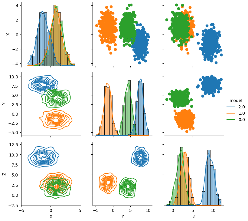
g = sns.PairGrid(df2, hue='model')

g.map_upper(plt.scatter)
g.map_lower(sns.kdeplot)
g.map_diag(sns.histplot, kde=True, stat='density', bins=20)

_ = g.add_legend()

enter image description here


Original Answer

I think that using the hue_kwds in PairGrid is a lot easyer. I found a nice explanation here Plotting on data-aware grids, because the doc in PairGrid isn't clear enough for me.

You can also let other aspects of the plot vary across levels of the hue variable, which can be helpful for making plots that will be more comprehensible when printed in black-and-white. To do this, pass a dictionary to hue_kws where keys are the names of plotting function keyword arguments and values are lists of keyword values, one for each level of the hue variable.

Essentially, hue_kws is a dict of lists. The keyword are passed to the single plotting functions with values from their list, one for each level of your hue variable. See the code example below.

I'm using a numerical columns for the hue in my analysis, but it should work also here. If not, you can easily map each unique value of 'models' to integer.

Stealing from the nice answer from Martin Perez I would do something like:

EDIT : complete code example

EDIT 2 : I found that kdeplot doesn't play well with numerical labels. Changing the code accordingly.

# generate data: sorry, I'm lazy and sklearn make it easy.
n = 1000
from sklearn.datasets.samples_generator import make_blobs
X, y = make_blobs(n_samples=n, centers=3, n_features=3,random_state=0)

df2 = pd.DataFrame(data=np.hstack([X,y[np.newaxis].T]),columns=['X','Y','Z','model'])
# distplot has a problem witht the color being a number!!!
df2['model'] = df2['model'].map('model_{}'.format)

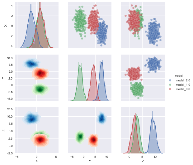
list_of_cmaps=['Blues','Greens','Reds','Purples']
g = sns.PairGrid(df2,hue='model',
      # this is only if you use numerical hue col
#     vars=[i for i in df2.columns if 'm' not in i], 
    # the first hue value vill get cmap='Blues'
    # the first hue value vill get cmap='Greens'
    # and so on
    hue_kws={"cmap":list_of_cmaps},
    )
g.map_upper(plt.scatter)
g.map_lower(sns.kdeplot,shade=True, shade_lowest=False)
g.map_diag(sns.distplot)
# g.map_diag(plt.hist)
g.add_legend()

enter image description here

Sorting list_of_cmaps you should be able to assign a particular shade to a specific level of your categorical variable.

An upgrade would be to dynamically create list_of_cmaps based on the number of levels you need.

Erine answered 10/1, 2018 at 16:35 Comment(0)
S
7

You would need to create your own plot function called by the PairGrid, with the form myplot(x, y, **kws). kws contains the field 'color' created automatically by PairGrid or given by you in the Palette argument of PairGrid.

To control how you select the colormap from the color given in Palette you better set this argument manually with a dictionary linking the variable values of the variable passed to hue with the colors of your choosing.

Here an example for only 4 colors: red, green, blue and magenta. Leading to the color maps: Reds, Greens, Blues and Purples.

Infer cmap from color

def infer_cmap(color):  
    if color == (0., 0., 1.):
        return 'Blues'
    elif color == (0., 0.5, 0.):
        return 'Greens'
    elif color == (1., 0., 0.):
        return 'Reds'
    elif color == (0.75, 0., 0.75):
        return 'Purples'

Add color hue to a kde plot

def kde_hue(x, y, **kws):
    ax = plt.gca()
    cmap = infer_cmap(kws['color'])
    sns.kdeplot(data=x, data2=y, ax=ax, shade=True, shade_lowest=False, cmap=cmap, **kws)
    return ax

Create the PairGrid

colors = ['b', 'g', 'r', 'm']
var = 'models'

color_dict = {}
for idx, v in enumerate(np.unique(df2[var])):
    color_dict[v] = colors[idx]
g = sns.PairGrid(df2, hue=var, palette=color_dict)
g = g.map_diag(sns.kdeplot)
g = g.map_upper(plt.scatter)
g = g.map_lower(kde_hue)
g = g.add_legend()
plt.show()
plt.close()
Switzerland answered 9/7, 2016 at 16:50 Comment(0)
E
2

I got to this question when trying to use hue on kdeplot() or distplot() which is not a supported parameter. This works

g = sns.FacetGrid(df_rtn, hue="group")
g = g.map(sns.kdeplot, "variable")
# or
g = g.map(sns.distplot, "variable")
Expunction answered 3/3, 2017 at 21:20 Comment(0)
D
2

As seen in Martin's example, a wrapper function needs to be created to instruct sns.kdeplot on what color maps to use. Here is a similar example that should be easier to understand:

# We will use seaborn 'Set1' color pallet

>>> print(sns.color_palette('Set1'))

[(0.89411765336990356, 0.10196078568696976, 0.10980392247438431),
 (0.21602460800432691, 0.49487120380588606, 0.71987698697576341),
 (0.30426760128900115, 0.68329106055054012, 0.29293349969620797),
 (0.60083047361934883, 0.30814303335021526, 0.63169552298153153),
 (1.0, 0.50591311045721465, 0.0031372549487095253),
 (0.99315647868549117, 0.9870049982678657, 0.19915417450315812)]

The color map takes in the color based on the pallet. The default pallet is green - (0., 0., 1.) and blue - (0., 0.5, 0.). However, we are using the above pallet which has different RBG tuples.

def infer_cmap(color):
    hues = sns.color_palette('Set1')
    if color == hues[0]:
        return 'Reds'
    elif color == hues[1]:
        return 'Blues'

def kde_color_plot(x, y, **kwargs):
    cmap = infer_cmap(kwargs['color'])
    ax = sns.kdeplot(x, y, shade=True, shade_lowest=False, cmap=cmap, **kwargs)
    return ax

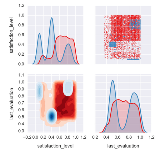
g = sns.PairGrid(df, hue='left', vars=['satisfaction_level', 'last_evaluation'], palette='Set1')
g = g.map_upper(plt.scatter, s=1, alpha=0.5)
g = g.map_lower(kde_color_plot)
g = g.map_diag(sns.kdeplot, shade=True);

enter image description here

Demography answered 8/10, 2017 at 3:4 Comment(0)

© 2022 - 2024 — McMap. All rights reserved.