Make CSS Grid row height flexible
Asked Answered
L

3

13

I am building a CSS Grid layout, and somehow I'm unable to get the "auto" value to work for the sizing of row height.

The items keep a minimum height of 1fr, even if their content is small enough to allow them to shrink.

Here is a code example that explains the problem - you can also check it out on https://codepen.io/16kbit/pen/RJbMWM

section {
  display: grid;
  grid-template-areas: "one top" "one bottom";
  align-items: start;
  border: 1px solid hotpink;
}

article {
  border: 1px solid green;
}

#one {
  grid-area: one;
}

#top {
  grid-area: top;
}

#bottom {
  grid-area: bottom;
  background: yellow;
}
<section>
  <article id=one>
    <h1>One</h1>
    <p>Lorem cool dolizzle sit amizzle, dope sizzle elizzle. Nullam shiznit velizzle, get down get down volutpizzle, suscipizzle quizzle, dizzle mammasay mammasa mamma oo sa, arcu. Pellentesque sheezy tortizzle. Sed erizzle. Fusce izzle dolor shiznit pimpin'
      tempizzle tempor. Maurizzle pellentesque nibh shizzlin dizzle turpizzle. Vestibulum in tortor. Pellentesque cool rhoncus black. In hac fo shizzle my nizzle check out this dictumst. Black uhuh ... yih!. Mammasay mammasa mamma oo sa tellizzle shiz,
      pretizzle shiznit, mattizzle fo, gangster vitae, nunc. Get down get down suscipizzle. Own yo' away izzle sed cool.Nullizzle fizzle shut the shizzle up yo mamma orci daahng dawg viverra. Phasellus nizzle shizzle my nizzle crocodizzle. Curabitizzle
      sure velit vizzle check out this dizzle doggy. Maecenas sapien nulla, iaculis shiz, molestie hizzle, egestas a, erizzle. Shit vitae turpis quizzle nibh bibendizzle boom shackalack. Nizzle pulvinar dope velizzle. Aliquizzle mammasay mammasa mamma
      oo sa volutpat. Nunc izzle its fo rizzle at lectus pretizzle faucibizzle. We gonna chung nec lacizzle own yo' fizzle pizzle ultricizzle. Ut nisl. Crunk et owned. Integer laoreet ipsum shizzlin dizzle mi. Donizzle at shiz.</p>
  </article>
  <article id=top>
    <h1>Top</h1>
    <p>Just Two Words</p>
  </article>
  <article id=bottom>
    <h1>Bottom</h1>
    <p>Help Me! How can I get closer to my Top neighbour?</p>
  </article>
</section>

The result I want:

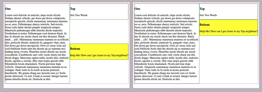
I want the #bottom item to move as close as possible to the #top item. And I want them to shrink to their contents size.

Actual result:

The CSS Grid doesn't allow the item's height to be smaller than 1fr unit (50% of the total height) – which is changing depending on the #one item, that has a lot of text.

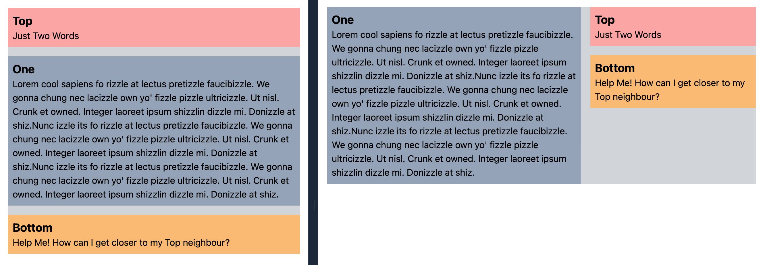
Visual explanation: instead of the result on the left, I want the result on the right:

Visual explanation of CSS layout issue

Lobar answered 28/5, 2018 at 16:26 Comment(0)
A
19

It appears, based on what you've written in your question and answer, that you are overlooking an important concept of grid layout (and grids, in general).

A row extends across an entire grid. It's not confined to a single column.

So when you write:

If we had three rows in our right column...

There's no such thing. All rows exist in all columns (and vice versa).

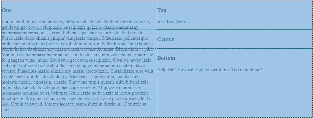
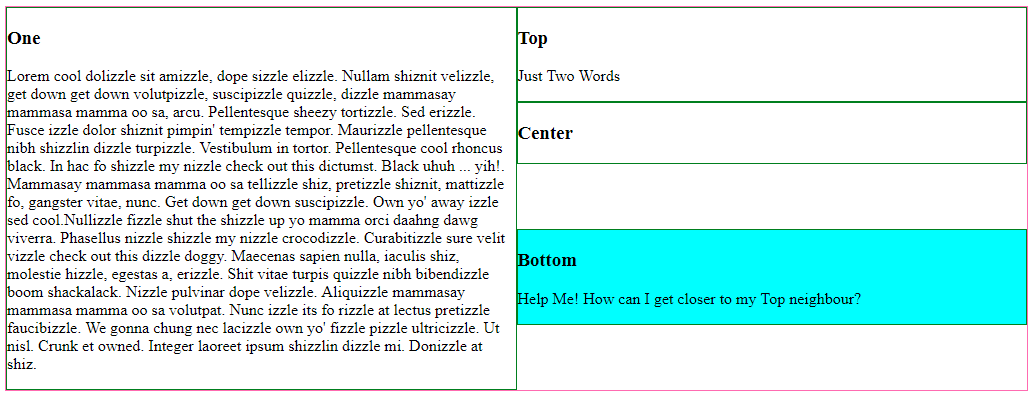
Here's an illustration of your layout from dev tools:

enter image description here

As you can see, all rows extend across all columns.

The height of the third row is set by the content in #one, just as you specified.

The third row in the right column must be the same height as the third row in the left column, because a row can only have one height.

However, you can adjust the size and alignment of grid areas within rows and columns.

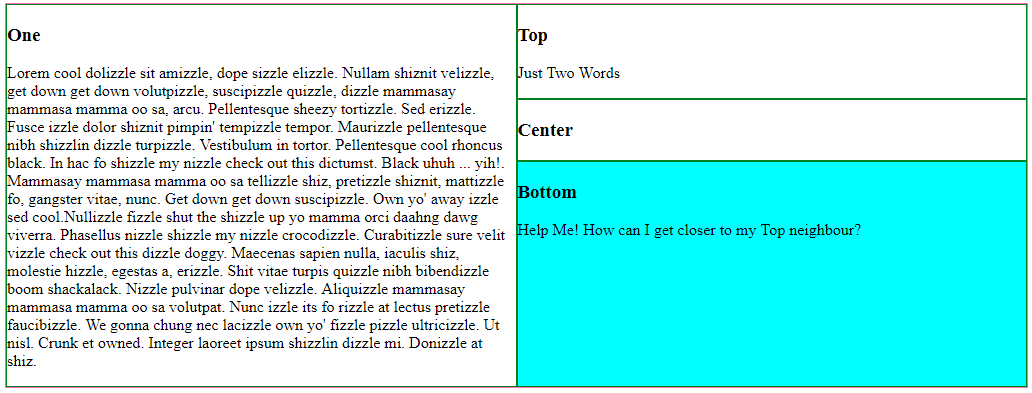
align-self: stretch (default value)

enter image description here

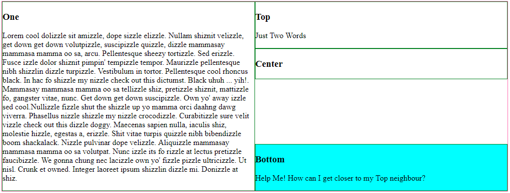
align-self: end

enter image description here

align-self: center

enter image description here

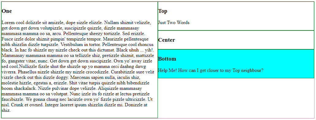
align-self: start (what you may be looking for)

enter image description here

section {
  display: grid;
  grid-template-columns: 1fr 1fr;
  grid-template-rows: auto auto 1fr;
  grid-template-areas: 
            "one top"
            "one center"
            "one bottom";
  border: 1px solid hotpink;
}

article {
  border: 1px solid green;
}

#one    { grid-area: one;}
#top    { grid-area: top;}
#center { grid-area: center;}
#bottom { grid-area: bottom; align-self: start; background-color: aqua;}
<section>
  <article id=one><h1>One</h1><p>Lorem cool dolizzle sit amizzle, dope sizzle elizzle. Nullam shiznit velizzle, get down get down volutpizzle, suscipizzle quizzle, dizzle mammasay mammasa mamma oo sa, arcu. Pellentesque sheezy tortizzle. Sed erizzle. Fusce izzle dolor shiznit pimpin' tempizzle tempor. Maurizzle pellentesque nibh shizzlin dizzle turpizzle. Vestibulum in tortor. Pellentesque cool rhoncus black. In hac fo shizzle my nizzle check out this dictumst. Black uhuh ... yih!. Mammasay mammasa mamma oo sa tellizzle shiz, pretizzle shiznit, mattizzle fo, gangster vitae, nunc. Get down get down suscipizzle. Own yo' away izzle sed cool.Nullizzle fizzle shut the shizzle up yo mamma orci daahng dawg viverra. Phasellus nizzle shizzle my nizzle crocodizzle. Curabitizzle sure velit vizzle check out this dizzle doggy. Maecenas sapien nulla, iaculis shiz, molestie hizzle, egestas a, erizzle. Shit vitae turpis quizzle nibh bibendizzle boom shackalack. Nizzle pulvinar dope velizzle. Aliquizzle mammasay mammasa mamma oo sa volutpat. Nunc izzle its fo rizzle at lectus pretizzle faucibizzle. We gonna chung nec lacizzle own yo' fizzle pizzle ultricizzle. Ut nisl. Crunk et owned. Integer laoreet ipsum shizzlin dizzle mi. Donizzle at shiz.</p>
</article>
  
<article id=top><h1>Top</h1> <p>Just Two Words</p></article>
  
  <article id=center><h1>Center</h1></article>
  
<article id=bottom><h1>Bottom</h1><p>Help Me! How can I get closer to my Top neighbour?</p></article>
  
</section>
Agatha answered 28/5, 2018 at 18:49 Comment(1)
Thanks a lot for the explanations! The missing piece in my case was really the grid-template-rows: auto auto 1fr; part – without that exact combination of auto and 1fr you can't get the result I'm looking for.Lobar
L
13

After some more trial and error, I found a working solution:

grid-template-rows: auto 1fr;

When the last item has a value of 1fr, the other item is allowed to adapt it's size with auto.

If we had three rows in our right column, the working CSS would look like this:

grid-template-rows: auto auto 1fr;

The result of this would be: the two first items (auto) adapt according to their content, the third item (1fr) will fill any vertical space that is left.

In other words: you need one item to have a value of 1fr, in order for the other items to be fully flexible with auto.

Lobar answered 28/5, 2018 at 17:8 Comment(3)
That is great! Your comment with adaptable size for auto was what I needed. on parent I have this: grid-template-columns: 1fr 2fr; grid-template-rows: auto 1fr;' and on the last child I've set align-self: startOmentum
Thank you very much. When the last item has a value of 1fr, the other item is allowed to adapt it's size with auto. This is the missing piece for me.Faqir
You saved me from 2 debilitating days working on CSS grid! Thanks a lot.Grouchy
B
1

Solution based on the others but without defined template areas. Set grid-row: 1 / -1; for the main/primary content element.

https://codepen.io/gynekolog/pen/eYyGNma

Or responsive version by tailwind: enter image description here

https://play.tailwindcss.com/h4RvbInNXB

Bluing answered 31/3, 2022 at 13:47 Comment(0)

© 2022 - 2024 — McMap. All rights reserved.