Best method of spatial interpolation for geographic heat/contour maps?
Asked Answered
C

2

14

I'd like to use something like ggplot2 and ggmap to produce a heat map of arbitrary values such as property prices per metre squared over a geographic area at a street level (with a high resolution).

Unfortunately, the task appears to be rather difficult because while ggplot2 can produce a great density plot, it seems unable to visualise spatial data like this without prior interpolation.

For this, I've used libraries akima (gridded bivariate interpolation for irregular data) and mgcv (generalised additive models with integrated smoothness estimation), however my knowledge of interpolation methods is mediocre at best and the results I've been able to produce aren't satisfactory enough.

Consider the following example:

Data

library(ggplot2)
library(ggmap)

## data simulation
set.seed(1945)

df <- tibble(x = rnorm(500, -0.7406, 0.03),
             y = rnorm(500, 51.9976, 0.03),
             z = abs(rnorm(500, 2000, 1000)))

Map, scatterplot, density plot

## ggmap
map <- get_map("Bletchley Park, Bletchley, Milton Keynes", zoom = 13, source = "stamen", maptype = "toner-background")
q <- ggmap(map, extent = "device", darken = .5)

## scatterplot over map
q + geom_point(aes(x, y), data = df, colour = z)

## classic density heat map
q + 
  stat_density2d(aes(x=x, y=y, fill=..level..), data=df, geom="polygon", alpha = .2) + 
  geom_density_2d(aes(x=x, y=y), data=df, colour = "white", alpha = .4) +
  scale_fill_distiller(palette = "Spectral")

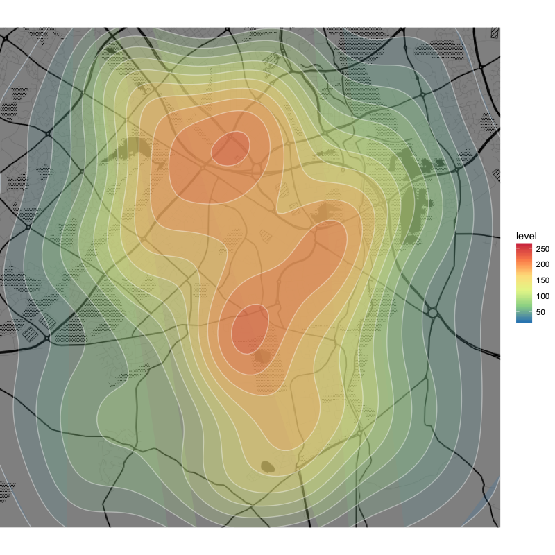
As you can see, the data are rather dense over the chosen area and the density heat map looks great with round edges and closed curves (except for some of the outermost layers).

density plot

Interpolation and plotting using akima

## akima interpolation
library(akima)

df_akima <-interp2xyz(interp(x=df$x, y=df$y, z=df$z, duplicate="mean", linear = T,
                             xo=seq(min(df$x), max(df$x), length=200),
                             yo=seq(min(df$y), max(df$y), length=200)), data.frame=TRUE)

## akima plot
q +
  geom_tile(aes(x = x, y = y, fill = z), data = df_akima, alpha = .4) +
  stat_contour(aes(x = x, y = y, z = z, fill = ..level..), data = df_akima, geom = 'polygon', alpha = .4) +
  geom_contour(aes(x = x, y = y, z = z), data = df_akima, colour = 'white', alpha = .4) +
  scale_fill_distiller(palette = "Spectral", na.value = NA)

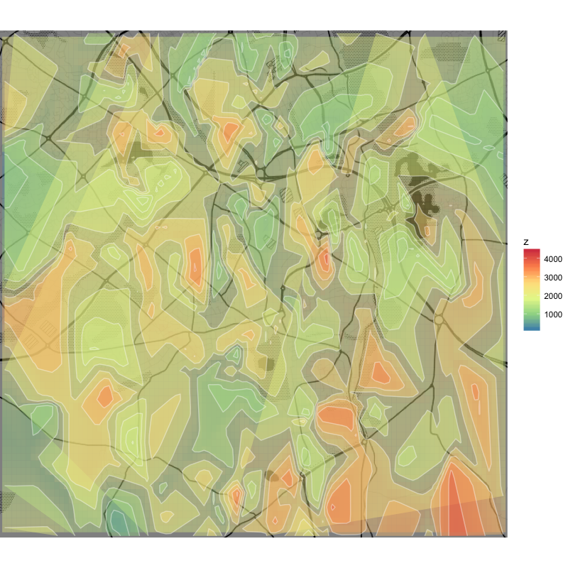
This produces a dense grid of interpolated values (to ensure a sufficient resolution) and while the tile plot underneath is acceptable, the contour plots are too ragged and many of the curves aren't closed.

linear akima

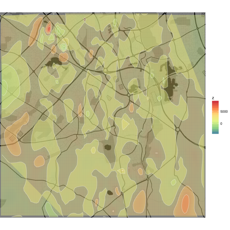
Non-linear interpolation using linear = F is smoother, but apparently sacrifices resolution and goes wild with the numbers (negative values of z).

non-linear akima

Interpolation and plotting using mgcv

## mgcv interpolation
library(mgcv)

gam <- gam(z ~ s(x, y, bs = 'sos'), data = df)
df_mgcv <- data.frame(expand.grid(x = seq(min(df$x), max(df$x), length=200),
                                  y = seq(min(df$y), max(df$y), length=200)))
resp <- predict(gam, df_mgcv, type = "response")
df_mgcv$z <- resp

## mgcv plot
q +
  geom_tile(aes(x = x, y = y, fill = z), data = df_mgcv, alpha = .4) +
  stat_contour(aes(x = x, y = y, z = z, fill = ..level..), data = df_mgcv, geom = 'polygon', alpha = .4) +
  geom_contour(aes(x = x, y = y, z = z), data = df_mgcv, colour = 'white', alpha = .4) +
  scale_fill_distiller(palette = "Spectral", na.value = NA)

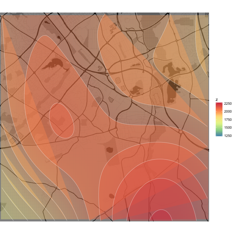
The same process using mgcv results in a nice and smooth plot, but the resolution is much lower and practically all curves aren't closed.

mgcv

Questions

  1. Could you please suggest a better method or modify my attempt to obtain a plot similar to the first one (clean, connected, and smooth lines with high resolution)?

  2. Is it possible to close the curves, e.g. in the last plot (the shaded area should be computed beyond the image boundaries)?

Thank you for your time!

Carberry answered 25/5, 2018 at 16:51 Comment(3)
You might have better response if you post to gis.stackexchange.comLawtun
@Lawtun Thank you for the suggestion! I'll give it some more time here and post there if no solution is found.Carberry
And consider giving bounty to give your question more attention as wellLawtun
A
2

The problem with your maps is not the interpolation method you're using, but the way ggplot displays density lines. Here's an answer to this: Remove gaps in a stat_density2d ggplot chart without modifying XY limits.

The density lines go beyond the map, so any polygon that goes outside the plot area is rendered inappropriately (ggplot will close the polygon using the next point of the correspondent level). This does not show up much on your first map because the interpolation resolution is low.

The trick proposed by Andrew is to first expand the plot area, so that the density lines are rendered correctly, then cut off the display area to hide the extra space. Since I tested his solution with your first example, here's the code:

q + 
  stat_density2d(
    aes(x = x, y = y, fill = ..level..),
    data = df,
    geom = "polygon",
    alpha = .2,
    color = "white",
    bins = 20
  ) + 
  scale_fill_distiller(
    palette = "Spectral"
  ) +
  xlim(
    min(df$x) - 10^-5,
    max(df$x) + 10^-5
  ) +
  ylim(
    min(df$y) - 10^-3,
    max(df$y) + 10^-3
  ) +
  coord_equal(
    expand = FALSE,
    xlim = c(-.778, -.688),
    ylim = c(51.965, 52.03)
  )

The only differences is that I used min()- / max() + instead of fixed numbers and coord_equal to ensure the map wasn't distorted. In addition, I manually specified a greater number of levels (using bin), since by increasing the plot area, stat_density automatically chooses a lower resolution.

As for the best interpolation method, this depends on your objective and the type of data you have. The question is not what is the best method for your map, but what is the best method for your data. This is a very broad issue, out of scope for this space. But here's a good guide: http://www.rspatial.org/analysis/rst/4-interpolation.html

For general ideas on how to make good maps in R using ggplot: http://spatial.ly/r/

Anodic answered 27/5, 2018 at 5:9 Comment(1)
Thank you very much for the thorough answer and please accept my apologies for not responding and accepting it at the time, sir. I upvoted your post and wanted to experiment before responding but then something probably distracted me and I've just found this question almost three years of very sporadic activity around here later.Carberry
A
2

Sorry, I can't run your example at the moment to provide details. But try autoKrige() from automap package.

Kriging is a great method for interpolation. Just be sure that your data fits the requisitions. Here's a good guide: https://gisgeography.com/kriging-interpolation-prediction/

Anodic answered 25/5, 2018 at 23:2 Comment(0)
A
2

The problem with your maps is not the interpolation method you're using, but the way ggplot displays density lines. Here's an answer to this: Remove gaps in a stat_density2d ggplot chart without modifying XY limits.

The density lines go beyond the map, so any polygon that goes outside the plot area is rendered inappropriately (ggplot will close the polygon using the next point of the correspondent level). This does not show up much on your first map because the interpolation resolution is low.

The trick proposed by Andrew is to first expand the plot area, so that the density lines are rendered correctly, then cut off the display area to hide the extra space. Since I tested his solution with your first example, here's the code:

q + 
  stat_density2d(
    aes(x = x, y = y, fill = ..level..),
    data = df,
    geom = "polygon",
    alpha = .2,
    color = "white",
    bins = 20
  ) + 
  scale_fill_distiller(
    palette = "Spectral"
  ) +
  xlim(
    min(df$x) - 10^-5,
    max(df$x) + 10^-5
  ) +
  ylim(
    min(df$y) - 10^-3,
    max(df$y) + 10^-3
  ) +
  coord_equal(
    expand = FALSE,
    xlim = c(-.778, -.688),
    ylim = c(51.965, 52.03)
  )

The only differences is that I used min()- / max() + instead of fixed numbers and coord_equal to ensure the map wasn't distorted. In addition, I manually specified a greater number of levels (using bin), since by increasing the plot area, stat_density automatically chooses a lower resolution.

As for the best interpolation method, this depends on your objective and the type of data you have. The question is not what is the best method for your map, but what is the best method for your data. This is a very broad issue, out of scope for this space. But here's a good guide: http://www.rspatial.org/analysis/rst/4-interpolation.html

For general ideas on how to make good maps in R using ggplot: http://spatial.ly/r/

Anodic answered 27/5, 2018 at 5:9 Comment(1)
Thank you very much for the thorough answer and please accept my apologies for not responding and accepting it at the time, sir. I upvoted your post and wanted to experiment before responding but then something probably distracted me and I've just found this question almost three years of very sporadic activity around here later.Carberry

© 2022 - 2024 — McMap. All rights reserved.