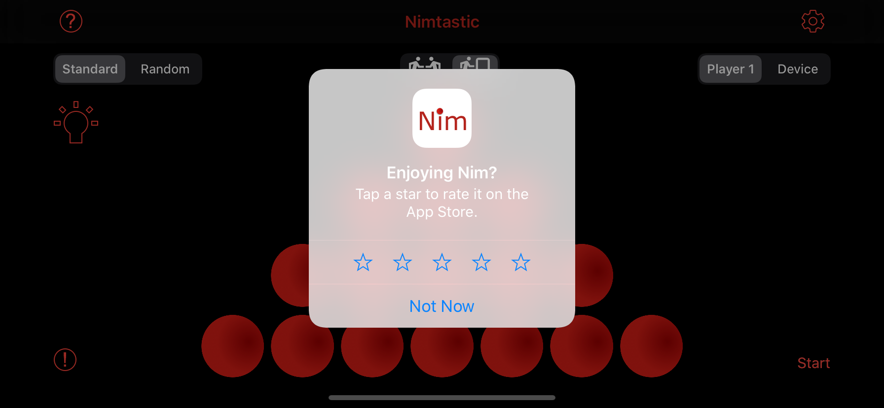
Is there any way to alter the colors/tint of an SKStoreKitReviewController? When I am modifying my apps to support DarkMode, when in dark mode, the presented viewController does not look good.
SKStoreKitReviewController and Darkmode
Asked Answered
IMO it doesn't look bad. Regardless, I don't believe that there is anything you can do; That dialog is presented out of process by iOS and presumably (unless it changes in a subsequent beta) that is what Apple wants it to look like in dark mode –
Expertise
The tintColor is wrong and does not adhere to the global tintColor of the app. The text is the .label color which is white in dark mode. IMO the view itself does not lend itself to the white text and should be black so it is more readable. Either that or change the view. However, if, as you say, it is not modifiable I suppose there is nothing I can do. Too bad because the devil is in the detail and should be fixed. –
Alane
You should definitely submit feedback to Apple using the feedback tool; They may not do anything before iOS 13 is released, but it can't hurt to let them know. –
Expertise
I will do that, just so it can be ignored like the rest of the iOS 13 FB that I have already submitted. There are so many UI issues with iOS 13 :( –
Alane
This doesn't answer your question, but it does provide some background on how that view is structured and why you cannot do anything about it (aside from tell Apple it looks weird): #46132747 –
Erena
I ran into the same issue and it doesn't seem like there's a way to fix it. I guess we'll have to wait for Apple to change it. –
Languet
Which pckageused here to show the reviews and ratings popup –
Tournedos
This issue was resolved in iOS 13.2. The blur effect is dark, just like other system alerts when Dark Mode is enabled.
© 2022 - 2024 — McMap. All rights reserved.

