Is it possible to always have an even number of columns with auto-fill?
Asked Answered
S

3

14

Hey there I am new to CSS grid. Have a look at the following example:

.platform {
  display: grid;
  grid-template-columns: repeat(auto-fit, minmax(100px, 1fr));
  grid-gap: 20px;
}

.item {
  width:100%;
  background-color:#aaa;
  padding:10px;
  box-sizing:border-box;
  text-align:center;
}

.wrapmed {
  max-width:400px;
}

.wrapsmall {
  max-width:300px;
}
<div class="platform">
  <div class="item">a</div>
  <div class="item">b</div>
  <div class="item">c</div>
  <div class="item">d</div>
</div>

<br/><br/>

<div class="wrapmed">
  <div class="platform">
    <div class="item">a</div>
    <div class="item">b</div>
    <div class="item">c</div>
    <div class="item">d</div>
  </div>
</div>

<br/><br/>

<div class="wrapsmall">
  <div class="platform">
    <div class="item">a</div>
    <div class="item">b</div>
    <div class="item">c</div>
    <div class="item">d</div>
  </div>
</div>

Basically the grid works great. However I never want to break the grid such that 3 items are on top and only one item is in the next row.

I want to have either 4 columns, or two colums, or one. (How) can I achieve this behavior?

Edit: The code snippet now shows the three possible cases. Case 2 is unwanted.

Sutphin answered 30/4, 2018 at 15:18 Comment(3)
Basically...no, not the way you have it. auto-fit is doing exactly what you asked it to do. If you don't want this behaviour I'd suggest a re-think.Graybeard
Not with auto-fit / auto-fill. But yes with media queries. jsfiddle.net/d0kroo27Spaniard
@Michael_B Yeah seems like media queries are the only solution :-/ This approach has drawbacks, though.Sutphin
S
10

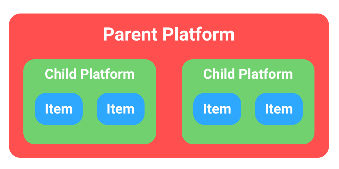
You can nest the platform divs to control how the columns will collapse.

I added a parent platform element that positions two child platform elements either side-by-side or ontop one another.
And I grouped the items in pairs or two inside of the child platform elements.

Now when the screen size shrinks, the child platform elements will stack first creating a 2x2 grid.
If the screen shrinks even more, the items inside the child platforms will stack and create a 1x4 grid.

enter image description here

.platform {
  display: grid;
  grid-template-columns: repeat(auto-fit, minmax(100px, 1fr));
  grid-gap: 20px;
}

.item {
  width:100%;
  background-color:#aaa;
  padding:10px;
  box-sizing:border-box;
  text-align:center;
}

.wrapmed {
  max-width:400px;
}

.wrapsmall {
  max-width:300px;
}
<div class="platform">
  <div class="platform">
    <div class="item">a</div>
    <div class="item">b</div>
  </div>
  <div class="platform">
    <div class="item">c</div>
    <div class="item">d</div>
  </div>
</div>

<br/><br/>

<div class="wrapmed">
  <div class="platform">
    <div class="platform">
      <div class="item">a</div>
      <div class="item">b</div>
    </div>
    <div class="platform">
      <div class="item">c</div>
      <div class="item">d</div>
    </div>
  </div>
</div>

<br/><br/>

<div class="wrapsmall">
  <div class="platform">
    <div class="platform">
      <div class="item">a</div>
      <div class="item">b</div>
    </div>
    <div class="platform">
      <div class="item">c</div>
      <div class="item">d</div>
    </div>
  </div>
</div>
Sternmost answered 1/3, 2020 at 1:25 Comment(4)
Late answer, but great answer ✌Sutphin
This wraps on columns, so if we have a b c d it becomes: a c b d I wonder if it's possible to wrap like this: a b c d Maybe it depends on what raps first, outside columns or inside columns. In my case the inside columns wrap first.Alfonsoalfonzo
You can force the outer columns to wrap first by increasing their minimum width. This min width needs to be at least twice as wide as the inner columns' min width plus padding. Here is an example.Sternmost
Hi @AlexWolski - this is really fantastic work. I'm trying to create something similar but running into a few issues - here's what I've got so far jsfiddle.net/xdw7ma3u/1 • wondering if I've over-engineered this? (the innermost min is to prevent overflow on mobile). I've got a few other Q's around spanning, gutters and trying to avoid hard magic numbers. Any thoughts?Hesse
D
1

Here's another late answer but I thought I'd record this here for future viewers with the same problem! I managed to find a solution that worked a bit better for me taking inspiration from the accepted answer, however using flexbox instead.

I used flexbox rather than CSS Grids as my requirement of this functionality was to have several cards which only collapse down in even numbers but don't go past a maximum width as this would make the cards look weird when the sub-platforms would initially collapse as their containers were too wide and the cards expanded to the width of the grid - i.e. I was restrained to the width of column grid tracks, whereas with flexbox you are not.

(If there was a way to do this with grids please comment to let me know - I tried setting the max-width of the items but then could not get them to centre within the grid cells while also growing between a minimum and maximum width of my choosing)

What I do here is use the same idea of nested containers, however they are not identical like in the accepted answer (note the additional flex property in the sub-container class). I then set my desired minimum item width using the flex-basis property in flex: 1 0 50px and my desired maximum width using max-width: 100px. Therefore I have a flex item that grows between 50-100px.

.container {
  display: flex;
  flex-wrap: wrap;
  gap: 10px;
  justify-content: space-evenly;
}

.sub-container {
  display: flex;
  flex-wrap: wrap;
  gap: 10px;
  justify-content: space-around;
  flex: 1 0 50px;
}

.item {
  flex: 1 0 50px;
  max-width: 100px;
  height: 100px;
  background-color: #aaa;
  padding: 10px;
  text-align: center;
}
<div class="container">
  <div class="sub-container">
      <div class="item">a</div>
      <div class="item">b</div>
  </div>
  <div class="sub-container">
      <div class="item">c</div>
      <div class="item">d</div>
  </div>
</div>
Decarlo answered 5/1, 2022 at 13:0 Comment(0)
O
-4

you could use a psuedo class of even or odd child so .item nth-child(even)

Opportunity answered 30/4, 2018 at 15:21 Comment(1)
Can you post a working example? Cause currently I do not know how this would solve the problem.Sutphin

© 2022 - 2024 — McMap. All rights reserved.