Limit height with distance from page bottom
Asked Answered
B

2

14

I have a webapp with buttons on one side. When I click one of these buttons, *JavaScript magic*, a menu appears next to it. The script knows nothing about positioning or style, it just finds a target element then writes HTML inside.

In short, I have a menu positioned relatively to its parent (#pretty-target in this example).

<div class="container">
    <button class="my-pretty-button">@</button>
    <div class="menu-target" id="pretty-target"></div>
</div>

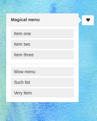
The result looks like this:

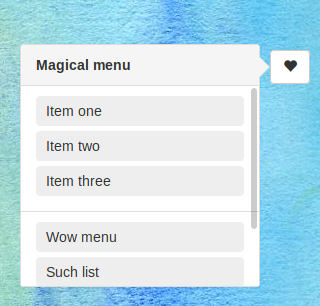
A floating menu next to a button

Now, when I reduce the page height, I would like to limit the height of this menu, depending on its distance from the bottom of the page. A more-than-ideal result would look like this:

The same menu but with its height magically limited

I know the very best practice would be to have a scrollable page body and don't bother about the height of such elements. However, my page body is a map, so any attempt to scroll it would just move the map.

I could certainly craft some alternative thing by using a scrollable overlay, or, even better, by using media queries to choose a better method for displaying these menus. But then, they wouldn't be displayed this way.

Briefly: I have a page-independent div, and I want it to be height-limited by the page height. How could this work (without using JS)?

Borghese answered 31/8, 2017 at 21:16 Comment(0)
R
8

If you are targeting modern browsers, you can use calc and vh to achieve your goal. If you need to place the button in the middle of the screen, just subtract the position of the button from the max-height of .popup.

.wrapper {
  position: absolute;
  top: 80px; /*the position of your floating button*/
  right: 50px;
}

.button {
  display: block;
  width: 50px;
  padding: 10px;
  float: right;
  box-sizing: border-box;
  text-align: center;
  border: 1px solid red;
}

.popup {
  position: absolute;
  max-height: calc(100vh - 50px - 80px); /*modify the value to fit your needs, 80px is the position of your floating button*/
  overflow-y: scroll;
  width: 100px;
  padding: 10px;
  right: 55px;
  top: 0;
  border: 1px solid blue;
}
<div class="wrapper">
  <span class="button">Star</span>
  <div class="popup">
    <p>Option 1</p>
    <p>Option 2</p>
    <p>Option 3</p>
    <p>Option 4</p>
    <p>Option 5</p>
    <p>Option 6</p>
    <p>Option 7</p>
    <p>Option 8</p>
    <p>Option 9</p>
  </div>
</div>
Raper answered 31/8, 2017 at 21:40 Comment(2)
Ok, this would work for a menu at the top of the page, but what if some are in the middle?Borghese
@Borghese I edited my answer. Since you don't want JS solutions, I made the .wrapper position: absolute;, so you can just subtract the value of top from your max-height of .popup. Hope it helps.Raper
H
3

One option is to use viewport units.

Something simple like this should work:

.menu-target {
    max-height: calc(100vh - 100px); /* 100px to match whatever offsets you might need for headers etc */
    overflow-y: scroll;
}

Example jsfiddle.

Hluchy answered 31/8, 2017 at 21:33 Comment(3)
Ok, this would work for a menu at the top of the page, but what if some are in the middle?Borghese
@Borghese This solution is pretty flexible and should work no matter where it's placed. It just relies on you knowing how many pixels from the top it's placed. To make it lower down, change the value. If you don't know, or don't want to hardcode that, you can just use max-height: 60vh; or similar, but that will be less consistent across different browser heights.Hluchy
@Hluchy Thanks! Never thought that would be so easy ;DNovel

© 2022 - 2024 — McMap. All rights reserved.