Reverse order of columns in CSS Grid Layout
Asked Answered
S

10

95

I was hoping to use CSS Grid to reverse the apparent order of two side-by-side divs, where one of the divs grows arbitrarily (I don't want to use floats).

I've created a plunkr here: http://plnkr.co/edit/6WZBnHbwhD7Sjx2ovCO7?p=preview

#container {
  grid-template-columns: 240px 1fr;
  display: grid;
}

.a {
  background: yellow;
}

.b {
  background: blue;
  color: white;
}

#container>.a {
  grid-column: 1;
}

#container>.b {
  grid-column: 2;
}

#container.reverse>.a {
  grid-column: 2;
}

#container.reverse>.b {
  grid-column: 1;
}
<div id="container" class="reverse" style="width: 800px;">
  <div class="a">A</div>
  <div class="b">B</div>
</div>

The crux of it is that when I have the .reverse class applied (so that you should see B | A), B is offset to a new line so it looks more like:

          | A
B

If I invert the document ordering of .a with .b, this goes back to normal (but of course, if I drop the .reverse class, I get the same problem).

Why is this, and how can I address?

Slosh answered 28/7, 2017 at 22:4 Comment(0)
D
74

As the Grid auto-placement algorithm lays out items in the container, it uses next available empty cells (source).

In your source code the A element comes before the B element:

<div id="container" class="reverse" style="width: 800px;">
   <div class="a">A</div>
   <div class="b">B</div>
</div>
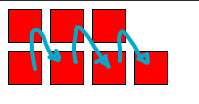
Therefore, the grid container first places A, then uses the next available space to place B.

By default, the auto-placement algorithm looks linearly through the grid without backtracking; if it has to skip some empty spaces to place a larger item, it will not return to fill those spaces. To change this behavior, specify the dense keyword in grid-auto-flow.

http://www.w3.org/TR/css3-grid-layout/#common-uses-auto-placement


grid-auto-flow: dense

One solution to this problem (as you have noted) is to override the default grid-auto-flow: row with grid-auto-flow: dense.

With grid-auto-flow: dense, the Grid auto-placement algorithm will look to back-fill unoccupied cells with items that fit.

#container {
  display: grid;
  grid-template-columns: 240px 1fr;
  grid-auto-flow: dense; /* NEW */
}

7.7. Automatic Placement: the grid-auto-flow property

Grid items that aren’t explicitly placed are automatically placed into an unoccupied space in the grid container by the auto-placement algorithm.

grid-auto-flow controls how the auto-placement algorithm works, specifying exactly how auto-placed items get flowed into the grid.

dense

If specified, the auto-placement algorithm uses a “dense” packing algorithm, which attempts to fill in holes earlier in the grid if smaller items come up later. This may cause items to appear out-of-order, when doing so would fill in holes left by larger items.

#container {
  display: grid;
  grid-template-columns: 240px 1fr;
  grid-auto-flow: dense; /* NEW */
}

.a {
  background: yellow;
}

.b {
  background: blue;
  color: white;
}

#container>.a {
  grid-column: 1;
}

#container>.b {
  grid-column: 2;
}

#container.reverse>.a {
  grid-column: 2;
}

#container.reverse>.b {
  grid-row: 1;
  grid-column: 1;
}
<div id="container" class="reverse" style="width: 800px;">
  <div class="a">A</div>
  <div class="b">B</div>
</div>

grid-row: 1

Another solution would be to simply define the row for the second item.

#container>.b {
  grid-column: 2;
  grid-row: 1; /* NEW */
}

#container {
  display: grid;
  grid-template-columns: 240px 1fr;
}

.a {
  background: yellow;
}

.b {
  background: blue;
  color: white;
}

#container>.a {
  grid-column: 1;
}

#container>.b {
  grid-column: 2;
  grid-row: 1; /* NEW */
}

#container.reverse>.a {
  grid-column: 2;
}

#container.reverse>.b {
  grid-row: 1;
  grid-column: 1;
}
<div id="container" class="reverse" style="width: 800px;">
  <div class="a">A</div>
  <div class="b">B</div>
</div>
Defiance answered 28/7, 2017 at 22:38 Comment(1)
Just wanted to note that dense fills empty spaces from the start of the grid to the end. So if you have two empty spaces preceding your placed grid item, you will fill those left to right.Charters
B
96

The simplest way is to add order: 1 to element B or order: -1 to element A in .reverse

It's also correct CSS rather than hack-y

Borodin answered 6/8, 2021 at 10:21 Comment(3)
This should be higher up. Its an easy fixMidsection
Not only an easy fix, but a correct one. This should be the accepted answer.Esta
This is what order is for developer.mozilla.org/en-US/docs/Web/CSS/order "The order CSS property sets the order to lay out an item in a flex or grid container. Items in a container are sorted by ascending order value and then by their source code order."Dibasic
D
74

As the Grid auto-placement algorithm lays out items in the container, it uses next available empty cells (source).

In your source code the A element comes before the B element:

<div id="container" class="reverse" style="width: 800px;">
   <div class="a">A</div>
   <div class="b">B</div>
</div>

Therefore, the grid container first places A, then uses the next available space to place B.

By default, the auto-placement algorithm looks linearly through the grid without backtracking; if it has to skip some empty spaces to place a larger item, it will not return to fill those spaces. To change this behavior, specify the dense keyword in grid-auto-flow.

http://www.w3.org/TR/css3-grid-layout/#common-uses-auto-placement


grid-auto-flow: dense

One solution to this problem (as you have noted) is to override the default grid-auto-flow: row with grid-auto-flow: dense.

With grid-auto-flow: dense, the Grid auto-placement algorithm will look to back-fill unoccupied cells with items that fit.

#container {
  display: grid;
  grid-template-columns: 240px 1fr;
  grid-auto-flow: dense; /* NEW */
}

7.7. Automatic Placement: the grid-auto-flow property

Grid items that aren’t explicitly placed are automatically placed into an unoccupied space in the grid container by the auto-placement algorithm.

grid-auto-flow controls how the auto-placement algorithm works, specifying exactly how auto-placed items get flowed into the grid.

dense

If specified, the auto-placement algorithm uses a “dense” packing algorithm, which attempts to fill in holes earlier in the grid if smaller items come up later. This may cause items to appear out-of-order, when doing so would fill in holes left by larger items.

#container {
  display: grid;
  grid-template-columns: 240px 1fr;
  grid-auto-flow: dense; /* NEW */
}

.a {
  background: yellow;
}

.b {
  background: blue;
  color: white;
}

#container>.a {
  grid-column: 1;
}

#container>.b {
  grid-column: 2;
}

#container.reverse>.a {
  grid-column: 2;
}

#container.reverse>.b {
  grid-row: 1;
  grid-column: 1;
}
<div id="container" class="reverse" style="width: 800px;">
  <div class="a">A</div>
  <div class="b">B</div>
</div>

grid-row: 1

Another solution would be to simply define the row for the second item.

#container>.b {
  grid-column: 2;
  grid-row: 1; /* NEW */
}

#container {
  display: grid;
  grid-template-columns: 240px 1fr;
}

.a {
  background: yellow;
}

.b {
  background: blue;
  color: white;
}

#container>.a {
  grid-column: 1;
}

#container>.b {
  grid-column: 2;
  grid-row: 1; /* NEW */
}

#container.reverse>.a {
  grid-column: 2;
}

#container.reverse>.b {
  grid-row: 1;
  grid-column: 1;
}
<div id="container" class="reverse" style="width: 800px;">
  <div class="a">A</div>
  <div class="b">B</div>
</div>
Defiance answered 28/7, 2017 at 22:38 Comment(1)
Just wanted to note that dense fills empty spaces from the start of the grid to the end. So if you have two empty spaces preceding your placed grid item, you will fill those left to right.Charters
D
24

I'm not sure how to reverse more grid items. But if you have 2 grid items in your grid, you can simply position 2nd grid item using below code.

#container > .b {
    grid-column-start: 1;
    grid-row-start: 1;
}
Disqualify answered 13/2, 2020 at 7:39 Comment(0)
U
13

I had this same issue just now. I tried auto-row-dense and then set the direction of the container parent to rtl. It worked.

Just this, on the plunker link, seemed to do the trick.

.reverse{
  display: grid;
  grid-template-columns: repeat(2, 1fr);
  grid-auto-flow: dense;
  direction: rtl;
}
Ultra answered 22/5, 2021 at 10:46 Comment(3)
rtl will also flip text and text-align as well, so it's not a really good solution for content.Burns
@RockyKev Upvoting this answer cause it's exactly what I was looking for. Use direction:rtl for the main grid container to reverse the X axis and add direction: ltr in sub elements to revert to initial and desired alignementEnrique
unfortunately, using direction will have unintended side effects and most likely break for any users viewing the page in a rtl languageAutohypnosis
Y
5

Round peg in square hole

Remember even if you're using fancy 'new' grid features the older flex layout will still work. You can combine them, nest them and sometime you have to admit that certain problems like this may just be better solved with good old flex-direction: row-reverse.

But here's another way with grid.

Use named template regions

You can use named template regions and reverse them in the definition.

#container
{
  grid-template-areas: a b;
  grid-template-rows: 240px 1fr;

  display: grid;
}

#container.reverse
{
  // note the order is flipped for both these properties
  grid-template-areas: b a;
  grid-template-rows: 1fr 240px;
}

.a {
  grid-area: a;
  background: yellow;
}

.b {
  grid-area: b;
  background: blue;
  color: white;
}

Here's an more complex example that uses that technique with media queries.

Yakutsk answered 29/6, 2021 at 22:28 Comment(2)
vote for the "Round peg in square hole" - what's the English parallel to EWS? (egg giving wool milk pig?)Ardellaardelle
I think it is “square peg in a round hole”. The other way around works just fine…Virtuosity
E
5

You can use direction property to reverse a grid x-axis order. Nested elements will be reversed too so you have to make sure to add additional styles to fix this behavior.

<div class="grid">
  <div class="grid-item"><div>
</div>

<style>
.grid { direction : rtl; }
.grid-item { direction : ltr; }
</style>

Edit: this may work but could cause accessibilty issues.

Enrique answered 23/1, 2022 at 12:8 Comment(0)
R
2

I want to mention a solution which is also relevant to this question in some cases. When having a multi-row layout, and you want a reversed look of how you grid fills up.

You can play with grid-start combined with some :nth-child & :last-child selectors to achieve a reverse auto flow.

Reversed grid-auto-flow: column

enter image description here

.container{
  display: grid;
  width: 10rem;
  gap: 0.5rem;
  grid-template-rows: repeat(2, 1fr);
  grid-auto-flow: column; /* => vertical grid*/
}

/* REMOVE THIS TO SEE THE DIFFERENCE */
.pixel:nth-child(odd):last-child { /* reversed auto-flow: column */
  grid-row-start: 2;
}

.pixel{
  width: 2rem;
  height: 2rem;
  background: red;
  border: 1px solid black
}
<div class="container">
  <!-- ADD/REMOVE SOME PIXELS to see the result  -->
  <div class="pixel"></div>
  <div class="pixel"></div>
  <div class="pixel"></div>
  <div class="pixel"></div>
  <div class="pixel"></div>
  <div class="pixel"></div>
  <div class="pixel"></div>
</div>

Reversed: horizontal & vertical

enter image description here

.container{
  display: grid;
  width: 10rem;
  gap: 0.5rem;
  grid-template-rows: repeat(2, 1fr);
  grid-auto-flow: column; 
  direction: rtl;  /* reversed horizontal */
}

/* REMOVE THIS TO SEE THE DIFFERENCE */
.pixel:nth-child(odd):last-child { /* reversed vertical */
  grid-row-start: 2;
}

.pixel{
  width: 2rem;
  height: 2rem;
  background: red;
  border: 1px solid black
}
<div class="container">
  <!-- ADD/REMOVE SOME PIXELS to see the result  -->
  <div class="pixel">1</div>
  <div class="pixel">2</div>
  <div class="pixel">3</div>
  <div class="pixel">4</div>
  <div class="pixel">5</div>
  <div class="pixel">6</div>
  <div class="pixel">7</div>
</div>
Resolute answered 14/4, 2022 at 7:39 Comment(0)
S
1

I found out: I need to apply grid-auto-flow: dense; on the container:

#container {
  grid-template-columns: 240px 1fr;
  display: grid;
  grid-auto-flow: dense;
}

According to MDN, this algorithm attempts to fill in holes earlier in the grid.

Slosh answered 28/7, 2017 at 22:8 Comment(0)
R
-1

If you are using something like SCSS, you can use:

#container {
  direction: rtl;
  & > * {
    direction: ltr;
  }
}

Note that in rtl locales, you will probably want to add:

[dir='rtl'] #container {
  direction: ltr;
  & > * {
    direction: rtl;
  }
}
Remorseful answered 14/3, 2023 at 17:57 Comment(2)
This is a hacky "solution" and an inappropriate hijacking of the language direction property. It's semantically incorrect and may lead to unexpected consequences since it's not the intended use.Bermuda
That's the only method that worked for me when combining it with grid-template-columns: repeat(auto-fit, ...) for responsiveness. I wanted the items to flip horizontally, not vertically.Odoacer
Q
-5

I found out: I need to apply grid-auto-flow: dense; on the container:

Quadriceps answered 26/11, 2020 at 16:8 Comment(1)
Isn't that what this accepted Answer by Michael Benjamin and this Answer by Rob is also saying?Bistre

© 2022 - 2024 — McMap. All rights reserved.