Using a custom gradient fill based on two different columns
Asked Answered
R

1

2

I am trying to have two different fill colors for each US state based on two different columns of my dataset. For this, I am using the counties and coloring half of them which are below the state centroid based on Qt column and another half based on Apo.

This is my data:

read.table(text = "State     Apo    Qt
NJ  1     10
MO  2     20
SD  3     30
NY  4     40
FL  5     50
OK  6     60
NE  7     70
KY  8     80
ME  9     90
CA  10  100
NC  11  110
MA  12  120
CT  13  140", header = T, stringsAsFactor = F) -> ex1

Here I am getting the US maps (with and without counties). Then, I join the county map with my dataset based on comparing the centroid of each county to its corresponding state (to decided whether to join Apo or Qt).

library(tidyverse)
library(usmap)
library(RColorBrewer)

#preparing data for join
ex1 %>% 
  pivot_longer(-State) -> ex_1_long

# geo dataset of US states map and US counties map
us <- usmap::us_map()
usc <- usmap::us_map(regions = "counties")

## creating a polygon dataframe with counties and values from my dataset
## (lower half of the state gets Apo and upper half gets Qt)
usc %>% 
  # getting counties centroid
  group_by(full, county) %>% 
  mutate(county.y.center =  mean(range(y))) %>% 
  # getting states centroid
  group_by(full) %>% 
  mutate(state.y.center =  mean(range(y))) %>% 
  # deciding whether to have Apo or Qt by comparing State and County centroids
  mutate(var = ifelse(state.y.center > county.y.center, "Apo", "Qt")) %>% 
  left_join(ex_1_long, ., by = c("State" = "abbr", "name" = "var")) %>% 
  pivot_wider(names_from = "name", values_from = "value") -> usc_map_ex

Then, I use usc_map_ex for plotting and deciding the fill colors.

## a color pallete
## I want the lower half (Apo) to have a shade of blue and upper half to be in Greens
mcolor <- c(colorRampPalette(brewer.pal(3, "Greens"))(3), 
            colorRampPalette(brewer.pal(3, "Blues"))(3))

## plot
ggplot() + 
  # polygon for Qt
  geom_polygon(data = {usc_map_ex %>% filter(is.na(Apo))},
               aes(x,y, group = group, fill = (Qt), color = "")) +
  # polygon for Apo (multiplyong by three to have a different range of values than Qt)
  geom_polygon(data = {usc_map_ex %>% filter(is.na(Qt))},
               aes(x,y, group = group, fill = (Apo)*3, color = "")) + 
  # adding the outline of each state
  geom_polygon(data = us,
               aes(x,y, group = group), fill = NA, color = "black")  +
  # removing the outline of counties
  scale_colour_manual(values = 'transparent', guide = "none")  +
  # custom fill gradient to have different shades of colors for each variable
  scale_fill_gradientn(name = "test",
                       breaks = c(0,5,15, 20, 270, 540),
                       labels = c(0,5,15, 7, 90, 180),
                       values = c(0,5,15, 20, 270, 540) / 540,
                       #limits = c(0, 540),
                       colors = mcolor,
                       guide = guide_colorbar(barwidth = 0.8, barheight = 18), 
                       trans = "log") +
  
  theme_void()    

Created on 2022-09-13 by the reprex package (v2.0.1)

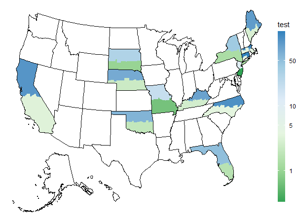
As you can see, I only have the shade of blue. I thought by adding values argument to scale_fill_gradientn I can get it to have the desired colors for the intended values, but I cannot get it to work. How can I assign the colors from my palette explicitly?

I am definitely open to a better solution altogether which would achieve the final plot (coloring each half of the states according to a different column).

Realistic answered 14/9, 2022 at 3:6 Comment(0)
V
3

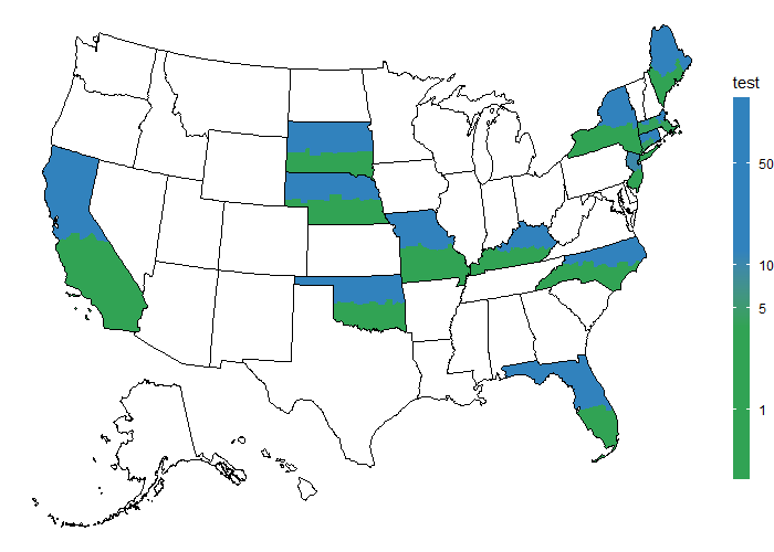
Here is an option without changing too much your code. I would divide the Apo by 3 instead of multiplying, like so all Apo are <5 and Qt>10:

> unique(usc_map_ex$Qt)
 [1]  NA  10  20  30  40  50  60  70  80  90 100 110 120 140
> unique(usc_map_ex$Apo)/3
 [1] 0.3333333        NA 0.6666667 1.0000000 1.3333333 1.6666667 2.0000000 2.3333333 2.6666667 3.0000000 3.3333333 3.6666667 4.0000000 4.3333333

Then for the plot itself perhaps solid colors would be better than the palette so I just set the color to the last of your brewer.pal() call.

mcolor <- c(rep("#31A354", 3), rep("#3182BD", 3))

## plot
ggplot() + 
  # polygon for Qt
  geom_polygon(data = {usc_map_ex %>% filter(is.na(Apo))},
               aes(x,y, group = group, fill = (Qt), color = "")) +
  # polygon for Apo (multiplyong by three to have a different range of values than Qt)
  geom_polygon(data = {usc_map_ex %>% filter(is.na(Qt))},
               aes(x,y, group = group, fill = (Apo)/3, color = "")) + 
  # adding the outline of each state
  geom_polygon(data = us,
               aes(x,y, group = group), fill = NA, color = "black")  +
  # removing the outline of counties
  scale_colour_manual(values = 'transparent', guide = "none")  +
  # custom fill gradient to have different shades of colors for each variable
  scale_fill_gradientn(name = "test",
                       breaks = c(1,5,10, 50),
                       colors = mcolor,
                       guide = guide_colorbar(barwidth = 0.8, barheight = 18), 
                       trans = "log") +
  
  theme_void()

enter image description here

Update with color shade

If you want the color shade from your code you would need to reverse order (rev). Currently the greens are going light to dark then blues light to dark again. By reversing the order of the greens, your color vector become dark green to light green/blue to dark blue. Plus I don't think you need the colorRampPalette as the 3 colors are already a palette. New color vector :

mcolor <- c(rev(brewer.pal(3, "Greens")), brewer.pal(3, "Blues"))

enter image description here

Update 2 reverse order:

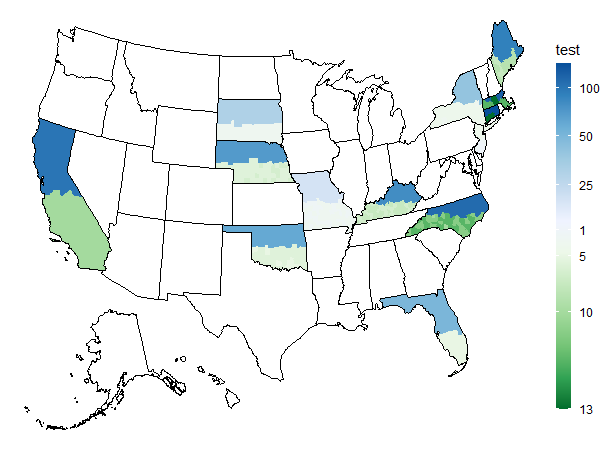
This way is probably best to highlight your data. By reverting the second set so the extreme value are in the darkest colors rather than light. (keep in mind that there is a little bias for the "Qt" as the 1 on the scale is effectively 13 for Qt value but that remain the lowest one therefore light color).

ggplot() + 
  # polygon for Qt
  geom_polygon(data = {usc_map_ex %>% filter(is.na(Apo))},
               aes(x,y, group = group, fill = (Qt), color = "")) +
  # polygon for Apo (multiplyong by three to have a different range of values than Qt)
  geom_polygon(data = {usc_map_ex %>% filter(is.na(Qt))},
               aes(x,y, group = group, fill = rev(Apo), color = "")) + 
  # adding the outline of each state
  geom_polygon(data = us,
               aes(x,y, group = group), fill = NA, color = "black")  +
  # removing the outline of counties
  scale_colour_manual(values = 'transparent', guide = "none")  +
  # custom fill gradient to have different shades of colors for each variable
  scale_fill_gradientn(name = "test",
                       breaks = c(1, 4,9, 13,25, 50, 100),
                       labels = c(13, 10,5, 1,25, 50, 100),
                       colors = mcolor,
                       guide = guide_colorbar(barwidth = 0.8, barheight = 18), 
                       trans = "log") +
  theme_void()

enter image description here

Vivienviviene answered 14/9, 2022 at 6:6 Comment(4)
Thank you, but I need the color shades to show the correlation.Realistic
I edited the answer to include the color shading, you just need to revert the order of the first palette to have the gradient going from dark to light to dark.Vivienviviene
This is great. Just to be completely right, please add labels to scale_fill... to reflect the right vales instead of the ones divided by three. I'll accept your answer shortly.Realistic
I modified in a way that the highest "Apo" value will be darkest by reversing the order, see update.Vivienviviene

© 2022 - 2024 — McMap. All rights reserved.