ggplot2 polar plot arrows
Asked Answered
S

1

6

I can use ggplot2 easily to draw a graph like below:

1

In fact, for my data, it is like below:

degree  value
1   120 0.50
2   30  0.20
3   -120    0.20
4   60  0.50
5   150 0.40
6   -90 0.14
7   -60 0.50
8   0   0.60

The first column is the degree (from -180 to 180 or from 0 to 360), the second column is the corresponding values. So I want to draw a graph point from (0,0) to each my data point with arrow but with a circular coordinate as below:
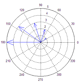
2
(source: matrixlab-examples.com)

I try to use follow code:

base <- ggplot(polar, aes(x=degree, y=value))
p <- base + coord_polar()
p <- p + geom_segment(aes(x=0, y=0, xend=degree, yend=value ),      arrow=arrow(length=unit(0.3,"cm")) )
print(p)

It produced a polar plot, but I did not get the straight arrow from (0,0) to my data points.

I also try to use plotrix package to draw this graph. It works like below:

3 http://rgm2.lab.nig.ac.jp/RGM_results/plotrix:polar.plot/polar.plot_001_med.png

I can not import arrow in this graph.

How to add arrows using the plotrix package, or how to draw it with ggplot2?

Summation answered 9/5, 2012 at 12:3 Comment(1)
Have a look at this post: #42277273Beira
R
13

Set up data (from dput):

polar <- structure(list(degree = c(120L, 30L, -120L, 60L, 150L, -90L, 
-60L, 0L), value = c(0.5, 0.2, 0.2, 0.5, 0.4, 0.14, 0.5, 0.6)), .Names = c("degree", 
"value"), class = "data.frame", row.names = c(NA, -8L))

You can get the straight lines fairly easily -- you just have to make sure your segments start at degree rather than 0:

library(ggplot2)
base <- ggplot(polar, aes(x=degree, y=value))
p <- base + coord_polar()
p+ geom_segment(aes(y=0, xend=degree, yend=value))

enter image description here Adding arrows, however, makes it look like there may be a bug (?) -- the coordinate transform doesn't get taken into account in computing the angle of the arrows:

library(grid)
p+ geom_segment(aes(y=0, xend=degree, yend=value) ,
                arrow=arrow(length=unit(0.3,"cm")))

enter image description here You can (sort of) hack around this by drawing your own arrowheads:

awid <- 2
p + geom_segment(aes(y=0, xend=degree, yend=value))+
    geom_segment(aes(y=value-0.05,yend=value,x=degree-awid/value,xend=degree))+
    geom_segment(aes(y=value-0.05,yend=value,x=degree+awid/value,xend=degree))

enter image description here

If you look closely, you can see that the arrowheads aren't perfectly straight (the effect is much more obvious if you make awid larger).

Randers answered 9/5, 2012 at 13:47 Comment(3)
Thank you very much! I try several awid values. It seems that awid = 0.5 is much better than 2.Summation
PS it would be a good idea to include expand_limits(x=c(-180,180)) in your code to make sure you get a full axis range ...Randers
PS It indeedly work for expand_limits(), but you can also use scale_x_continuous(limits=c(-180, 180), breaks=c(-90, 0, 90, 180)) to get a better view that show (0, 90, 180, -180)Summation

© 2022 - 2024 — McMap. All rights reserved.