Add sparkline graph to a table
Asked Answered
N

3

14

I am trying to move all my data crunching to Rmarkdown, instead of SPSS+Excel, but can't figure out how to create a table with an appending graph.

Ideal table

In Excel this can be done with Sparklines feature or, as I do it, simply creating a graph and placing it very accurately.

The table above is created with tabular function from Tables package (and Pander). And pasted into Excel to create the graph (and header for graph).

library(tables)
library(pander)
pander( #convert table to rmarkdown table
  tabular( 
  (Species + 1) ~ (n=1) + Format(digits=2) *
         (Sepal.Length + Sepal.Width) * (mean + sd), 
  data = iris),
  caption = "Table 1. Iris") #Heading for table

Has anyone created something like this? Maybe a workaround with the gridExtra package, although I am sceptical that the package can match together table and graph.


Edit - My solution so far.
The HTML is finished. Half way there with the pdf. For doc, I don't think it is possible (copy paste to Excel).

HTML table
First, so R knows if I am rendering a html, pdf or doc. out_type takes the values: "html", "pdf" and "docx". I can use this object in if statements.

out_type <- knitr::opts_knit$get("rmarkdown.pandoc.to")

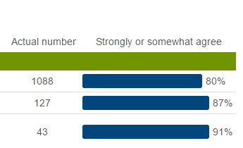
Now the bars:

    if(out_type == "html"){ #if output is html then:
        my_table$Mean_Sepal_Length <- paste0( #I have a table saved as a dataframe. I add a column to it called Mean_Sepal_Length
"<span style=' width: 100%; display: flex;'><span style='display: inline-block; border-radius: 3px; padding-right: 0; background-color: #00457C; width:", #create the bar
        MEAN_SEPAL_L_OBJECT, #set the with of the bar. I have an object with these proportions
"%; margin-right: 5px;'>&nbsp;</span><span>", MEAN_SEPAL_L_VARIABLE, "%</span></span>") #finally add the value behind the bar.
    }

Looks like this

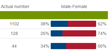
It is also possible to have two columns.

Another possibility

Here again I have a table with proportions, I have two objects that have the proportions of males and females.

    my_table$male_female <- paste0(
"<span style=' width: 100%; display: flex;'><span>", MALE_BAR, #the proportion of males
 "%</span><span style='display: inline-block;border-top-left-radius: 3px; border-bottom-left-radius:3px; padding: 0; background-color: #00457C; width:", MALE_BAR, #width of the bar for males
 "%; margin-left: 5px;'></span><span style='display: inline-block; border-top-right-radius: 3px; border-bottom-right-radius:3px; padding:0; background-color: #AC1A2F; width:",
 FEMALE_BAR, #width of bar for females
 "%;margin-right: 5px;'></span><span>", FEMALE_BAR, #proportion of females
 "%</span></span>")

Of course you can also have the numbers inside the bars if you wish, but it is a problem when the bars are small.

PDF
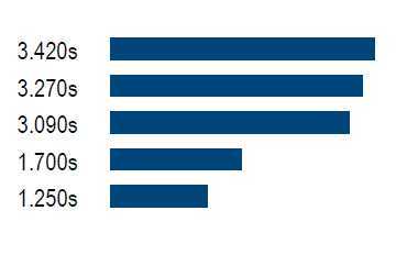
I haven't gotten as far with the pdf. Here is my solution so far:

\begin{tabular}{>{$\rhd$ }lrl}
Loop at line 151 in divergence  & \mybar{3.420}\\
Loop at line 1071 in radiation  & \mybar{3.270}\\
scalar face value               & \mybar{3.090}\\
Loop at line 102 in get         & \mybar{1.700}\\
get sensible enthalpy           & \mybar{1.250}\\
\end{tabular}

PDF bars

It doesn't look as good. I am very new to Latex. I still need to find out how to place the numbers behind the bars. And how to put this into an if statement in my function. If HTML then: if pdf then...

I hope this helps someone. But please, consider the packages mentioned in this thread. They are excellent, my solution is very much based on them. I just could not get exactly what I was looking for with the packages so I did this manually.

Notarial answered 29/9, 2015 at 10:5 Comment(2)
See github.com/htmlwidgets/sparklineJudges
That is a very cool package/widget. How would one go about adding it to a table in rmarkdown, without drawing up the table: in text like is shown on the page. For example this does not work: pander( ddply(iris, "Species", summarise, N = length(Sepal.Length), Mean = mean(Sepal.Length, na.rm=T), Sd = sd(Sepal.Length, na.rm=T), spark = sparkline(Mean)) )Phelgon
J
7

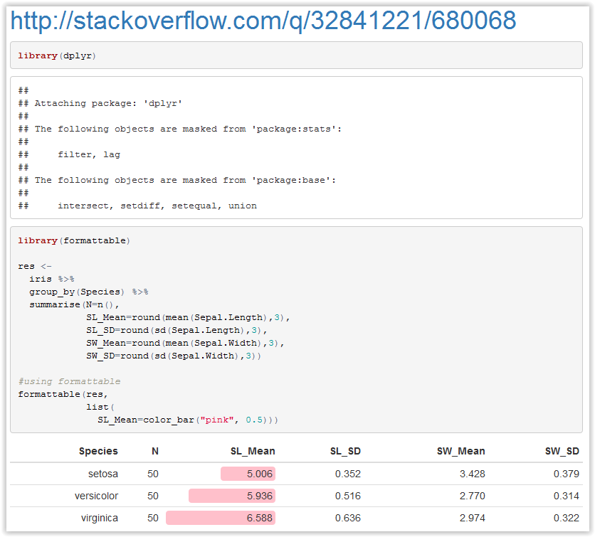
I think what you need is formattable package. There is also an example of mixing sparklines with formattable, but I couldn't adapt it to your needs.

---
title: https://mcmap.net/q/816442/-add-sparkline-graph-to-a-table/680068
---

```{r cars}

library(dplyr)
library(formattable)

res <- 
  iris %>% 
  group_by(Species) %>% 
  summarise(N=n(),
            SL_Mean=round(mean(Sepal.Length),3),
            SL_SD=round(sd(Sepal.Length),3),
            SW_Mean=round(mean(Sepal.Width),3),
            SW_SD=round(sd(Sepal.Width),3))

#using formattable
formattable(res,
            list(
              SL_Mean=color_bar("pink", 0.5)))


```

enter image description here

Judges answered 30/9, 2015 at 8:10 Comment(2)
let me know if you need any additional help with formattable.Pants
@Pants Could you add an example answer with sparklines? 3 sparklines should show line chart per Species group for Sepal.Length.Judges
P
8

Just adding a sparkline example to the previous answer. Hope it helps.

---
title: https://mcmap.net/q/816442/-add-sparkline-graph-to-a-table/680068
---

```{r results="asis"}

library(dplyr)
library(formattable)
library(sparkline)


res <- 
  iris %>% 
  group_by(Species) %>% 
  summarise(N=n(),
            SL_Mean=round(mean(Sepal.Length),3),
            SL_SD=round(sd(Sepal.Length),3),
            SW_Mean=round(mean(Sepal.Width),3),
            SW_SD=round(sd(Sepal.Width),3)) %>%
  mutate(sparkline = as.character(Species))

#using formattable
formattable(
  res,
  list(
    SL_Mean=color_bar("pink", proportion),
    "sparkline"=function(z){
      sapply(
        z,
        function(zz){
          knitr::knit(
            text = sprintf(
              '`r sparkline(c(%s))`',
              paste0(
                iris[which(iris$Species == zz),"Sepal.Length"],
                collapse=","
              )
            ),
            quiet = TRUE
          )
        }
      )
    }
  )
)


```

Also, I thought a non-rmarkdown example might make some folks happy.

library(dplyr)
library(formattable)
library(sparkline)


res <-
  iris %>%
  group_by(Species) %>%
  summarise(N=n(),
            SL_Mean=round(mean(Sepal.Length),3),
            SL_SD=round(sd(Sepal.Length),3),
            SW_Mean=round(mean(Sepal.Width),3),
            SW_SD=round(sd(Sepal.Width),3)) %>%
  mutate("sparkline" = as.character(Species))

#using formattable
ft <- formattable(
  res,
  list(
    SL_Mean=color_bar("pink", proportion),
    "sparkline"=function(z){
      sapply(
        z,
        function(zz){
          sprintf(
            '<span class="sparkline-bar">%s</span>',
            paste0(
              iris[which(iris$Species == zz),"Sepal.Length"],
              collapse=","
            )
          )
        }
      )
    }
  )
)

library(htmlwidgets)
browsable(
  attachDependencies(
    tagList(
      onRender(
        as.htmlwidget(ft),
        "function(el,x){$('.sparkline-bar').sparkline('html',{type:'bar'});}"
      )

    ),
    htmlwidgets:::widget_dependencies("sparkline","sparkline")
  )
)
Pants answered 30/9, 2015 at 18:19 Comment(3)
Is it possible to use formattable with the tabular function from the tables package? I am trying to make a large nested table. I.e. the small example I provide on top. Could I add a bar to that table with formattable?Phelgon
just now seeing this comment. Are you still interested? I have done experiments with formattable and nearly every table package I can find in R.Pants
No problem, thanks for getting back to me. No I am actually not using the tables package any more, so I got this sorted out. Btw thanks for your help; my solution was moslty based of your package.Phelgon
J
7

I think what you need is formattable package. There is also an example of mixing sparklines with formattable, but I couldn't adapt it to your needs.

---
title: https://mcmap.net/q/816442/-add-sparkline-graph-to-a-table/680068
---

```{r cars}

library(dplyr)
library(formattable)

res <- 
  iris %>% 
  group_by(Species) %>% 
  summarise(N=n(),
            SL_Mean=round(mean(Sepal.Length),3),
            SL_SD=round(sd(Sepal.Length),3),
            SW_Mean=round(mean(Sepal.Width),3),
            SW_SD=round(sd(Sepal.Width),3))

#using formattable
formattable(res,
            list(
              SL_Mean=color_bar("pink", 0.5)))


```

enter image description here

Judges answered 30/9, 2015 at 8:10 Comment(2)
let me know if you need any additional help with formattable.Pants
@Pants Could you add an example answer with sparklines? 3 sparklines should show line chart per Species group for Sepal.Length.Judges
M
1

There is also a package called sparkTable, you can create sparkline objects and add them to your markdown object. The objects are like ggplot objects that I'm guessing you can refer to in rmarkdown. But you can also save the objects as pdf, eds, or png.

There is also an sparkTable object that prints a table like you printed.

From the paper (p28):

    ‘‘‘{r, echo=TRUE}
require( sparkTable )
sl <- newSparkLine (values = rnorm (25) , lineWidth = .18, pointWidth = .4,
width = .4, height = .08)
export(sl , outputType = "png", filename = "sparkLine ")
‘‘‘
This is a sparkline included in the ![ firstSparkLine ]( sparkLine.png)
text ...
Mcbee answered 17/11, 2015 at 21:13 Comment(2)
Their paper (p28) in the recent R journal goes into some detail about knitr:Mcbee
Thanks, that's a cool package. I'll give it a try and see if I can get what I am looking for with it.Phelgon

© 2022 - 2024 — McMap. All rights reserved.