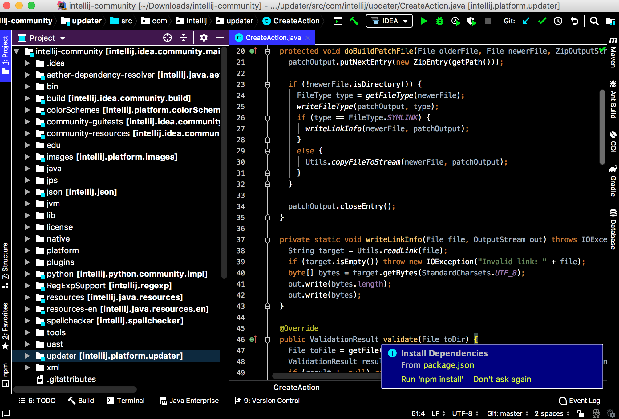
I'm colorblind and, while many themes for IntelliJ editors are just fine, I was wondering if there was a theme developed with the comfort of someone who is colorblind in mind.
The best solution would be to make your own color theme (https://www.jetbrains.com/idea/help/configuring-colors-and-fonts.html) or pick one you like from the internet and edit it to best suit you.
And to answer best your question, there isn't, in my knowledge, a color theme for red-green colorblind BUT there are "soft" color themes, which simply use very little color.
EDIT: Forgot to say that there is also an option (in BETA) to adjust the IDE depending on your color deficiency (http://blog.jetbrains.com/idea/2015/09/intellij-idea-15-eap-help-us-test-the-adjustments-for-color-deficiency/), this may help.
There is also an option in settings to turn on color-blind mode in settings
Settings → Appearance & Behavior → Appearance → Adjust colors for red-green vision deficiency
You can find more details about changes it makes in this document.
UPDATE: As of 2018.3, IDEA has its own high contrast theme. It may be potentially useful in this case. You can access in in
Settings → Appearance & Behavior
The best solution would be to make your own color theme (https://www.jetbrains.com/idea/help/configuring-colors-and-fonts.html) or pick one you like from the internet and edit it to best suit you.
And to answer best your question, there isn't, in my knowledge, a color theme for red-green colorblind BUT there are "soft" color themes, which simply use very little color.
EDIT: Forgot to say that there is also an option (in BETA) to adjust the IDE depending on your color deficiency (http://blog.jetbrains.com/idea/2015/09/intellij-idea-15-eap-help-us-test-the-adjustments-for-color-deficiency/), this may help.
I've had the same problem, no theme seemed to fit my color-blind eye. So I spend some hours creating my own theme. It might not fit you, and it might be ugly, but it works for me :-)
Settings → Appearance & Behavior → Appearance → Theme → Windows 10 Light
... solved the basic problem for me of not being able to read the word 'end' (too faded out) for example in:
print('zoo', end='')
What specifically is that called? And/or what setting would control that word individually? I want to change just that alone as I've grown to like IntelliJ's other choices.
Allow me to take this opportunity to mention to you normies haha love ya that we red-green-not-so-fully-differentiated see color alright (it isn't "blindness"), if the Enchroma glasses give me the right idea I find it kind of overwhelming that your world is so awash in colors, like turning the saturation way up on a TV. For me it's just that pastels are extra dim-ish perhaps, in a manner of speaking, such an unexpected effect from red and green cones picking up some of each other's frequencies. Overlap.
© 2022 - 2024 — McMap. All rights reserved.


