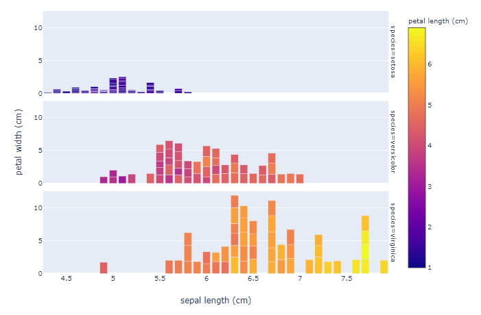
Single axis caption in plotly express facet plot
Asked Answered
I

3

14

I am learning to use pyplot.express and struggle with the following design problem: In faceted plots, the axis title is repeated for every subplot (in the example case 'petal width (cm)'). Is there a way to get a single axis label for all subplots on faceted plots using pyplot.express?

thanks, Michael

Minimal example:

from sklearn.datasets import load_iris
import plotly.express as px
import pandas as pd
import numpy as np

# import iris-data
iris = load_iris()
df= pd.DataFrame(data= np.c_[iris['data'], iris['target']], columns= iris['feature_names'] + ['target'])
df['species'] = pd.Categorical.from_codes(iris.target, iris.target_names)

# plot using pyplot.express
fig = px.bar(df, x="sepal length (cm)", y="petal width (cm)", color = 'petal length (cm)', facet_row="species")
fig.show()

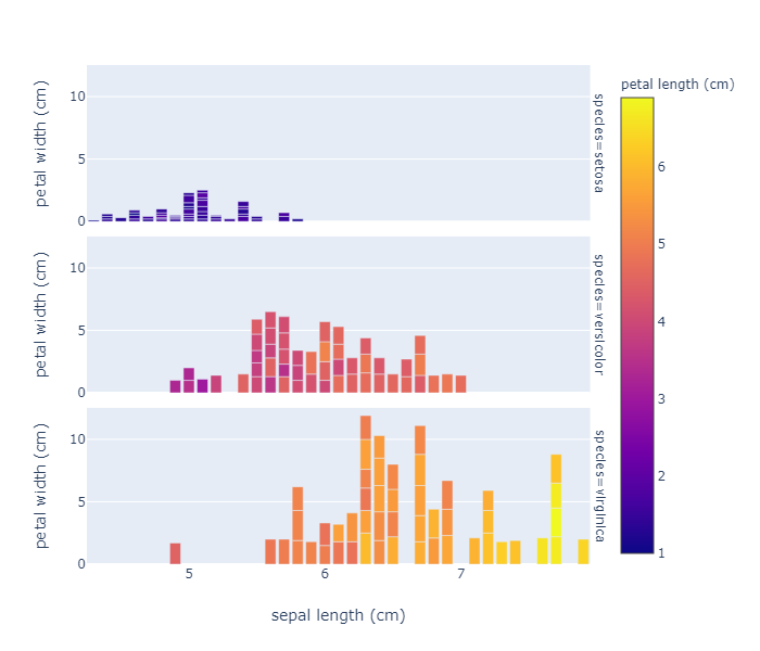
Iris facet plot

Isochromatic answered 30/9, 2019 at 11:29 Comment(0)
I
10

Thanks @vestland that helped alot!

I figured out a way for a more flexible design (multiple facet_rows) based on your answer:

First I needed to remove all subplot axes:

for axis in fig.layout:
    if type(fig.layout[axis]) == go.layout.YAxis:
        fig.layout[axis].title.text = ''

The next step was the to add an Annotation instead of an axis, as the yaxis attribute in the layout always modifies the scaling of one of the axes and messes up the plot. Searching for annotations, I found a link how to add a custom axis. xref='paper' and yref='paper' are required to position the label independently of the subplots.

fig.update_layout(
    # keep the original annotations and add a list of new annotations:
    annotations = list(fig.layout.annotations) + 
    [go.layout.Annotation(
            x=-0.07,
            y=0.5,
            font=dict(
                size=14
            ),
            showarrow=False,
            text="Custom y-axis title",
            textangle=-90,
            xref="paper",
            yref="paper"
        )
    ]
)

pyplot

Isochromatic answered 1/10, 2019 at 14:47 Comment(1)
This worked for me, thank you. I wish there was a simpler way to do it though, this is too much for such a simple thing... weird that plotly doesn't have an option for it.Balmacaan
A
14

For this particular case, after your example snippet, just run

fig['layout']['yaxis']['title']['text']=''
fig['layout']['yaxis3']['title']['text']=''
fig.show()

Or, for a more general approach for multiple subplots, just run:

fig.for_each_yaxis(lambda y: y.update(title = ''))
# and:
fig.add_annotation(x=-0.1,y=0.5,
                   text="Custom y-axis title", textangle=-90,
                    xref="paper", yref="paper")

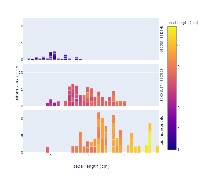
I've also included a title for all y-axes using fig.add_annotation() and made sure it's always placed in the center of the plot by specifying yref="paper"

Plot:

enter image description here

Alenaalene answered 1/10, 2019 at 7:51 Comment(0)
I
10

Thanks @vestland that helped alot!

I figured out a way for a more flexible design (multiple facet_rows) based on your answer:

First I needed to remove all subplot axes:

for axis in fig.layout:
    if type(fig.layout[axis]) == go.layout.YAxis:
        fig.layout[axis].title.text = ''

The next step was the to add an Annotation instead of an axis, as the yaxis attribute in the layout always modifies the scaling of one of the axes and messes up the plot. Searching for annotations, I found a link how to add a custom axis. xref='paper' and yref='paper' are required to position the label independently of the subplots.

fig.update_layout(
    # keep the original annotations and add a list of new annotations:
    annotations = list(fig.layout.annotations) + 
    [go.layout.Annotation(
            x=-0.07,
            y=0.5,
            font=dict(
                size=14
            ),
            showarrow=False,
            text="Custom y-axis title",
            textangle=-90,
            xref="paper",
            yref="paper"
        )
    ]
)

pyplot

Isochromatic answered 1/10, 2019 at 14:47 Comment(1)
This worked for me, thank you. I wish there was a simpler way to do it though, this is too much for such a simple thing... weird that plotly doesn't have an option for it.Balmacaan
G
4

Here's the Plotly native way to do this

    fig.update_yaxes(title='')
    fig.update_layout(yaxis2=dict(title="Custom Title"))
Gorrono answered 22/10, 2021 at 18:55 Comment(2)
But this assumes you always have an odd number of rows, right?Baulk
Ya, it assumes yaxis2 is the most central. So generally you'll have to pick the yaxisN which is best. At least until they add a general yaxis parameter for facet plots. Or if you wanna get hacky with it: fig.update_layout(**{f'yaxis{n_facets // 2 + 1}':dict(title="Custom Title")})Gorrono

© 2022 - 2024 — McMap. All rights reserved.