I have a plotly graph of the EUR/JPY exchange rate across a few months in 15 minute time intervals, so as a result, there is no data from friday evenings to sunday evenings.
Here is a portion of the data, note the skip in the index (type: DatetimeIndex) over the weekend:
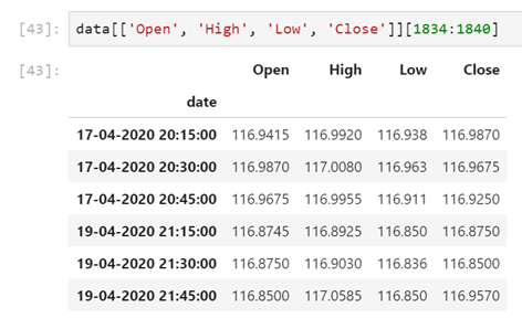
Plotting this data in plotly results in a gap over the missing dates Using the dataframe above:
import plotly.graph_objs as go
candlesticks = go.Candlestick(x=data.index, open=data['Open'], high=data['High'],
                   low=data['Low'], close=data['Close'])
fig = go.Figure(layout=cf_layout)
fig.add_trace(trace=candlesticks)
fig.show()
Ouput:
As you can see, there are gaps where the missing dates are. One solution I've found online is to change the index to text using:
data.index = data.index.strftime("%d-%m-%Y %H:%M:%S")
and plotting it again, which admittedly does work, but has it's own problem. The x-axis labels look atrocious:
I would like to produce a graph that plots a graph like in the second plot where there are no gaps, but the x-axis is displayed like as it is on the first graph. Or at least displayed in a much more concise and responsive format, as close to the first graph as possible.
Thank you in advance for any help!

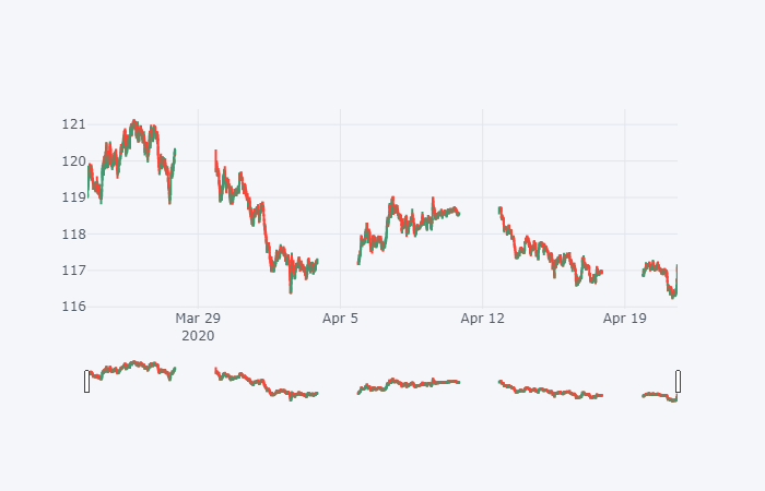
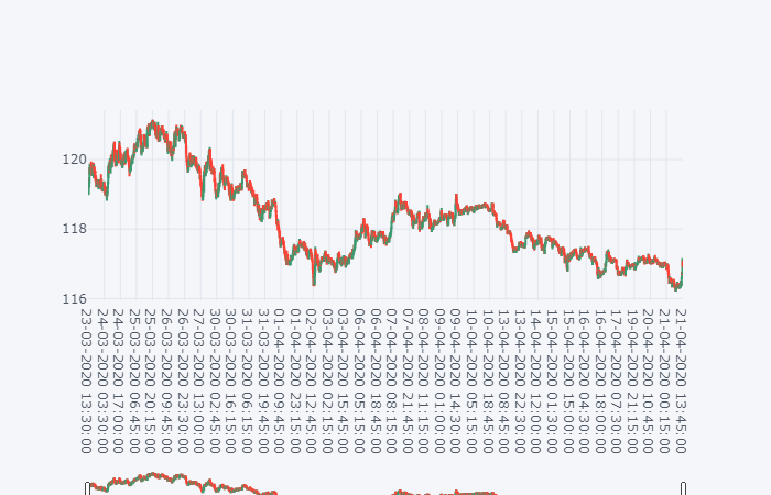
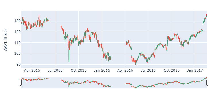
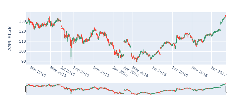
fig.update_layout(xaxis = dict(type="category"))– Operant