plot running average in ggplot2
Asked Answered
S

2

14

I'm hoping to create a plot that shows a running average over a scatterplot of the observed data. The data consists of observations of hares' coat color (Color) over time (Julian).

Color  Julian
50  85
50  87
50  89
50  90
100 91
50  91
50  92
50  92
100 92
50  93
100 93
50  93
50  95
100 95
50  95
50  96
50  96
50  99
50  100
0   101
0   101
0   103
50  103
50  104
50  104
50  104
50  104
100 104
100 104
50  109
50  109
100 109
0   110
0   110
50  110
50  110
50  110
50  110
0   112

A friend wrote a function for me that calculates a running average of the color observations, but I can't figure out how to add the line (haresAveNoNa) into the plot.

The function:

haresAverage <- matrix( NA, max(hares$Julian), 3 )
for( i in 4:max(hares$Julian) ){
  haresAverage[i,1]<-i
  haresAverage[i,2]<-mean( hares$Color[ hares$Julian >= (i-3) &
                                             hares$Julian <= (i+3)]
                              , na.rm=T )
  haresAverage[i,3]<-sd( hares$Color[ hares$Julian >= (i-3) &
                                           hares$Julian <= (i+3)]

                            , na.rm=T )
}
haresAveNoNa <- na.omit( haresAverage)

The plot:

p <- ggplot(hares, aes(Julian, Color))
p  +
  geom_jitter(width = 1, height = 5, color="blue", alpha = .65) 

Can you please help me add the running average 'haresAveNoNa' into the plot? Thanks very much!

Shrew answered 29/11, 2016 at 3:32 Comment(1)
A new package named tidyquant has been added to the R ecosystem and has a geom_ma function included to easily add moving averages to ggplot.Eckenrode
I
33

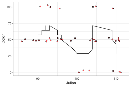
You can calculate the rolling mean using rollmean from the zoo package instead of writing your own function. You can invoke rollmean on the fly, within ggplot, to add the rolling mean line, or you can add the rolling mean values to your data frame and then plot them. I provide examples below for both methods. The code below calculates a centered rolling mean with a seven-day window, but you can customize the function for different window sizes and for a left- or right-aligned rolling mean, rather than centered.

Calculate rolling mean on the fly within ggplot

library(zoo)

ggplot(hares, aes(Julian, Color)) + 
  geom_point(position=position_jitter(1,3), pch=21, fill="#FF0000AA") +
  geom_line(aes(y=rollmean(Color, 7, na.pad=TRUE))) +
  theme_bw()

enter image description here

Add rolling mean to your data frame as a new column and then plot it

To answer your specific question, let's say you actually do need to add the rolling mean line from separate data, rather than calculate it on the fly. If the rolling mean is another column in your data frame, you just need to give the new column name to geom_line:

hares$roll7 = rollmean(hares$Color, 7, na.pad=TRUE)

ggplot(hares, aes(Julian, Color)) + 
  geom_point(position=position_jitter(1,3), pch=21, fill="#FF0000AA") +
  geom_line(aes(y=roll7)) +
  theme_bw()

Add rolling mean to a plot using a separate data frame

If the rolling mean is in a separate data frame, you need to feed that data frame to geom_line:

haresAverage = data.frame(Julian=hares$Julian, 
                          Color=rollmean(hares$Color, 7, na.pad=TRUE))

ggplot(hares, aes(Julian, Color)) + 
  geom_point(position=position_jitter(1,3), pch=21, fill="#FF0000AA") +
  geom_line(data=haresAverage, aes(Julian, Color)) +
  theme_bw()

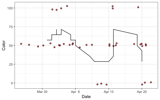
UPDATE: To show date instead of the numeric Julian value

First, convert Julian to Date format. I don't know the actual mapping from Julian to date in your data, so for this example let's assume that Julian is the day of the year, counting the first day of the year as 1, and let's assume the year is 2015.

hares$Date = as.Date(hares$Julian + as.numeric(as.Date("2015-01-01")) - 1)

Now we plot using our new Date column for the x-axis. To customize both the number of breaks and the date labels, use scale_x_date.

ggplot(hares, aes(Date, Color)) + 
  geom_point(position=position_jitter(1,3), pch=21, fill="#FF0000AA") +
  geom_line(aes(y=rollmean(Color, 7, na.pad=TRUE))) +
  theme_bw() +
  scale_x_date(date_breaks="weeks", date_labels="%b %e")

enter image description here

Illinois answered 29/11, 2016 at 3:52 Comment(2)
Thank you so much for your help! The code works great but the line is very spiky (no matter how big of a window). Can a different calculation or a certain curve function create a smoother trend line? I tried geom_smooth with the default method loess but the line dipped below and above the min and max color values during certain periods when all animals had the extreme values or was too smooth when I increased the span value. Also, is it possible to change the x axis to show real date as opposed to Julian date (my data include an additional column Date in the format of MM/DD/YYYY). Thank you!Shrew
I've added an update on how to get date values on the x-axis.Illinois
S
0

Exploit the fact that the "loess" method available in ggplot degenerates to moving average with degree=0, as mentioned in the documentation

ggplot(hares, aes(Date, Color)) + 
      geom_point(position=position_jitter(1,3), pch=21, fill="#FF0000AA") +
          geom_smooth(method=stats::loess, se=F, 
                      method.args=list(degree=0,span=10)) + #degree = zero makes it into a moving average
Sciuroid answered 1/8 at 5:26 Comment(0)

© 2022 - 2024 — McMap. All rights reserved.