Scatterplot with different size, marker, and color from pandas dataframe
Asked Answered
F

3

14

I am trying to do a scatter plot with speed over meters for each point where marker indicate different types, size indicate different weights and color indicate how old a point is over 10 minutes scale. However, I was only able to plot by size so far.

Any help is highly appreciated.

x = {'speed': [10, 15, 20, 18, 19], 'meters' : [122, 150, 190, 230, 300], 'type': ['phone', 'phone', 'gps', 'gps', 'car'], 'weight': [0.2, 0.3, 0.1, 0.85, 0.0], 'old': [1, 2, 4, 5, 8]}

m = pd.DataFrame(x)

plt.scatter(m.meters, m.speed, s = 30* m.weight)

mkr_dict = {'gps': 'x', 'phone': '+', 'car': 'o'}

   meters  speed   type  weight  old
0     122     10  phone    0.20    1
1     150     15  phone    0.30    2
2     190     20    gps    0.10    4
3     230     18    gps    0.85    5
4     300     19    car    0.00    8

Updated question:

I am trying to add colorbar to the color scale based on old. it worked when I plot against the entire dataset but failed after trying to add marker for each subset. Any idea?

plt.scatter(m.meters, m.speed, s = 30* m.weight, c=m.old)
cbar = plt.colorbar(ticks = [0, 5, 10])
cbar.ax.set_yticklabels(['New','5mins', '10mins'])

TypeError: You must first set_array for mappable

Flamboyant answered 18/5, 2015 at 22:37 Comment(0)
P
26

scatter can only do one kind of marker at a time, so you have to plot the different types separately. Fortunately pandas makes this easy:

import matplotlib.pyplot as plt
import pandas as pd
x = {'speed': [10, 15, 20, 18, 19],
     'meters' : [122, 150, 190, 230, 300],
     'type': ['phone', 'phone', 'gps', 'gps', 'car'],
     'weight': [0.2, 0.3, 0.1, 0.85, 0.0],
     'old': [1, 2, 4, 5, 8]}

m = pd.DataFrame(x)
mkr_dict = {'gps': 'x', 'phone': '+', 'car': 'o'}
for kind in mkr_dict:
    d = m[m.type==kind]
    plt.scatter(d.meters, d.speed, 
                s = 100* d.weight, 
                c = d.old, 
                marker = mkr_dict[kind])
plt.show()

enter image description here

.... Where's the car? Well, the weight is 0.0 in the original test data, and we're using weight for marker-size, so: can't see it.

Padgett answered 19/5, 2015 at 0:52 Comment(0)
A
8

If you have just a few points, as here, you can pass a list of floats to the c argument:

colors = ['r', 'b', 'k', 'g', 'm']
plt.scatter(m.meters, m.speed, s=30*m.weight, vmin=0, vmax=10, cmap=cm)

to have your points coloured in the order given. Alternatively, to use a colormap:

cm = plt.cm.get_cmap('hot')  # or your colormap of choice
plt.scatter(m.meters, m.speed, s=30*m.weight, c=m.old, cmap=cm)

To change the marker shapes, you either need to add your own Patches, or add one point at a time: e.g.

markers = ['^', 'o', 'v', 's', 'd']
for px, py, c, s, t in zip(m.meters, m.speed, m.old, m.weight, markers):
    plt.scatter(px, py, marker=t, c=cm(c/10.), vmin=0, vmax=10, s=400*s+100)
plt.show()

enter image description here

(I've scaled the m.weight to a different range to see the 5th point, which would otherwise have size 0.0).

Abstriction answered 19/5, 2015 at 0:0 Comment(0)
I
3
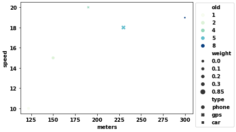
  • The easiest option is to use seaborn, a high-level API for matplotlib
  • See Choosing color palettes for palette options.
  • Tested in python 3.8.11, pandas 1.3.2, matplotlib 3.4.3, seaborn 0.11.2

Axes-level plots

import seaborn as sns
import matplotlib.pyplot as plt

fig, ax = plt.subplots(figsize=(6, 4))

p = sns.scatterplot(data=m, x='meters', y='speed', hue='old', style='type', size='weight', palette='GnBu', ax=ax)
sns.move_legend(p, bbox_to_anchor=(1, 1.02), loc='upper left')

enter image description here

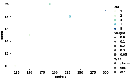
Figure-level plots

  • Use sns.relplot, with kind='scatter' (default)
  • This offers more degrees of plotting by using the col and row parameter to have subplots
p = sns.relplot(data=m, x='meters', y='speed', hue='old', style='type', size='weight', palette='GnBu', height=4, aspect=1.4

enter image description here

Isostasy answered 29/9, 2021 at 14:34 Comment(0)

© 2022 - 2024 — McMap. All rights reserved.