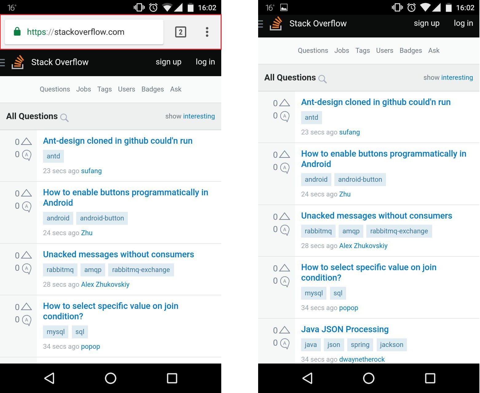
Get Android Chrome Browser Address bar height in JS
Asked Answered
G

5

14

How do I get the height of the address bar in JavaScript in the Chrome browser for Android (marked by red rectangle in left picture)? I need to know that as it disappears while scrolling down and I need to react to that because the viewport height is different then.

enter image description here

One solution I already figured out:

  1. Get viewport height at initial state: var height = Math.max(document.documentElement.clientHeight, window.innerHeight || 0);

  2. Get viewport height when the address bar has disappeared

  3. Compute difference between both values

Problem is that you have to be in the second state to know that.

Galengalena answered 22/6, 2018 at 14:20 Comment(3)
What are you trying to use this for? If your layout is dependant on the height of the screen you might run into problem with phones that have a different ratio. Is there a reason you can not use a responsive height?Catachresis
That's a really specific situation, it would be too complex to go in detail here. And that's not relevant for the question either. If we could concentrate on that straight question of mine, that would be great, thanks!Galengalena
Maybe this could help you? #18138190Catachresis
G
6

Best approach for me was to have something like that:

$(document).ready(function(){   

var viewportHeight = Math.max(document.documentElement.clientHeight, window.innerHeight || 0);
var viewportWidth = Math.max(document.documentElement.clientWidth, window.innerWidth || 0);
var isPortrait = viewportHeight > viewportWidth;

$( window ).resize(onresize);

function onresize() {
        var newViewportHeight = Math.max(document.documentElement.clientHeight, window.innerHeight || 0);
        var newViewportWidth = Math.max(document.documentElement.clientWidth, window.innerWidth || 0);
        var hasOrientationChanged = (newViewportHeight > newViewportWidth) != isPortrait;
        var addressbarHeight = 130;

        if (!hasOrientationChanged && (newViewportHeight != viewportHeight)) {
            addressbarHeight = Math.abs(newViewportHeight - viewportHeight);
            if (newViewportHeight < viewportHeight) {
                // Android Chrome address bar has appeared
            } else {
                // Android Chrome address bar has disappeared
            }
        } else if(hasOrientationChanged) {
            // Orientation change
        }

        viewportHeight = newViewportHeight;
        viewportWidth = newViewportWidth;
        isPortrait = viewportHeight > viewportWidth;
}
});
Galengalena answered 4/7, 2018 at 15:7 Comment(0)
C
20

UPDATE - Dynamic units
Not directly addressing the browser bar height, but addressing the mentioned problem of adapting to the new size.

You can use dynamic viewport units - dvh

The dynamic viewport-percentage units (dv*) are defined with respect to the dynamic viewport size: the viewport sized with dynamic consideration of any UA interfaces that are dynamically expanded and retracted. This allows authors to size content such that it can exactly fit within the viewport whether or not such interfaces are present. (source)


ORIGINAL ANSWER - JavaScript
Because 100vh will be larger than the visible height when the URL bar is shown. According to this.

You can calculate the height of the URL bar by creating a 0-width element with 100vh height.

<div id="control-height"></div>
#control-height {
    height: 100vh;
    width: 0;
    position: absolute;
}

Then using javascript compare window.innerHeight with the height of this element.

const visibleHeight = window.innerHeight;
const fullHeight = document.querySelector('#control-height').clientHeight;

const barHeight = fullHeight - visibleHeight;
Cady answered 14/11, 2020 at 17:45 Comment(0)
C
7

The thing you're are looking for is url bar resizing. Since Android's chrome v56, it's recommended by David Bokan to use vh unit on mobile. There is a demo in that article, clicks the link to get more informations and how to use it on mobile.

When the user is scrolling down the page, a window.resize event is throwed. You could update your page by catching this event with an event listener.

More informations : mobile chrome fires resize event on scroll

Capone answered 22/6, 2018 at 15:15 Comment(3)
Thank you! This is quite interesting even though it's not the answer to my question because i need to react to elements with position: fixed;. Anyway, thanks a bunch!Galengalena
@Galengalena Sorry for not being able to help anymore, I'm glad you were interested :)Capone
vh won't fix his problem, vh and wh for window height not view heightMyranda
G
6

Best approach for me was to have something like that:

$(document).ready(function(){   

var viewportHeight = Math.max(document.documentElement.clientHeight, window.innerHeight || 0);
var viewportWidth = Math.max(document.documentElement.clientWidth, window.innerWidth || 0);
var isPortrait = viewportHeight > viewportWidth;

$( window ).resize(onresize);

function onresize() {
        var newViewportHeight = Math.max(document.documentElement.clientHeight, window.innerHeight || 0);
        var newViewportWidth = Math.max(document.documentElement.clientWidth, window.innerWidth || 0);
        var hasOrientationChanged = (newViewportHeight > newViewportWidth) != isPortrait;
        var addressbarHeight = 130;

        if (!hasOrientationChanged && (newViewportHeight != viewportHeight)) {
            addressbarHeight = Math.abs(newViewportHeight - viewportHeight);
            if (newViewportHeight < viewportHeight) {
                // Android Chrome address bar has appeared
            } else {
                // Android Chrome address bar has disappeared
            }
        } else if(hasOrientationChanged) {
            // Orientation change
        }

        viewportHeight = newViewportHeight;
        viewportWidth = newViewportWidth;
        isPortrait = viewportHeight > viewportWidth;
}
});
Galengalena answered 4/7, 2018 at 15:7 Comment(0)
E
6

Had the same issue today, turns out there is no easy way to figure out the height of the url bar directly. As far as I know, none of the directly accessible variables in javascript can tell you how much the size of "100vh" really is.

On mobile browsers, 100vh may or may not include the height of the url bar, which leaves us in a tricky situation, if we want to size a div to the exact height of the visible content area of the browser during load.

I figured out a workaround though that worked pretty neat for me, here's what I did:

  1. add a dummy property on your html root element with a size of 100vh. In my case, i used the "perspective" attribute, which worked for me
  2. then you can get the address bar size with the following code:

    var addressBarSize = parseFloat(getComputedStyle(document.documentElement).perspective) - document.documentElement.clientHeight
    
Etymon answered 20/2, 2019 at 23:21 Comment(0)
D
4

I had a container with dynamic content that had to always have at least viewport's full height (and be scrollable if the content doesnt fit on the screen).

So if you need a fixed height, just replace "min-height" with "height" in my solution.

That's how I dealt with it.

// calculate min-height on init
$(".content-container").css("min-height", `${window.innerHeight}px`);

// recalculate the min-height everytime the bar appears or disappears
$(window).resize(() => {
    $(".content-container").css("min-height", `${window.innerHeight}px`);
});

It works for android's address bar and also safari's bars (in safari mobile there can be top and the bottom bar aswell).

Then to make the transition smooth, you can apply a css rule:

.content-container{
    transition: min-height 500ms ease;
}
Dink answered 27/2, 2019 at 14:14 Comment(0)

© 2022 - 2024 — McMap. All rights reserved.