I'm new to Android development and also on Android theming/customization that looks to be a wide subject...
I'm trying to give my Switch component a special look & feel, but I don't manage to achieve what I want, avan after looking many resources on internet.
This is driving me crazy!!
Thanks in advance for your help, Android masters !
The context
I work on an existing android application (v1) that was minSdkVersion="8".
Because of this, the application used 3rd-party libraries to get actionbar (ActionBar Sherlock) and switches (SwitchCompatLibrary) :
Today, we are making the v2 version, with minSdkVersion="14".
Our customer also ask us to change the default switch look and feel.
The target is to have thiese switches :


This really looks like the latest material design switches, but with the orange color instead of the "green-blue" color, like here.
The constraints
As we are now minSdk 14, we could remove the 2 libraries "ActionBarSherlock" and "SwitchCompatLibrary", but this is NOT an option. Indeed, we do not have time for that...
Indeed, I tried to add in dependencies in my project's gradle file the appcompat-v7, in order to try using the native switch component with material theme inside (see here) but this gives me errors because of duplicate attributes definitions with the 2 libs mentionned above. So I can't use it, and I'm not sure this should have work...
dependencies {
(...)

compile project(':actionbarsherlock')
compile project(':switchCompatLibrary')
compile files('libs/android-support-v4.jar')

// incompatible avec actionbarsherlock and SwitchCompatLibrary...
// compile "com.android.support:appcompat-v7:22.0.+"

(...)
}
Existing code
So here is the actuel code.
In my layout.xml file, I use the SwitchCompatLibrary switch :
        <de.ankri.views.Switch
            android:id="@+id/switchButtonNotification"
            android:layout_width="wrap_content"
            android:layout_height="wrap_content"
            android:layout_alignParentRight="true" />
In my themes.xml file :
<style name="Theme.Orange" parent="@style/Theme.Sherlock">
    ...
    <!-- Theme switch with SwitchCompatLibrary -->
    <item name="switchStyle">@style/switch_light</item>
    <item name="textAppearance">@style/TextAppearance</item>
</style>
with styling informations defined in the SwitchCompatLibrary itself like this
styles.xml :
<resources xmlns:android="http://schemas.android.com/apk/res/android">

    <style name="switch_light">
        <item name="track">@drawable/switch_track_holo_light</item>
        <item name="thumb">@drawable/switch_inner_holo_light</item>
        <item name="textOn">@string/textOn</item>
        <item name="textOff">@string/textOff</item>
        <item name="thumbTextPadding">12dip</item>
        <item name="switchMinWidth">96dip</item>
        <item name="switchPadding">16dip</item>
        <item name="switchTextAppearance">@style/TextAppearance</item>
    </style>

    <style name="TextAppearance">
        <item name="textColor">?android:attr/textColorPrimary</item>
        <item name="textColorHighlight">?android:attr/textColorHighlight</item>
        <item name="textColorHint">?android:attr/textColorHint</item>
        <item name="textColorLink">?android:attr/textColorLink</item>
        <item name="textSize">16sp</item>
    </style>
</resources>
switch_inner_holo_light.xml
<selector xmlns:android="http://schemas.android.com/apk/res/android">
    <item android:state_enabled="false" android:drawable="@drawable/switch_thumb_disabled_holo_light" />
    <item android:state_pressed="true"  android:drawable="@drawable/switch_thumb_pressed_holo_light" />
    <item android:state_checked="true"  android:drawable="@drawable/switch_thumb_activated_holo_light" />
    <item                               android:drawable="@drawable/switch_thumb_holo_light" />
</selector>
switch_track_holo_light.xml
<selector xmlns:android="http://schemas.android.com/apk/res/android">
    <item android:state_focused="true"  android:drawable="@drawable/switch_bg_focused_holo_light" />
    <item                               android:drawable="@drawable/switch_bg_holo_light" />
</selector>
What I tried
Use the native switch
As I'm now API 14 minimum, I first tried to replace the "de.ankri.views.Switch" with "android.widget.Switch" in my layout.xml, but the styling was not applying anymore (blue activated switch instead or orange)...


However, defining directly in each switch the theme (as described here) seems to work better as I have an orange switch back :
    <Switch
        android:id="@+id/switchButtonNotification"
        android:layout_width="wrap_content"
        android:layout_height="wrap_content"
        tools:checked="true"
        android:thumb="@drawable/switch_inner_holo_light"
        android:track="@drawable/switch_track_holo_light"
        android:layout_alignParentRight="true" />
Strange... I don't know why, so I will not do that and keep "de.ankri.views.Switch" component.
Use the SwitchCompatLibrary switch and do my own styling
Then I tried to keep "de.ankri.views.Switch" component and do the same thing than SwitchCompatLibrary, but overriding the "@style/switch_light" style with my own one, using new drawables for track and thumb
themes.xml :
<style name="Theme.Orange" parent="@style/Theme.Sherlock">
    ...
    <!-- Theme switch with SwitchCompatLibrary -->
    <item name="switchStyle">@style/Switch.Orange</item>
    <item name="textAppearance">@style/TextAppearance</item>
</style>
styles.xml :
<style name="Switch.Orange" parent="@style/switch_light">
    <item name="track">@drawable/switch_track_orange</item>
    <item name="thumb">@drawable/switch_thumb_orange</item>
    <item name="textOn">@string/textOn</item>
    <item name="textOff">@string/textOff</item>
    <item name="thumbTextPadding">12dip</item>
    <item name="switchMinWidth">96dip</item>
    <item name="switchPadding">16dip</item>
    <item name="switchTextAppearance">@style/TextAppearance</item>
</style>
switch_thumb_orange.xml
<selector xmlns:android="http://schemas.android.com/apk/res/android">
    <item android:state_enabled="false" android:drawable="@drawable/switch_thumb_normal_orange" />
    <item android:state_pressed="true"  android:drawable="@drawable/switch_thumb_activated_orange" />
    <item android:state_checked="true"  android:drawable="@drawable/switch_thumb_activated_orange" />
    <item                               android:drawable="@drawable/switch_thumb_normal_orange" />
</selector>
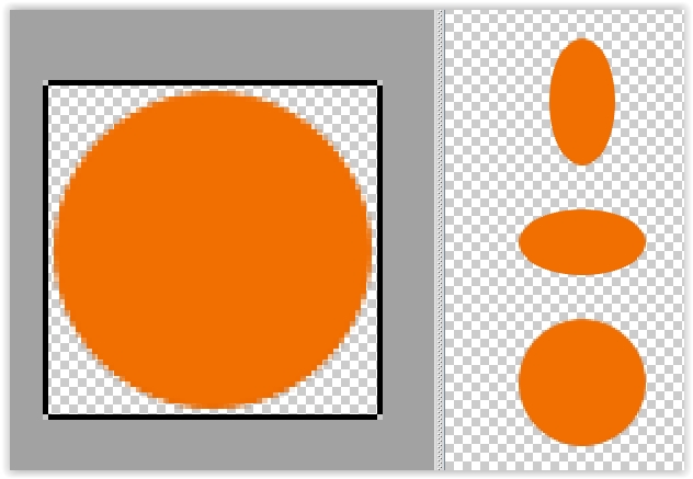
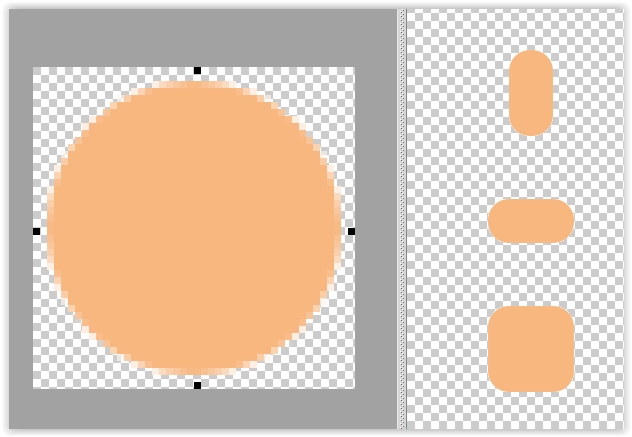
switch_thumb_activated_orange.9.png

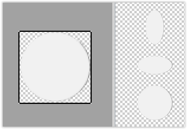
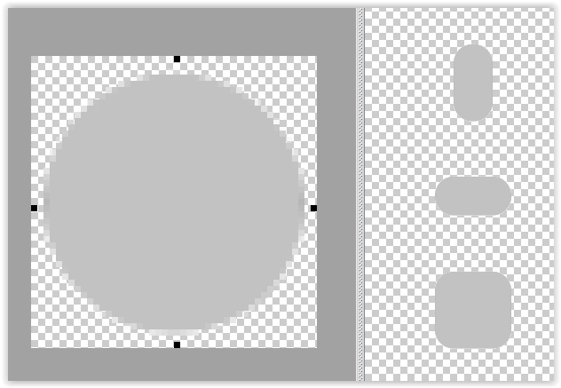
switch_thumb_normal_orange.9.png

switch_track_orange.xml
<selector xmlns:android="http://schemas.android.com/apk/res/android">
    <item android:state_enabled="false" android:drawable="@drawable/switch_track_normal_orange" />
    <item android:state_checked="true" android:drawable="@drawable/switch_track_activated_orange" />
    <item android:state_focused="true"  android:drawable="@drawable/switch_track_activated_orange" />
    <item                               android:drawable="@drawable/switch_track_normal_orange" />
</selector>
switch_track_activated_orange.9.png

switch_track_normal_orange.9.png

Results :
And the result is just AWFUL !! :


Where am I wrong ? I tried to change the "thumbTextPadding", "switchMinWidth" and "switchPadding" in styles.xml, but without good results.
Perhaps my 9-patch files are wrong?


