R: Plotting predictions of MASS polr ordinal model
Asked Answered
S

1

15

I fitted a proportional odds cumulative logit model on ordinal data using MASS's polr function using (in this case on data giving the preference for different kinds of cheese) :

data=read.csv("https://www.dropbox.com/s/psj74dx8ohnrdlp/cheese.csv?dl=1")
data$response=factor(data$response, ordered=T) # make response into ordered factor
head(data)
  cheese response count
1      A        1     0
2      A        2     0
3      A        3     1
4      A        4     7
5      A        5     8
6      A        6     8
library(MASS)
fit=polr(response ~ cheese, weights=count, data=data, Hess=TRUE, method="logistic")

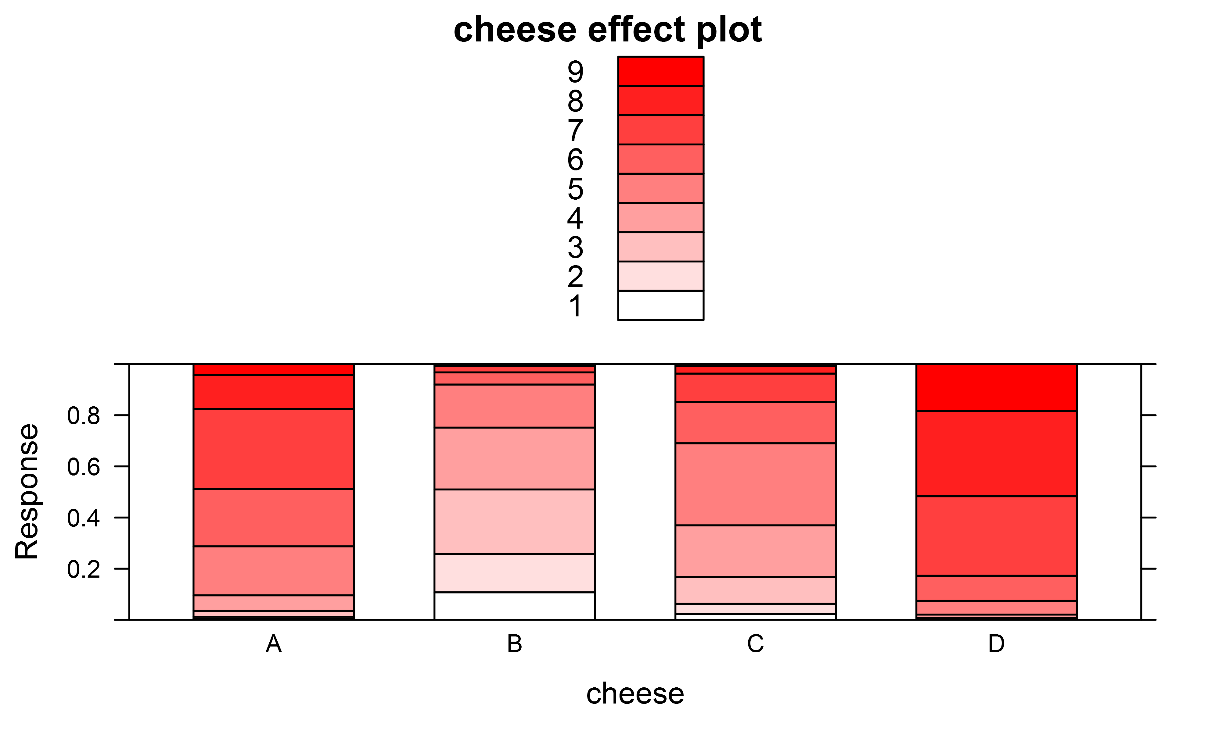
To plot the predictions of the model I made an effect plot using

library(effects)
library(colorRamps)
plot(allEffects(fit),ylab="Response",type="probability",style="stacked",colors=colorRampPalette(c("white","red"))(9))

enter image description here

I was wondering though if from the predicted means reported by the effects package one could also plot something like the mean preference for each kind of cheese together with the 95% conf intervals on this?

EDIT: originally I also asked about how to obtain Tukey posthoc tests, but in the meantime I found that those can be obtained using

library(multcomp)
summary(glht(fit, mcp(cheese = "Tukey")))

or using package lsmeans as

summary(lsmeans(fit, pairwise ~ cheese, adjust="tukey", mode = "linear.predictor"),type="response")
Superscription answered 24/10, 2015 at 9:40 Comment(6)
Interesting question. I'm assuming (as you do) that the problem arises because you take the means after you created the predicted probabilities. See here and here for more on this on SE. Also, with 9 categories, I'd simply go for an OLS on the response variable which produces almost exactly the same point estimates for the mean categories, together w/ sensible standard errors. But it's an interesting question.Annunciata
Yes I think it's got to do with averaging on the cumulative logit scale vs on the final backtransformed scale. So basically I would like to know how to average on the link scale and then backtransform to the original ordinal scale. I know that for 9 categories I could also just do OLS, but I would like a general solution also for fewer categories, e.g. 3 or 4.Superscription
dynamite plots (those bar plots) are just bad statistics. You don't gain any more insights than you do from the wmeans table of summary statistics. and due to the fact that this is just a plot of summary statistics, you lose all of the data that went into making it. plots should show data not summary statistics. I think this solves your problem since you shouldn't be doing it in the first placeSelhorst
Well my question is about how to correctly calculated my wmeans table, not about how to best display it... I am well aware of those bar plot haters, which to be honest I never quite understood, especially not in this case where I display everything over the full response scale...Superscription
The main problem is that your trying to summarize non-normal data based on assumptions that require normality. You could, as you suggested, create the confidence intervals on transformed data and back-transform. Another alternative, though, would be to simply use non-parametric summaries. Perhaps your error bars could be the first and third quartiles, for instance.Forwhy
Ha Russ Lenth just sent me a message pointing out how to do it, see below!Superscription
S
2

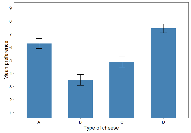
Russ Lenth just kindly pointed out to me that the mean preference and 95% confidence intervals can be obtained simply with lsmeans with option mode="mean" (?models) (the same also applies to a clm or clmm model fit using package ordinal):

df=summary(lsmeans(fit, pairwise ~ cheese, mode = "mean"),type="response")$lsmeans
 cheese mean.class        SE df asymp.LCL asymp.UCL
 A        6.272828 0.1963144 NA  5.888058  6.657597
 B        3.494899 0.2116926 NA  3.079989  3.909809
 C        4.879440 0.2006915 NA  4.486091  5.272788
 D        7.422159 0.1654718 NA  7.097840  7.746478

which gives me the plot I was looking for :

library(ggplot2)
library(ggthemes)
ggplot(df, aes(cheese, mean.class)) + geom_bar(stat="identity", position="dodge", fill="steelblue", width=0.6) + 
     geom_errorbar(aes(ymin=asymp.LCL, ymax=asymp.UCL), width=0.15, position=position_dodge(width=0.9)) + 
     theme_few(base_size=18) + xlab("Type of cheese") + ylab("Mean preference") + 
     coord_cartesian(ylim = c(1, 9)) + scale_y_continuous(breaks=1:9)

enter image description here

Superscription answered 29/2, 2016 at 15:39 Comment(0)

© 2022 - 2024 — McMap. All rights reserved.