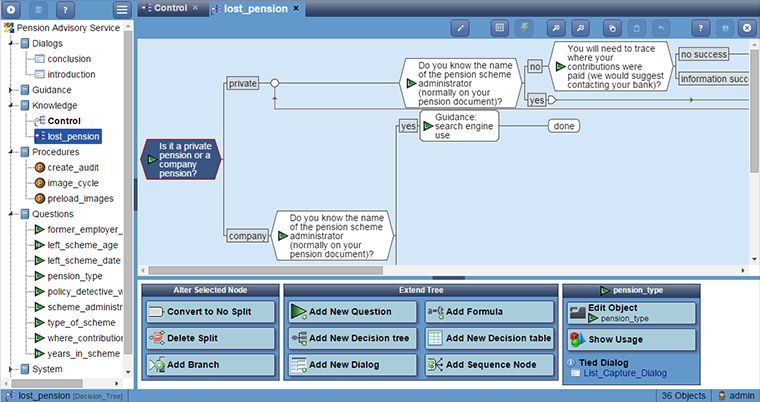
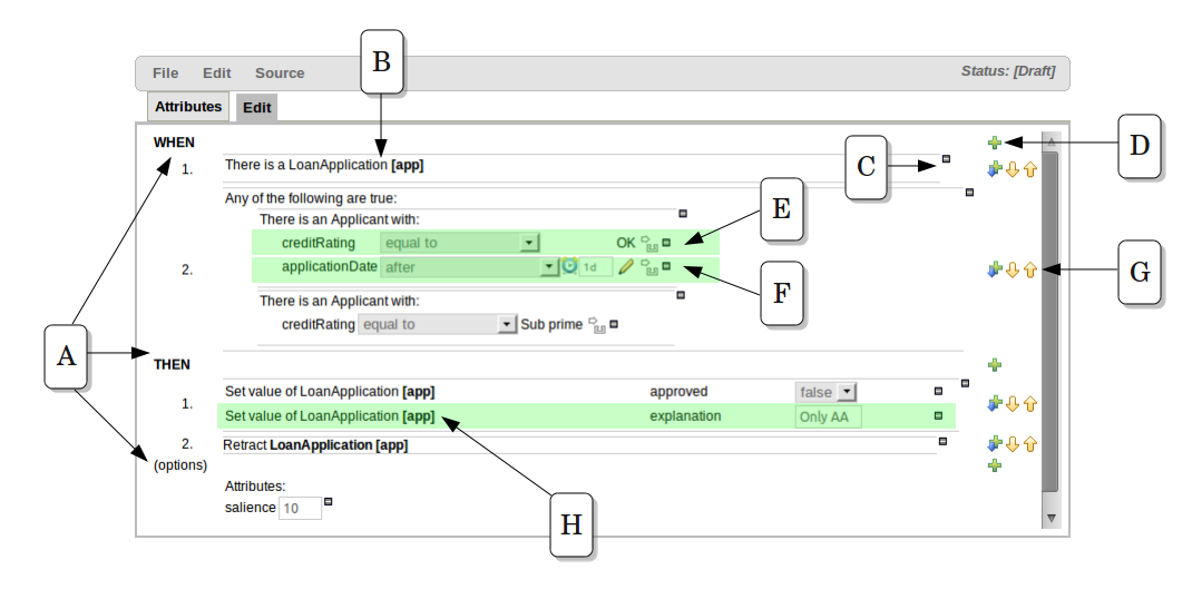
At work, we have optimization engines, and one of the inputs used by these engines are business rules, which we create and edit with a proprietary rule editor.
These rules are of our own proprietary format, because the existing rule engines were not capable of representing the business rules of the complexity we required.
Anyhow, we are more or less happy with the way that the rules engine currently works - it works really well with complex business rules, but are not happy with the user interface (rule editor). Basically this currently consists of a set of tables that are edited, literally, using a complex spreadsheet-like tabular GUI.
While this is functional, it is an atrocious interface to present to end users who are not developers but are the equivalent of business analysts. Before getting my hands dirty, I thought it would be a good idea to ask the StackOverflow community's opinion on user interface design specific to this situation.
My Question
- What are some of the best user interfaces you have seen out in existing rule editors?
- What do you think are the best principles behind the design of user interfaces, in rule editors.
I use the terms rule engine and rule editor separately. For this question, I am concerned only with the rule editor
Other questions on StackOverflow that address rules-engines, but neither rule editors nor their user interface design:


