CSS Grid inside Flexbox not working as expected only on Chrome
Asked Answered
V

2

15

I'm trying to create a flexbox that contains a header and a 2x2 CSS grid.

  • The flexbox (.container) fills the entire viewport.
  • The height of the header is variable. It may change dynamically while the page is open.
  • The four cells in the grid must occupy the remaining part of the viewport and they must have the equal width and height.

Here's what I have now:

html,
body {
  height: 100%;
  padding: 0;
  margin: 0;
}

* { box-sizing: border-box; }

.container {
  height: 100%;
  display: flex;
  flex-direction: column;
  border: 2px solid red;
}

.header {
  background: lime;
}

.grid {
  flex: auto; /* fills the remaining part of the viewport below header */
  background: cyan;
  display: grid;
  grid-template: 1fr 1fr / 1fr 1fr;
  grid-gap: 2px;
}

.cell {
  padding: 10px;
  background: linear-gradient(to bottom right, orange, white);
}
<div class="container">
  <div class="header">Variable Height<br />Header</div>
  <div class="grid">
    <div class="cell a">Cell A</div>
    <div class="cell b">Cell B</div>
    <div class="cell c">Cell C</div>
    <div class="cell d">Cell D</div>
  </div>
</div>

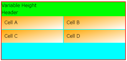
This works as I expect on Firefox, but not on Chrome. Here's the desired behavior:

Desired output

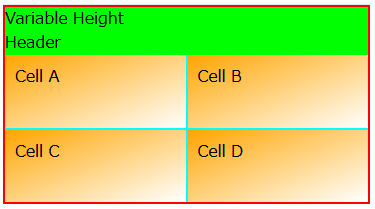
And here's the undesired behavior on Chrome:

Wrong output

The confusing part is that my div.grid (cyan) has a desired height (100vh minus the header height), so the flexbox itself is working correctly. And when I remove the flexbox and the header, the grid itself works as expected outside flexbox, too.

html,
body {
  height: 100%;
  padding: 0;
  margin: 0;
  font-family: sans-serif;
}

* { box-sizing: border-box; }

.container {
  height: 100%;
  background-color: pink;
  border: 2px solid red;
}

.grid {
  height: 100%;
  background: cyan;
  display: grid;
  grid-template: 1fr 1fr / 1fr 1fr;
}

.cell {
  padding: 10px;
  background: linear-gradient(to bottom right, orange, white);
}
<div class="container">
  <div class="grid">
    <div class="cell a">Cell A</div>
    <div class="cell b">Cell B</div>
    <div class="cell c">Cell C</div>
    <div class="cell d">Cell D</div>
  </div>
</div>

So it appears to me that the problem happens only by the combination of Chrome, flexbox and css grid. What am I missing, and how can I fix this? (Please note that including the header in the grid is not an option now.)

Vedis answered 4/10, 2018 at 11:45 Comment(1)
This seems to be a known Chrome bug: bugs.chromium.org/p/chromium/issues/detail?id=784059. @kukkuz's suggestion is the known workaround for it.Disagreement
A
13

Instead of flex: auto on grid, use flex: 1 on it so that the grid, and you have the desired behavior in both Firefox and Chrome. See demo below:

html,
body {
  height: 100%;
  padding: 0;
  margin: 0;
}

* { box-sizing: border-box; }

.container {
  height: 100%;
  display: flex;
  flex-direction: column;
  border: 2px solid red;
}

.header {
  background: lime;
}

.grid {
  flex: 1; /* fills the remaining part of the viewport below header */
  background: cyan;
  display: grid;
  grid-template: 1fr 1fr / 1fr 1fr;
  grid-gap: 2px;
}

.cell {
  padding: 10px;
  background: linear-gradient(to bottom right, orange, white);
}
<div class="container">
  <div class="header">Variable Height<br />Header</div>
  <div class="grid">
    <div class="cell a">Cell A</div>
    <div class="cell b">Cell B</div>
    <div class="cell c">Cell C</div>
    <div class="cell d">Cell D</div>
  </div>
</div>
Amylose answered 4/10, 2018 at 11:53 Comment(2)
This workaround no more works in chrome 83, edge is fine, i am angry.Romanesque
You have to add "height: 100vh; min-height: 0;" to the ".grid"Romanesque
H
0

<style>
    html,
    body {
      height: 100%;
      padding: 0;
      margin: 0;
    }

    * { box-sizing: border-box; }

    .container {
      height: 100%;
      display: flex;
      flex-direction: column;
      border: 2px solid red;
    }

    .header {
      background: lime;
    }

    .grid {
      flex: 1; /* fills the remaining part of the viewport below header */
      background: cyan;
      display: grid;

      grid-template-columns:1fr 1fr;
   
      grid-gap: 2px;
    }

    .cell {
      padding: 10px;
      background: linear-gradient(to bottom right, orange, white);
    }
</style>
    </head>
    </body>
<html>
    </head>
<!-- begin snippet: js hide: false console: true babel: null -->
Humerus answered 1/1, 2022 at 0:51 Comment(1)
Can you give some explanation outside of the code snippet?Algol

© 2022 - 2024 — McMap. All rights reserved.