The following code generates a spectrogram using either scipy.signal.spectrogram or matplotlib.pyplot.specgram.
The color contrast of the specgram function is, however, rather low.
Is there a way to increase it?
import numpy as np
from scipy import signal
import matplotlib.pyplot as plt

# Generate data
fs = 10e3
N = 5e4
amp = 4 * np.sqrt(2)
noise_power = 0.01 * fs / 2
time = np.arange(N) / float(fs)
mod = 800*np.cos(2*np.pi*0.2*time)
carrier = amp * np.sin(2*np.pi*time + mod)
noise = np.random.normal(scale=np.sqrt(noise_power), size=time.shape)
noise *= np.exp(-time/5)
x = carrier + noise
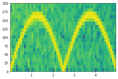
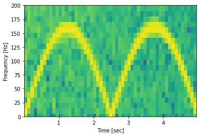
Using matplotlib.pyplot.specgram gives the following result:
Pxx, freqs, bins, im = plt.specgram(x, NFFT=1028, Fs=fs)
x1, x2, y1, y2 = plt.axis()
plt.axis((x1, x2, 0, 200))
plt.show()
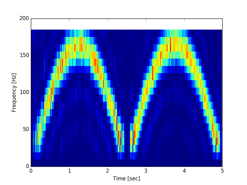
Using scipy.signal.spectrogram gives the following plot
f, t, Sxx = signal.spectrogram(x, fs, nfft=1028)
plt.pcolormesh(t, f[0:20], Sxx[0:20])
plt.ylabel('Frequency [Hz]')
plt.xlabel('Time [sec]')
plt.show()
Both functions seem to use the 'jet' colormap.
I would also be generally interested in the difference between the two functions. Although they do something similar, they are obviously not identical.


matplotlib.pyplot.specgramcontains mainly warm colors (yellow) in the background, whereas thescipy.signal.spectrogram contains rather cold colors (blue) in the background. I would like to achieve scipy's choice of colors for matplotlib'sspecgram` plot. – Bamboozle