Why is 'position: sticky' not working with Core UI's Bootstrap CSS
Asked Answered
R

1

9

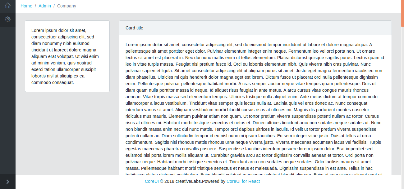
I am trying to build a react dashboard using Core UI's react template found here.

CSS

.top-stick {
    position: sticky !important;
    position: -webkit-sticky;
    top: 5rem;
    overflow-y: auto;
    height: calc(100vh - 5rem);
}

JSX

<div className="animated fadeIn">
  <Row className="app-scrollable-body">
    <Col xs="12" sm="4" md="3" className="top-stick">
      <Card className="toic">
        <CardBody>
          Lorem ipsum dolor sit amet
        </CardBody>
      </Card>
    </Col>
    <Col xs="12" sm="8" md="9">
      <Card>
        <CardHeader>Card title</CardHeader>
        <CardBody>
        Lorem ipsum dolor sit amet
        </CardBody>
      </Card>
    </Col>
  </Row>
  <div className="app-fixed-footer">
    <span>
      <a href="https://coreui.io">CoreUI</a> &copy; 2018
      creativeLabs.
    </span>
    <span className="ml-auto">
      Powered by{" "}
      <a href="https://coreui.io/react">CoreUI for React</a>
    </span>
  </div>
</div>

But on scroll the card does not seem to stick.

On inspecting the CSS is present. Also no overflow: hidden is there in the CSS Tree.

Dash

Rubric answered 21/2, 2019 at 10:9 Comment(0)
C
17

The issue is the use of overflow inside .app-body. It's a bit tricky but there should be no overflow property set to any element between the element that has the scroll and the sticky element.

Here is a basic example to illustrate. The scroll is on the viewport and we have a wrapper with overflow:hidden (or even auto) thus the sticky behavior won't work.

.container {
  display:flex;
  align-items:flex-start;
  border:2px solid green;
}
.content {
  flex:1;
  height:200vh;
  background:red;
  margin:10px;
}
.sticky {
  flex:1;
  height:100px;
  background:blue;
  margin:10px;
  position:sticky;
  top:0;
}

.wrapper {
  overflow:hidden;
  border:2px solid red;
}
<div class="wrapper">
  <div class="container">
    <div class="sticky"></div>
    <div class="content"></div>
  </div>
</div>

If we remove the overflow, it will work as expected:

.container {
  display:flex;
  align-items:flex-start;
  border:2px solid green;
}
.content {
  flex:1;
  height:200vh;
  background:red;
  margin:10px;
}
.sticky {
  flex:1;
  height:100px;
  background:blue;
  margin:10px;
  position:sticky;
  top:0;
}

.wrapper {
  border:2px solid red;
}
<div class="wrapper">
  <div class="container">
    <div class="sticky"></div>
    <div class="content"></div>
  </div>
</div>

If we keep the overflow within the wrapper but we move the scroll to the container element it will also work because there is no element with overflow set between the scroll and the sticky element:

.container {
  display:flex;
  align-items:flex-start;
  border:2px solid green;
  max-height:200px;
  overflow:auto;
}
.content {
  flex:1;
  height:200vh;
  background:red;
  margin:10px;
}
.sticky {
  flex:1;
  height:100px;
  background:blue;
  margin:10px;
  position:sticky;
  top:0;
}

.wrapper {
  overflow:hidden;
  border:2px solid red;
}
<div class="wrapper">
  <div class="container">
    <div class="sticky"></div>
    <div class="content"></div>
  </div>
</div>

Related: What are `scrolling boxes`?

Chilopod answered 21/2, 2019 at 12:0 Comment(1)
In my case I had overflow: auto in Bootstrap's class table-responsiveAdlee

© 2022 - 2024 — McMap. All rights reserved.