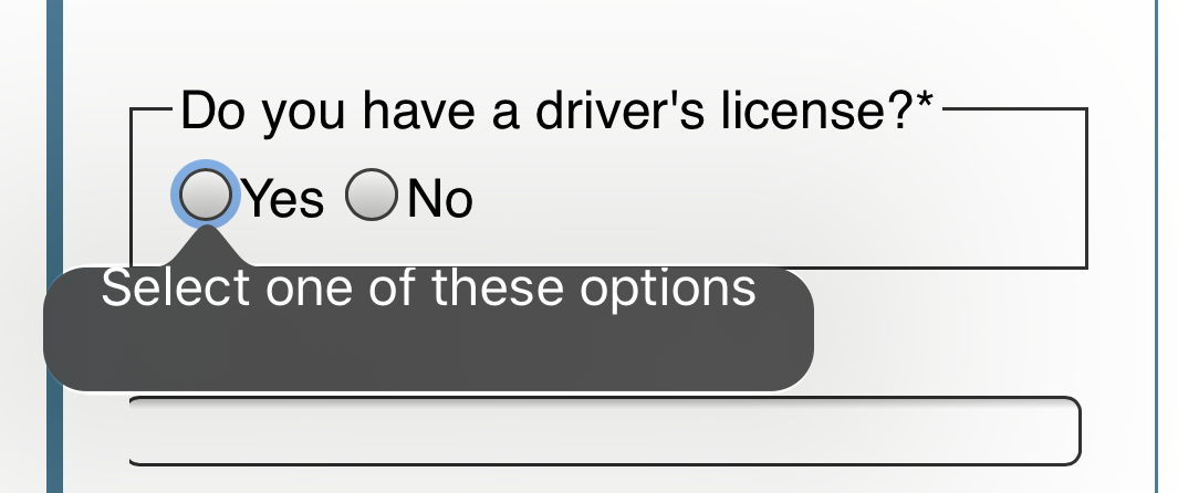
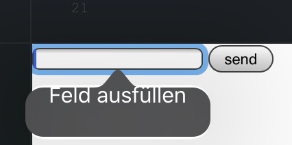
We're using HTML5 form validation without overwriting the default system UI for the validation error messages. This is working fine everywhere but on iOS Safari, where the validation messages are not aligned properly inside the bubble popup. We have tested this on two completely separate devices and with different forms. Even a minimal form with no CSS has the same result:
https://jsfiddle.net/GinSan/48hnrf92/1/
<form>
  <label for="test">Test field</label>
  <input required id="test" name="test" type="text">
  <button type="submit">Submit</button>
</form>
This is what the validation message looks like on the iOS devices we tested:
The validation message is aligned to the top instead of centered, even though this is a system UI element. Is this a known problem? Is there anything that can be done about it, except reporting it to apple and waiting for a fix, or replacing the system validation messages?
My Safari version was Safari / iOS 13.3.1, but after upgrading to 13.5 it is still an issue.


