Add a horizontal discrete legend below the chart in ggvis
Asked Answered
P

2

16

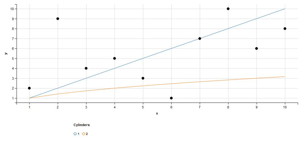
I'd like to make a horizontal legend below the ggvis chart. I can use legend properties to place it below the chart, but don't know how to make the labels horizontal below the legend title. Below is the minimum reproducible code (grabbed from the web).

df1 = data.frame(x=sample(1:10), y=sample(1:10))
df2 = data.frame(x=1:10, y=1:10)
df3 = data.frame(x=1:10, y=sqrt(1:10))

df2$id <- 1
df3$id <- 2
df4    <- rbind(df2,df3)
df4$id <- factor(df4$id)

df4 %>% ggvis(x=~x, y=~y, stroke=~id) %>% layer_lines() %>%
    # make sure you use add relative scales
    add_relative_scales() %>%
    # values for x and y need to be between 0 and 1
    # e.g for the x-axis 0 is the at far-most left point and 1 at the far-right 
    add_legend("stroke", title="Cylinders",
               properties=legend_props(
                   legend=list(
                       x=scaled_value("x_rel", 0.2),
                       y=scaled_value("y_rel", -.2)
                   ))) %>%
    layer_points(x=~x, y=~y, data=df1, stroke:='black') 
Palinode answered 26/5, 2016 at 15:35 Comment(3)
Since this still seems to be an open issue over at the ggvis GitHub developer page, I doubt this is possible without a major hack. But I could be wrong.Carolincarolina
@Carolincarolina Any idea if this feature has been added to ggvis yet?Franctireur
Does my answer seem like what you are looking for?Franctireur
F
0

This is most certainly a hack, but works great:

df4 %>% ggvis(x=~x,y=~y,stroke=~id) %>% layer_lines() %>%
  #make sure you use add relative scales
  add_relative_scales() %>%
  #values for x and y need to be between 0 and 1
  #e.g for the x-axis 0 is the at far-most left point and 1 at the far-right 
  add_legend("stroke", title = "Cylinders", values = c(1, 1),
             properties = legend_props(
               legend = list(
                 x = scaled_value("x_rel", 0.2),
                 y = scaled_value("y_rel", -.2)
               ))) %>%
  add_legend("stroke", title = " ", values = c(2, 2),
             properties = legend_props(
               legend = list(
                 x = scaled_value("x_rel", 0.23),
                 y = scaled_value("y_rel", -.2)
               ))) %>%
  layer_points(x=~x,y=~y,data = df1,stroke:='black') 

enter image description here

Basically, I'm adding another add_legend, setting the title as blank, adjusting the scale_value so that it is very close to the first legend but not overlapping. I then set the first legend with values = c(1,1) and the second with values = c(2,2) so that the two values stack on top of each other. This makes it look like one legend with horizontal values.

Franctireur answered 30/8, 2017 at 19:51 Comment(0)
L
0

Seen that ggvis is dormant now, maybe you may consider switching to googleVis.

Here's a similar plot you can get by manipulating a little bit your sample data:

df5 <- df4[df4$id==1,]
colnames(df5)[2] <- "y1"

library(tidyverse)

df5 <- df5 %>%
  mutate(
    y0 = df1[order(df1$x),c(2)],
    y2 = sqrt(x)
  )

df5 <- df5[, c(1,4,2,5)]

library(googleVis)

plot_df5 <- gvisLineChart(df5, options=list(
                                            legend="bottom",
                                            series =
                                            "[{labelInLegend: 'Dot', color: 'black'},                                            
                                            {labelInLegend: 'Cylinders: 1', color: 'blue', curveType: 'dot'},
                                            {labelInLegend: 'Cylinders: 2', color: 'orange'}]"
                                           )
                         )
plot(plot_df5)

<!-- LineChart generated in R 3.5.2 by googleVis 0.6.2 package -->
<!-- Sun Dec 30 21:21:26 2018 -->


<!-- jsHeader -->
<script type="text/javascript">


// jsData 
function gvisDataLineChartID1fd8710660d () {
var data = new google.visualization.DataTable();
var datajson =
[
 [
"1",
3,
1,
1
],
[
"2",
4,
2,
1.414213562
],
[
"3",
6,
3,
1.732050808
],
[
"4",
1,
4,
2
],
[
"5",
10,
5,
2.236067977
],
[
"6",
8,
6,
2.449489743
],
[
"7",
7,
7,
2.645751311
],
[
"8",
2,
8,
2.828427125
],
[
"9",
9,
9,
3
],
[
"10",
5,
10,
3.16227766
] 
];
data.addColumn('string','x');
data.addColumn('number','y0');
data.addColumn('number','y1');
data.addColumn('number','y2');
data.addRows(datajson);
return(data);
}


// jsDrawChart
function drawChartLineChartID1fd8710660d() {
var data = gvisDataLineChartID1fd8710660d();
var options = {};
options["allowHtml"] = true;
options["legend"] = "bottom";
options["series"] = [{labelInLegend: 'Dot', color: 'black'},                                            
                                            {labelInLegend: 'Cylinders: 1', color: 'blue', curveType: 'dot'},
                                            {labelInLegend: 'Cylinders: 2', color: 'orange'}];


    var chart = new google.visualization.LineChart(
    document.getElementById('LineChartID1fd8710660d')
    );
    chart.draw(data,options);
    

}


// jsDisplayChart
(function() {
var pkgs = window.__gvisPackages = window.__gvisPackages || [];
var callbacks = window.__gvisCallbacks = window.__gvisCallbacks || [];
var chartid = "corechart";
  
// Manually see if chartid is in pkgs (not all browsers support Array.indexOf)
var i, newPackage = true;
for (i = 0; newPackage && i < pkgs.length; i++) {
if (pkgs[i] === chartid)
newPackage = false;
}
if (newPackage)
  pkgs.push(chartid);
  
// Add the drawChart function to the global list of callbacks
callbacks.push(drawChartLineChartID1fd8710660d);
})();
function displayChartLineChartID1fd8710660d() {
  var pkgs = window.__gvisPackages = window.__gvisPackages || [];
  var callbacks = window.__gvisCallbacks = window.__gvisCallbacks || [];
  window.clearTimeout(window.__gvisLoad);
  // The timeout is set to 100 because otherwise the container div we are
  // targeting might not be part of the document yet
  window.__gvisLoad = setTimeout(function() {
  var pkgCount = pkgs.length;
  google.load("visualization", "1", { packages:pkgs, callback: function() {
  if (pkgCount != pkgs.length) {
  // Race condition where another setTimeout call snuck in after us; if
  // that call added a package, we must not shift its callback
  return;
}
while (callbacks.length > 0)
callbacks.shift()();
} });
}, 100);
}


// jsFooter
</script>


<!-- jsChart -->  
<script type="text/javascript" src="https://www.google.com/jsapi?callback=displayChartLineChartID1fd8710660d"></script>


<!-- divChart -->
  
<div id="LineChartID1fd8710660d" 
  style="width: 500; height: automatic;">
</div>
Logwood answered 30/12, 2018 at 20:26 Comment(0)

© 2022 - 2024 — McMap. All rights reserved.