Violin plot for positive values with python
Asked Answered
H

1

9

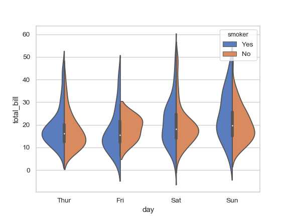
I find violin plots very informative and useful, I use python library 'seaborn'. However, when applied to positive values, they nearly always show negative values at the lower end. I find this really misleading, especially when working with real-life datasets.

In the official documentation of seaborn https://seaborn.pydata.org/generated/seaborn.violinplot.html one can see examples with "total_bill" and "tip" which can not be negative. The violin plots show negative values, however. For example,

import seaborn as sns
sns.set(style="whitegrid")
tips = sns.load_dataset("tips")
ax = sns.violinplot(x="day", y="total_bill", hue="smoker",data=tips, palette="muted", split=True)

enter image description here

I do understand, that those negative values come from gaussian kernels. My question is, therefore: is there any way to solve this problem? Another library in python? Possibility to specify a different kernel?

Hugmetight answered 8/1, 2020 at 15:50 Comment(6)
A violin plot is two KDE plots aligned on an axis. The "negative" values you are seeing are just an artifact of KDEs. They are estimations of values in your data. It's not saying you have negative data, it's saying that your data contains values very close to negative values, namely 0. And thus you have a non-zero estimated probability of selecting a negative value from your dataset.Doubledealing
The kernel density is defined over the full range from -infinity to +infinity.Stilu
I do understand where those values come from. I am looking for a way out. I can, for example, dream of using truncated gaussian kernels for KDE estimation. Why do I worry? Wenn working with real-life datasets, my data are nearly always dirty, nearly always I am doing some cleaning. Looking at the violin plot (which was created a while ago) with negative values you can never be sure, if you missed something in cleaning or is this an artifact of KDEsHugmetight
Check e.g. this. In order to check if you have negative values in your data, use something like numpy.any(data < 0)Stilu
Yes, of course, I am doing this, always. But I want intuition from my plots. I want to present those plots to my business-users. And I want this intuition not to be misleadingHugmetight
Would masking the plot to now show the negative values be acceptable?Debtor
T
12

You can use the keyword cut=0 to limit your plot to the data range. If the data doesn't have negative values, this will chop the end of the violin to zero. Using the same example as you, try:

ax = sns.violinplot(x="day", y="total_bill", hue="smoker",data=tips, palette="muted", split=True,cut=0)

Trenatrenail answered 23/1, 2020 at 15:51 Comment(0)

© 2022 - 2025 — McMap. All rights reserved.