create a bar chart using plotly
Asked Answered
H

1

1

I'm trying to create a bar chart using plotly.

The input data looks like:

In [7]: datag.ix[:,0].tolist()[1:6]
Out[7]: [2020.0, 5000.0, 6010.0, 6017.0, 6020.0]

and

In [8]:datag.ix[:,1].tolist()[1:6]
Out[8]: 
[0.005178087393490427,
 0.0014053668695097226,
 0.3174139251746979,
 0.006049724003653125,
 0.24824287385322272]

and the code is

import plotly
import plotly.offline as offline
import plotly.plotly as py 
import plotly.graph_objs as go

trace1 = go.Bar(
        x=[str(x) for x in datag.ix[:,0].tolist()[1:6]],#datag.ix[:,0].tolist()[1:6],
        y=datag.ix[:,1].tolist()[1:6],
        name='travel'
        )
data=[trace1]
layout= go.Layout(
        barmode= 'stack',
        title='Realization: 0, 0',
        xaxis=dict(title='Model'),
        yaxis=dict(title='Time (minutes)')
        )
fig= go.Figure(data=data, layout=layout)
offline.plot(fig, image='png', filename='stacked-bar')

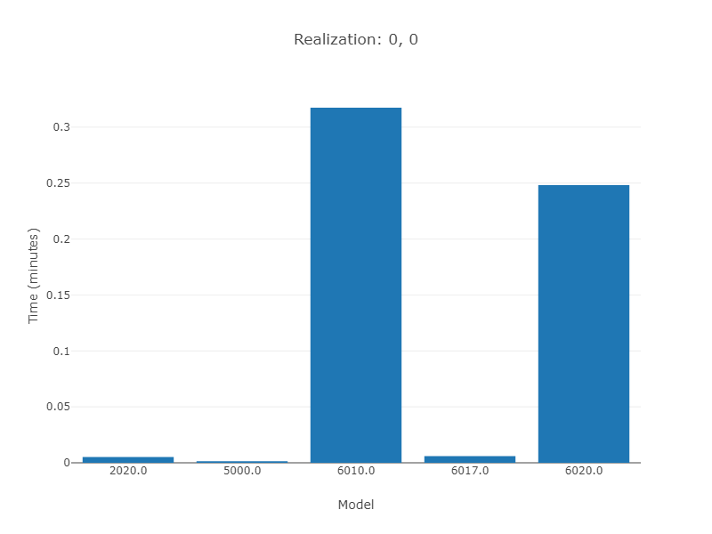
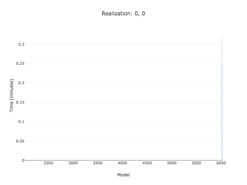
I get the following output: enter image description here However, the problem is I want to demonstrate the x-data just as strings which I tried with x=[str(x) for x in datag.ix[:,0].tolist()[1:6]]. Can some one help me to figure out how?
Haddad answered 3/4, 2018 at 11:23 Comment(0)
C
2

Plotly 'assumes' your data type, even if you provide strings. Setting type to categorical for your xaxis resp. yaxis in layout should do the trick.

import pandas as pd
import plotly.offline as offline
import plotly.plotly as py 
import plotly.graph_objs as go

d = {'x': [None,
           2020.0, 
           5000.0, 
           6010.0, 
           6017.0, 
           6020.0], 
     'y': [None,
           0.005178087393490427,
           0.0014053668695097226,
           0.3174139251746979,
           0.006049724003653125,
           0.24824287385322272]}
datag = pd.DataFrame(data=d)

trace1 = go.Bar(
    x=[str(x) for x in datag.ix[:,0].tolist()[1:6]],
    y=datag.ix[:,1].tolist()[1:6],
    name='travel')

data = [trace1]
layout = go.Layout(
    barmode='stack',
    title='Realization: 0, 0',
    xaxis=dict(title='Model', 
               type='category'),
    yaxis=dict(title='Time (minutes)'))
fig = go.Figure(data=data, layout=layout)
offline.plot(fig, image='png', filename='stacked-bar')

enter image description here

C answered 4/4, 2018 at 21:16 Comment(0)

© 2022 - 2024 — McMap. All rights reserved.